Creative Transitions… custom stains on a floor The renovation of this vintage kitchen was an…
Creative Transitions… custom stains on a floor The renovation of this vintage kitchen was an…
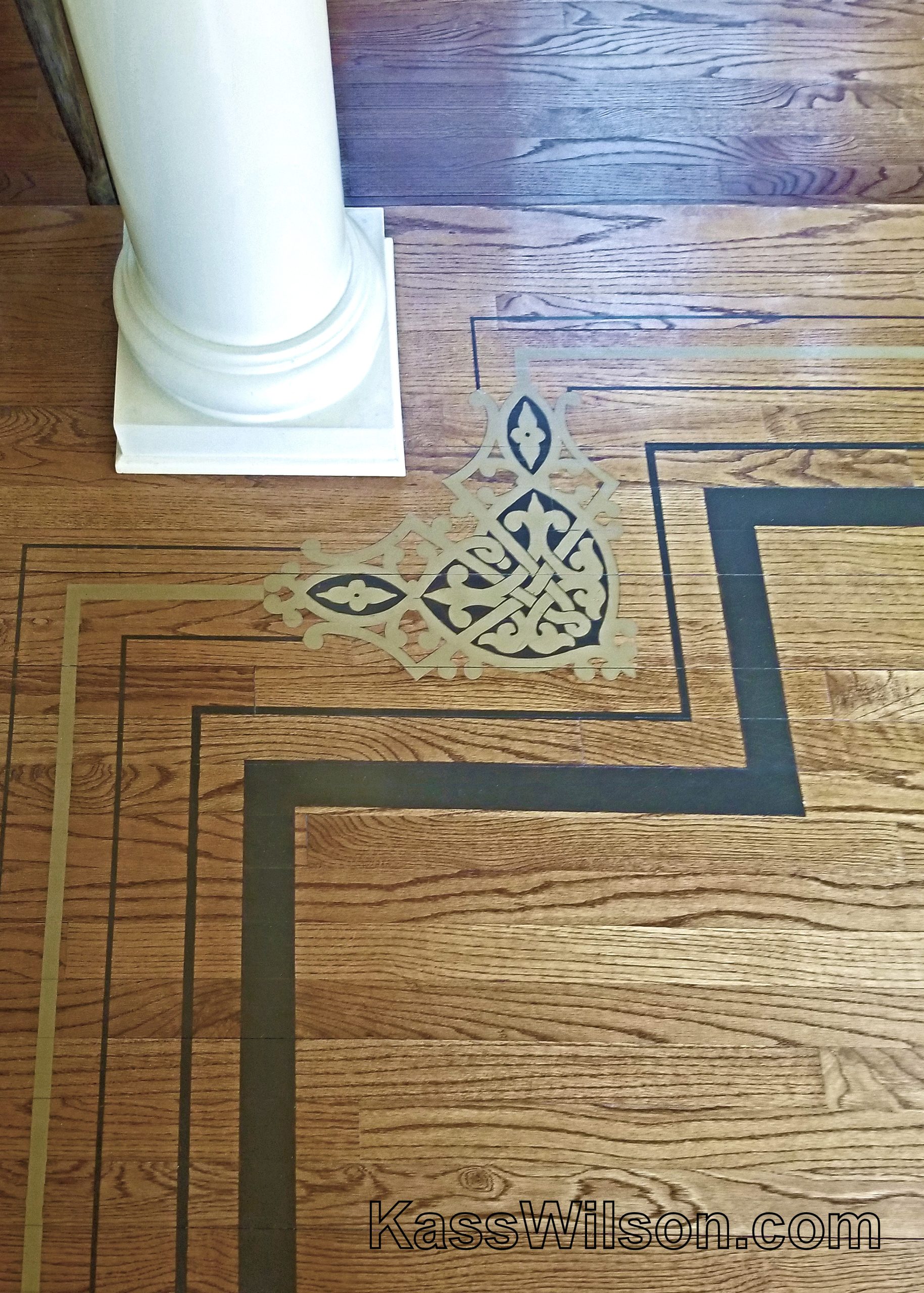
Do The Math… hand painted floor pattern Some of the most impactful changes you can…
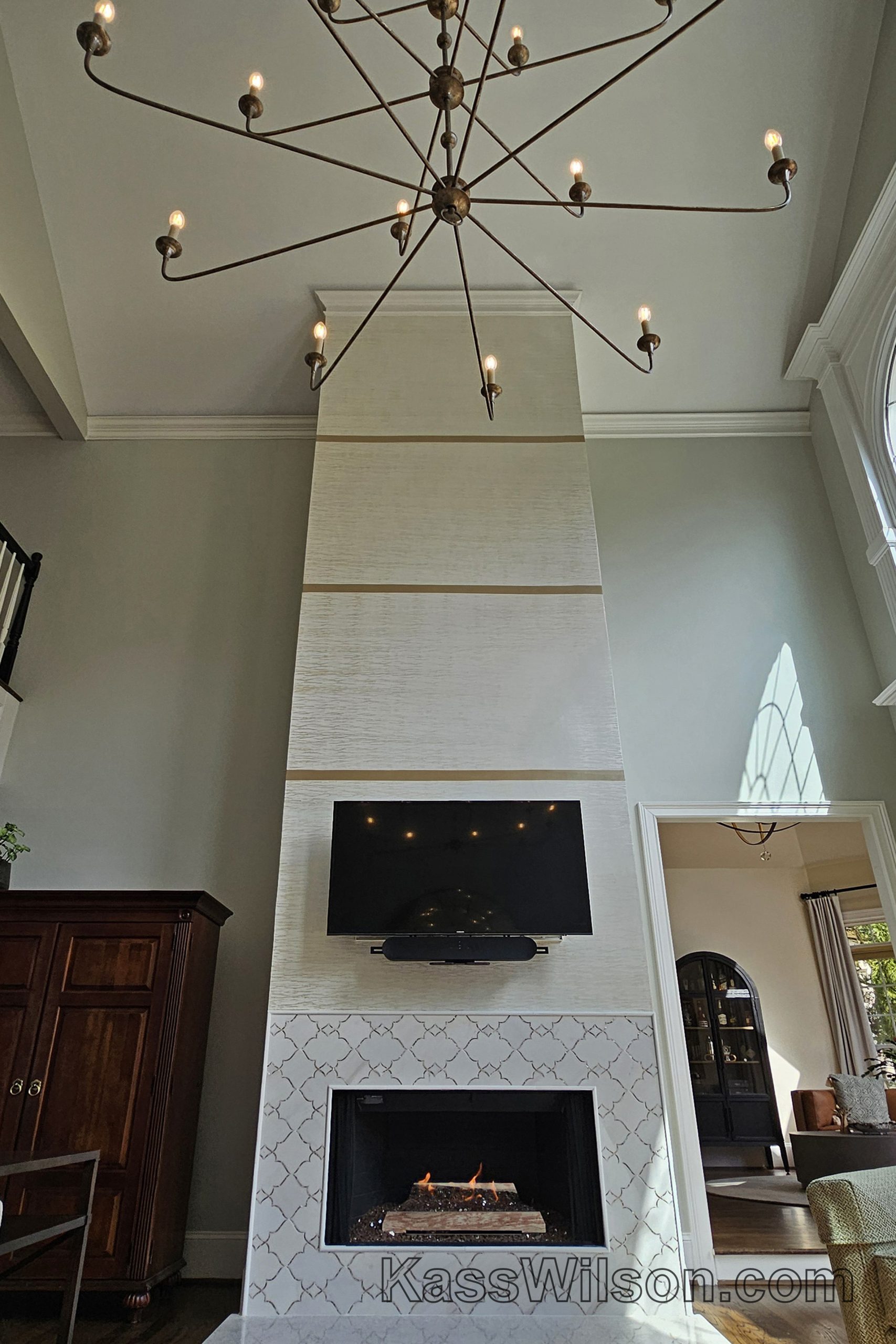
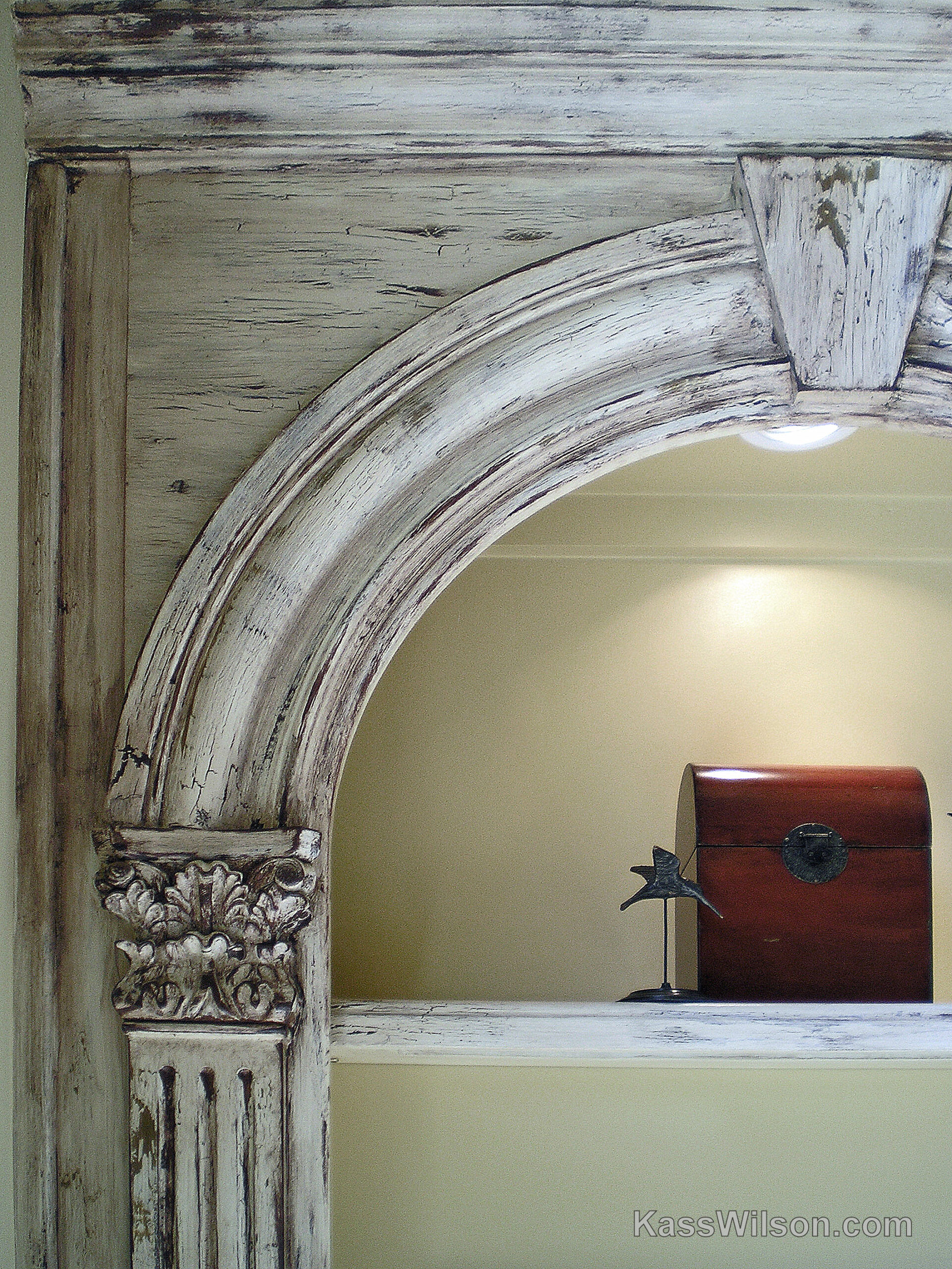
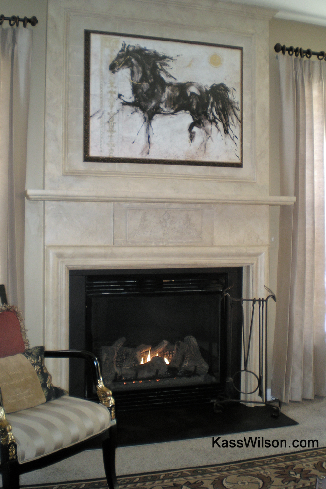
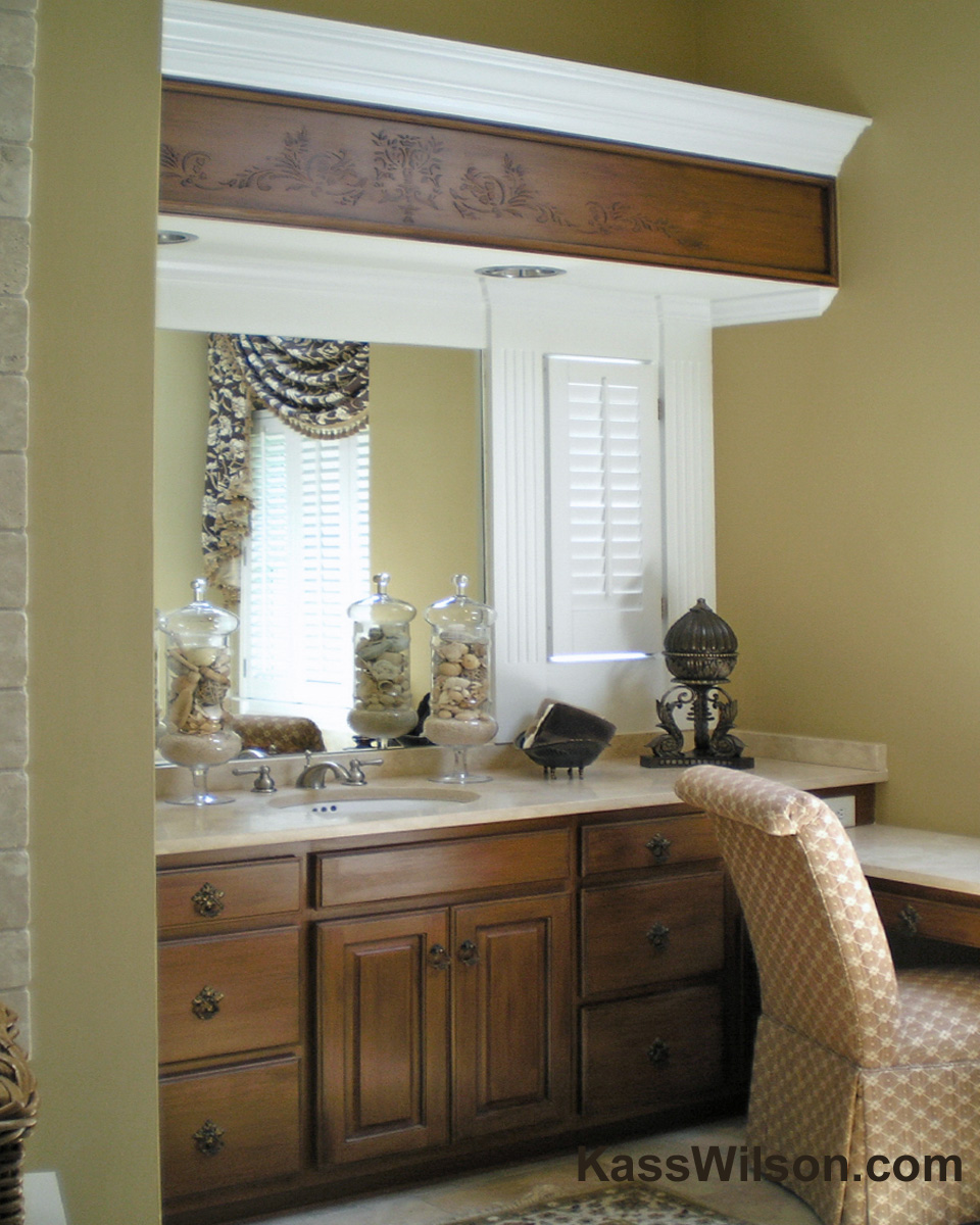
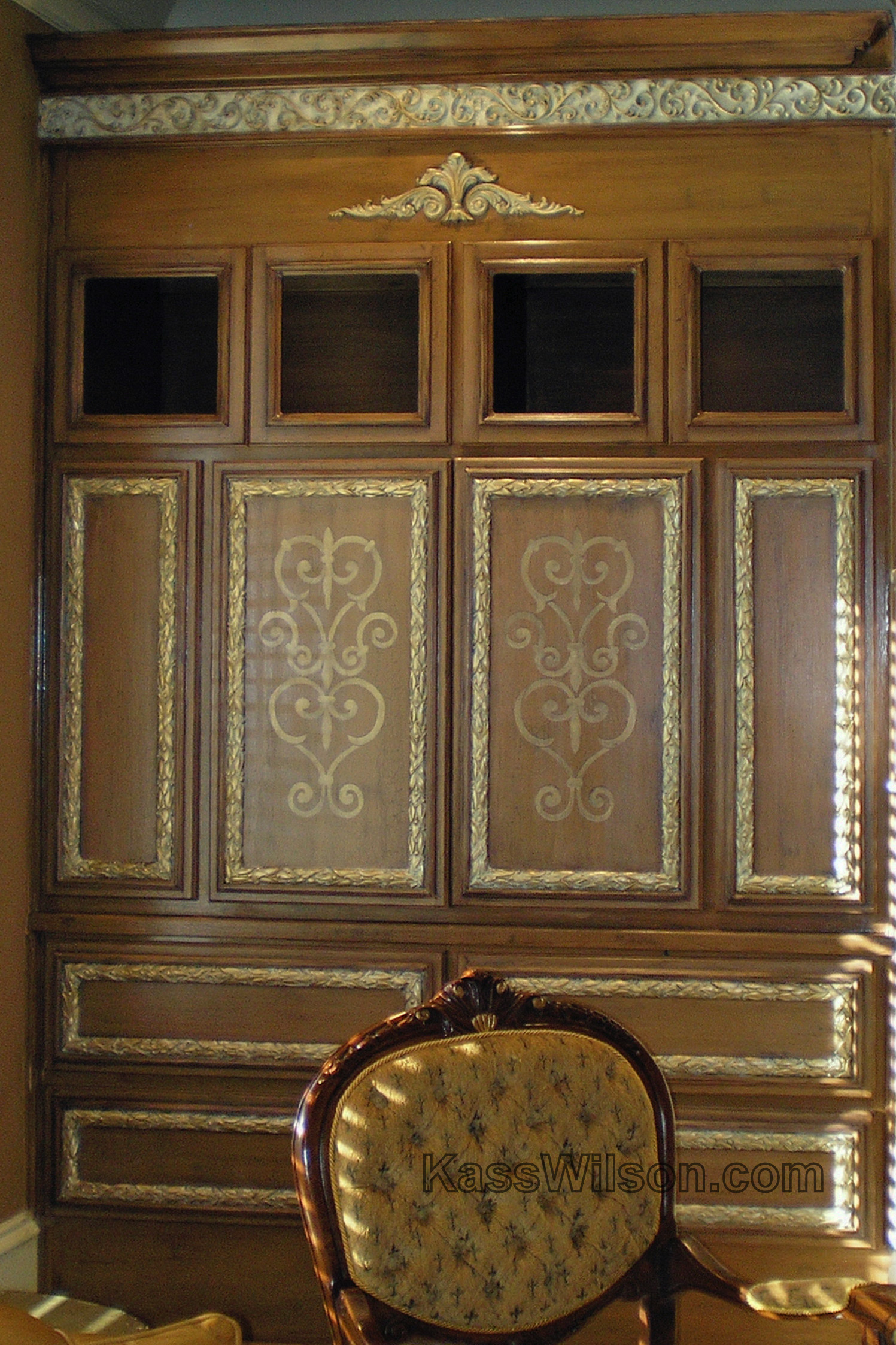
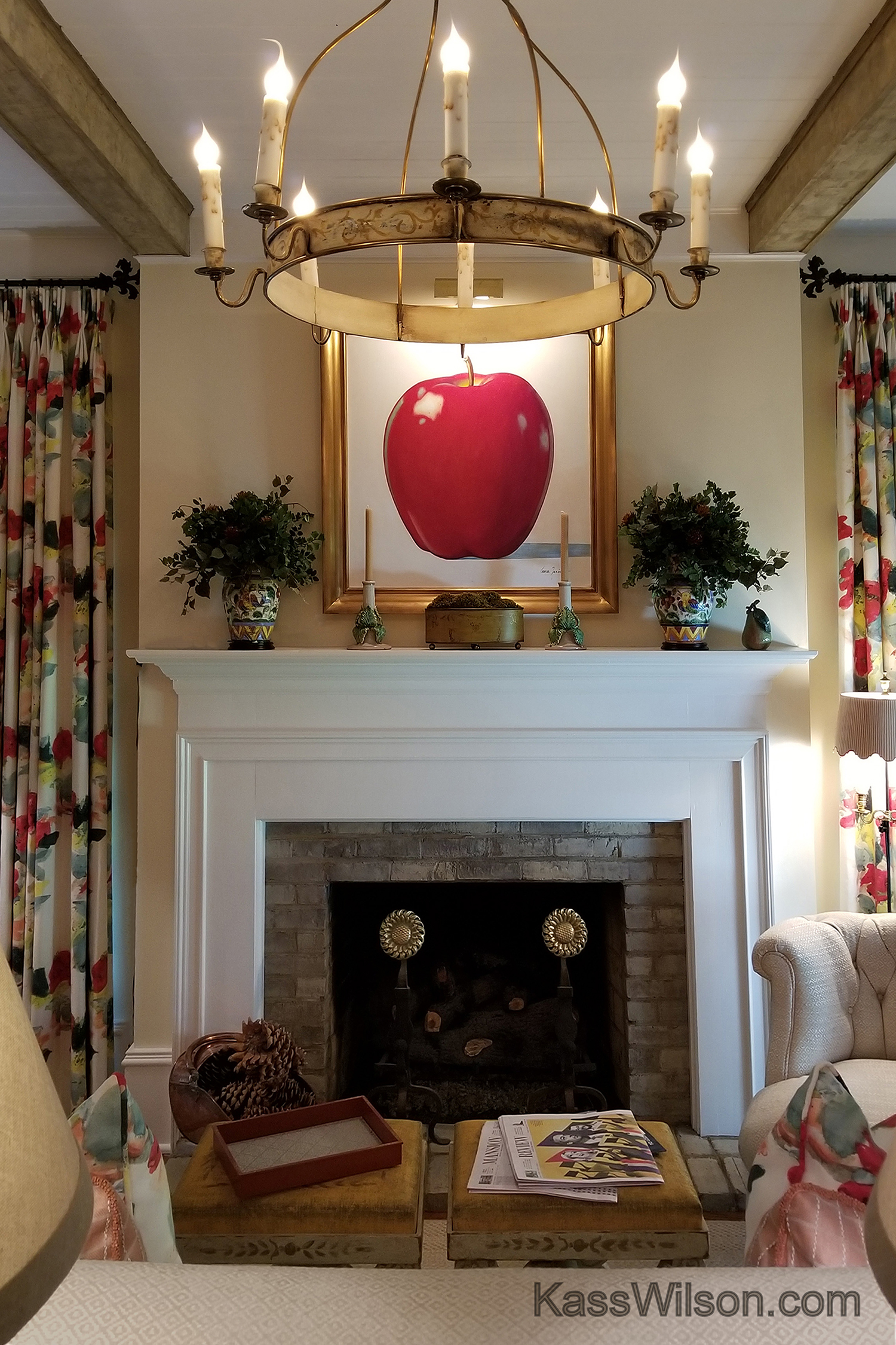
Line By Line… a unique mantel transformation Sprucing up a high mantel can be a…
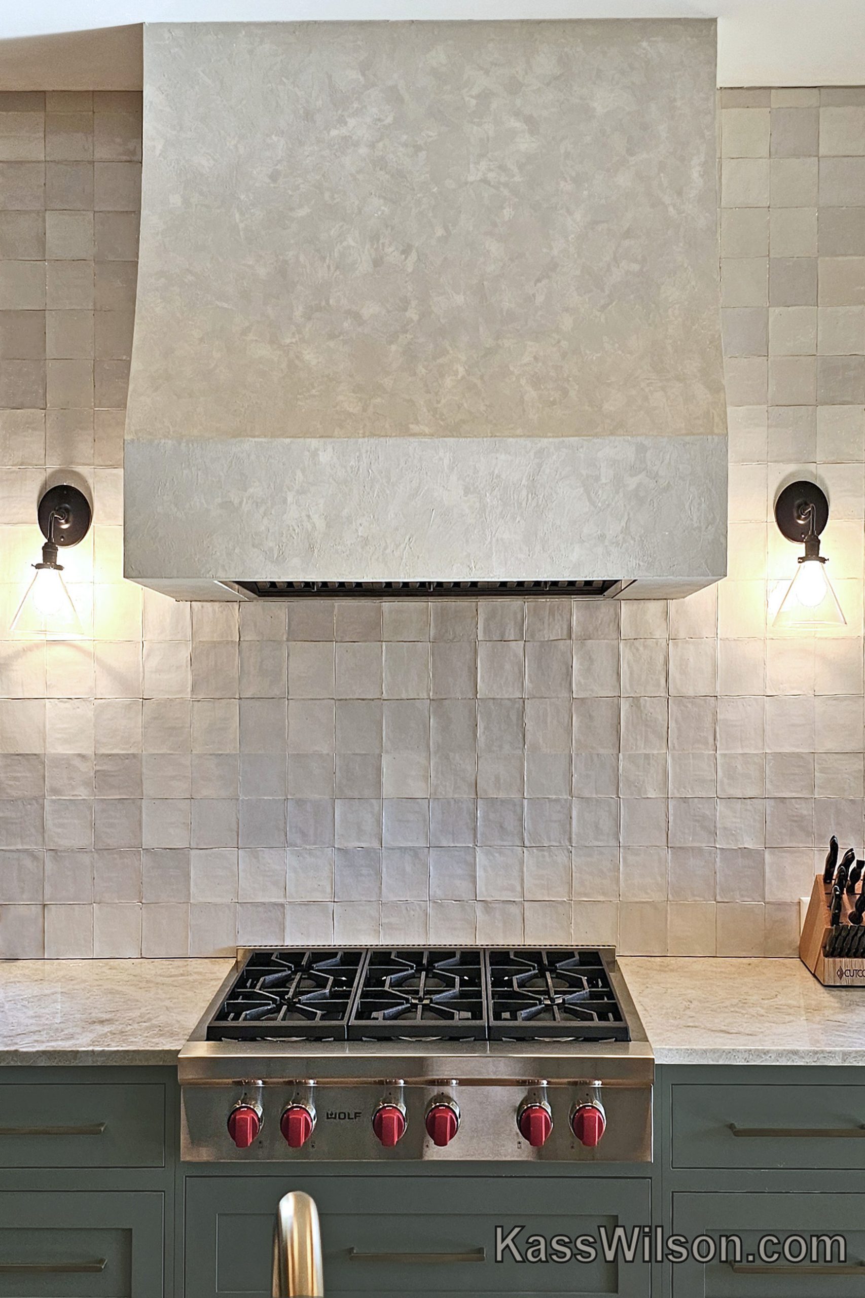
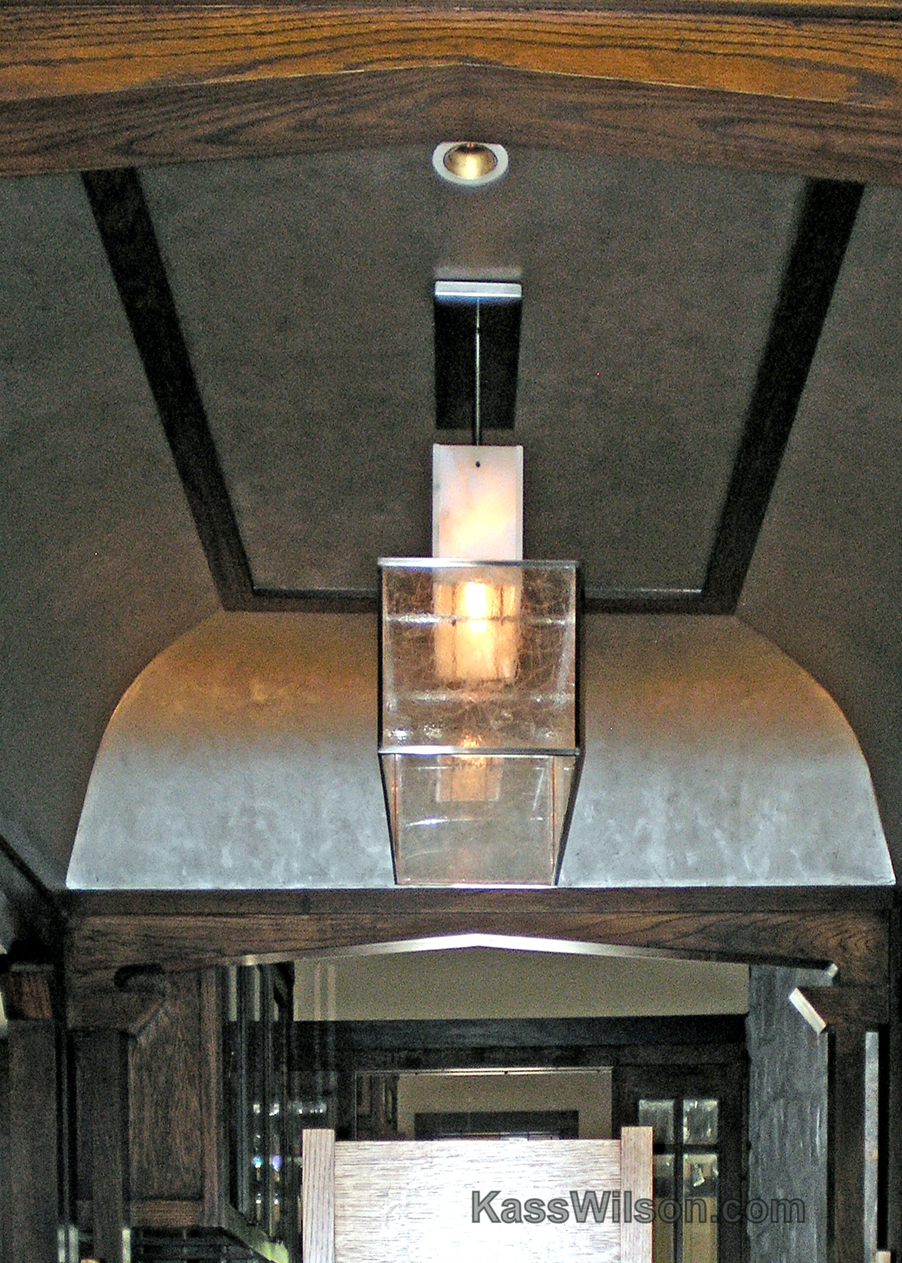
Form, Function and Blending … custom plaster vent hood In the past, vent hoods have…

At your feet … painted concrete floor. How do you create an intriguing focal point…

Project Runway… plaster vent hood Ventilation above the stove is critical in any kitchen, but,…
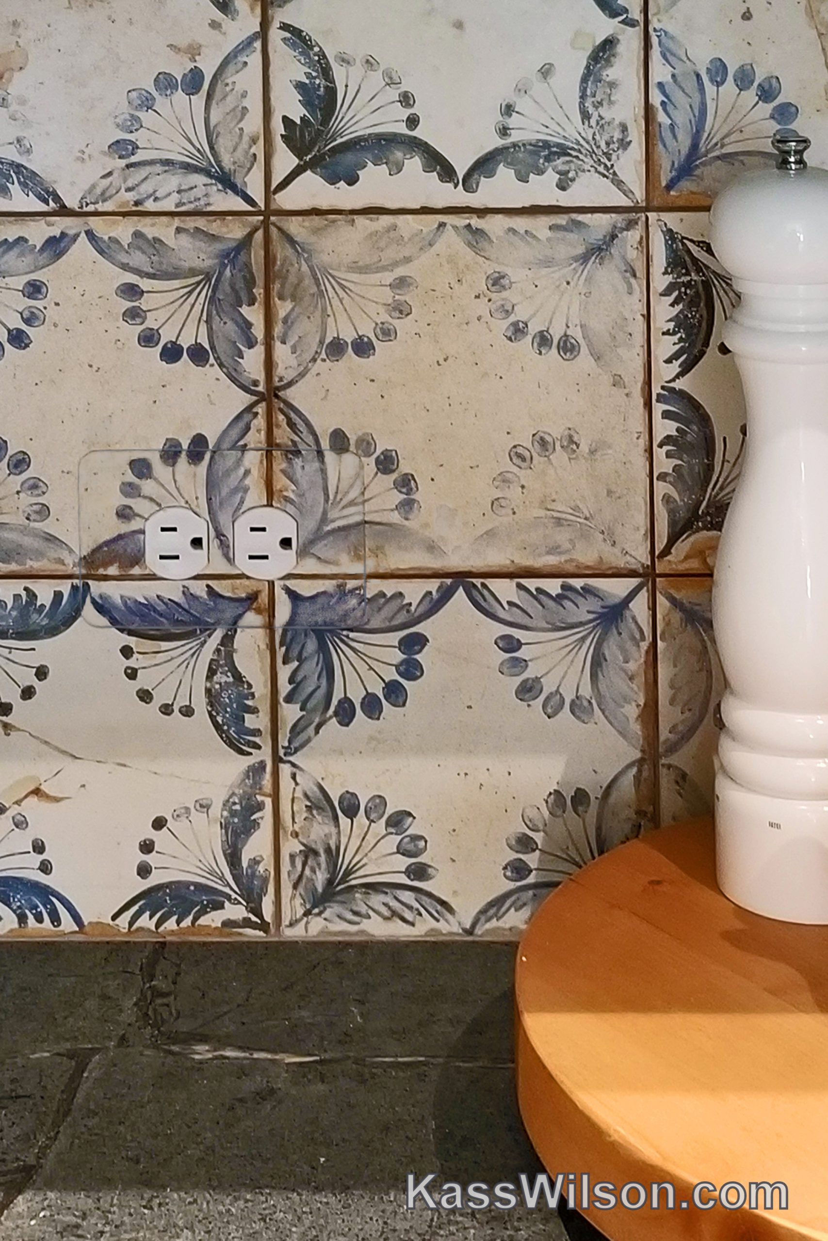
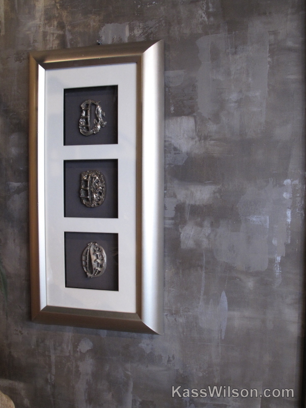
Now you see it… hand painted outlet covers Handmade tile is filled with character because…
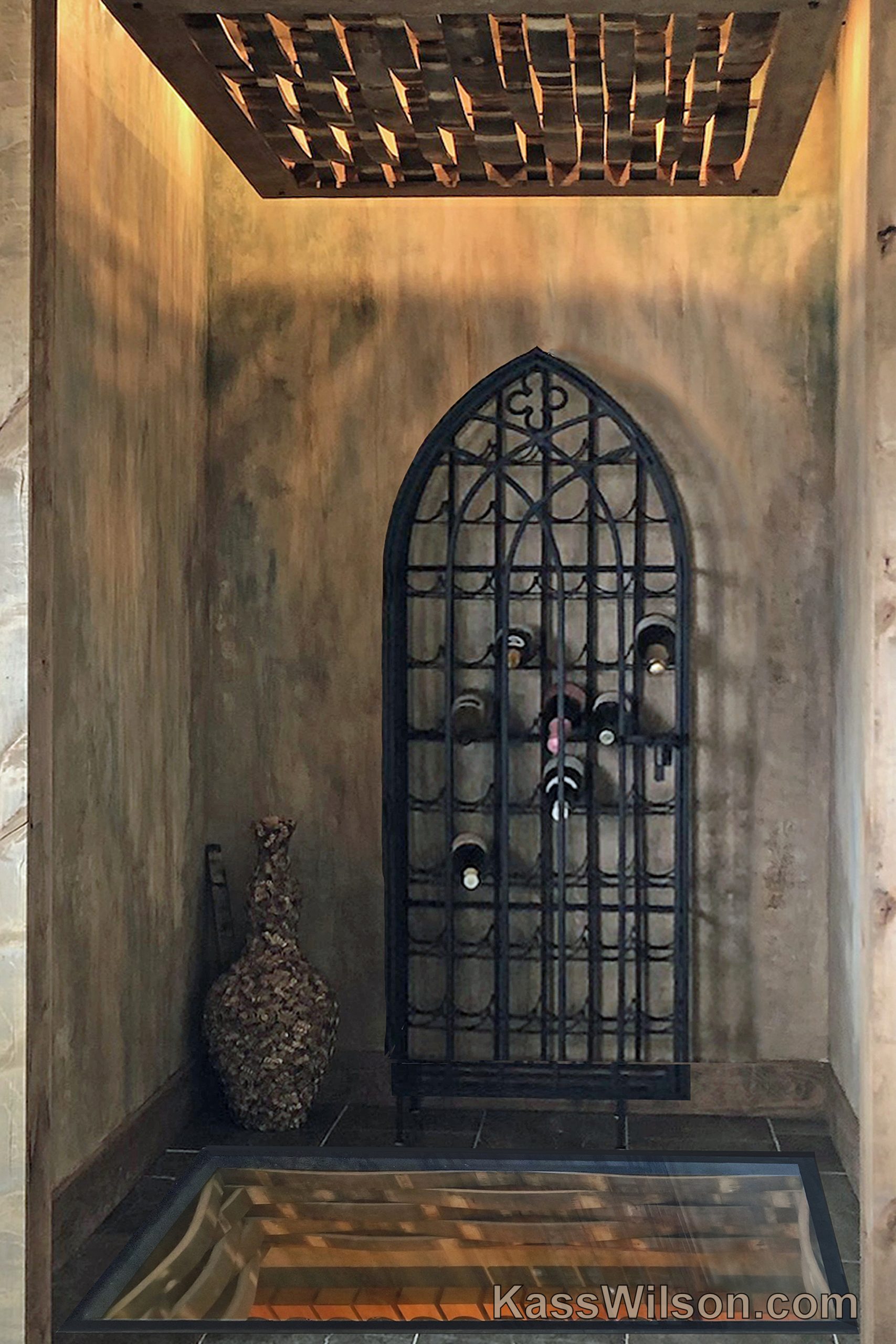
Window of Opportunity… aged finish in wine cellar Glass floors are not just for contemporary…
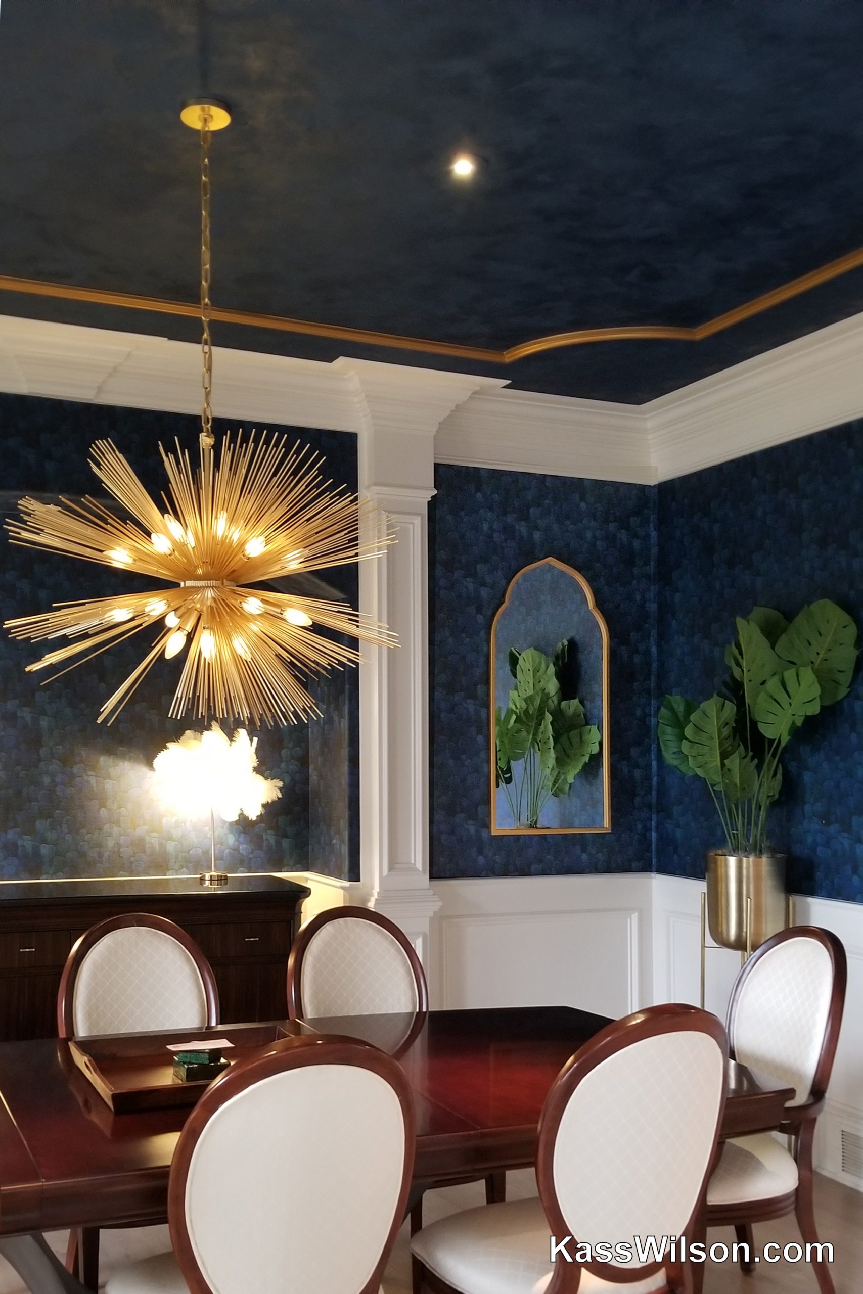
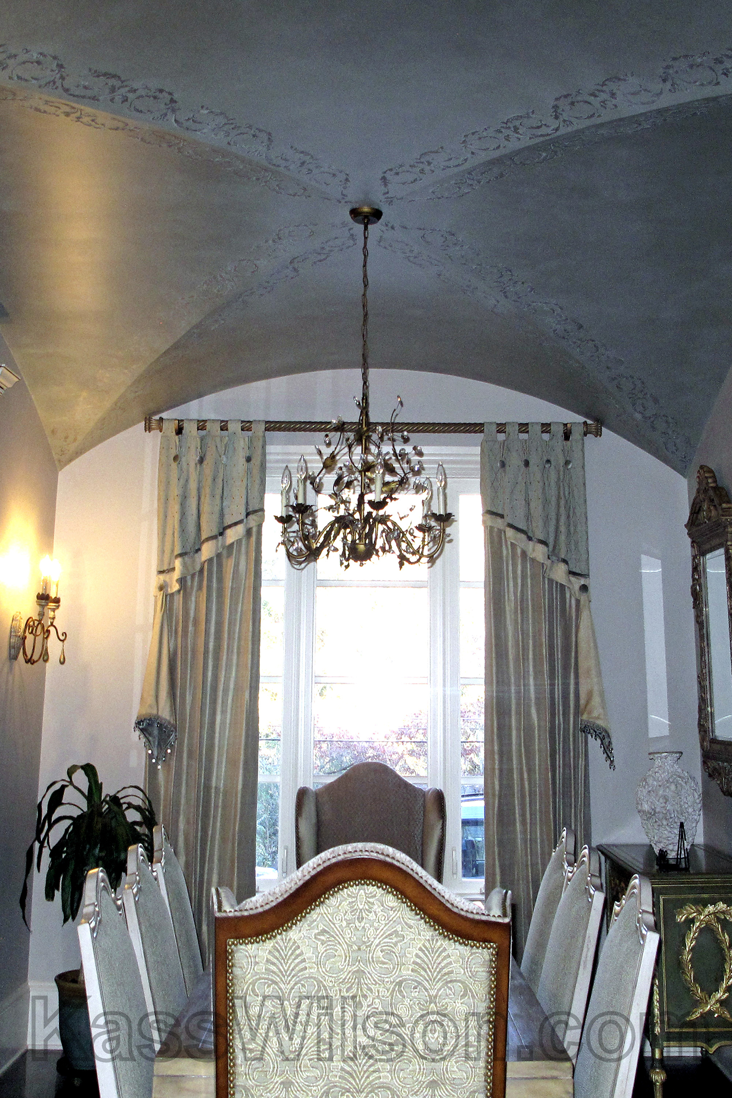
High Drama… a deep blue reflective ceiling Dining rooms are reserved for special guests and…
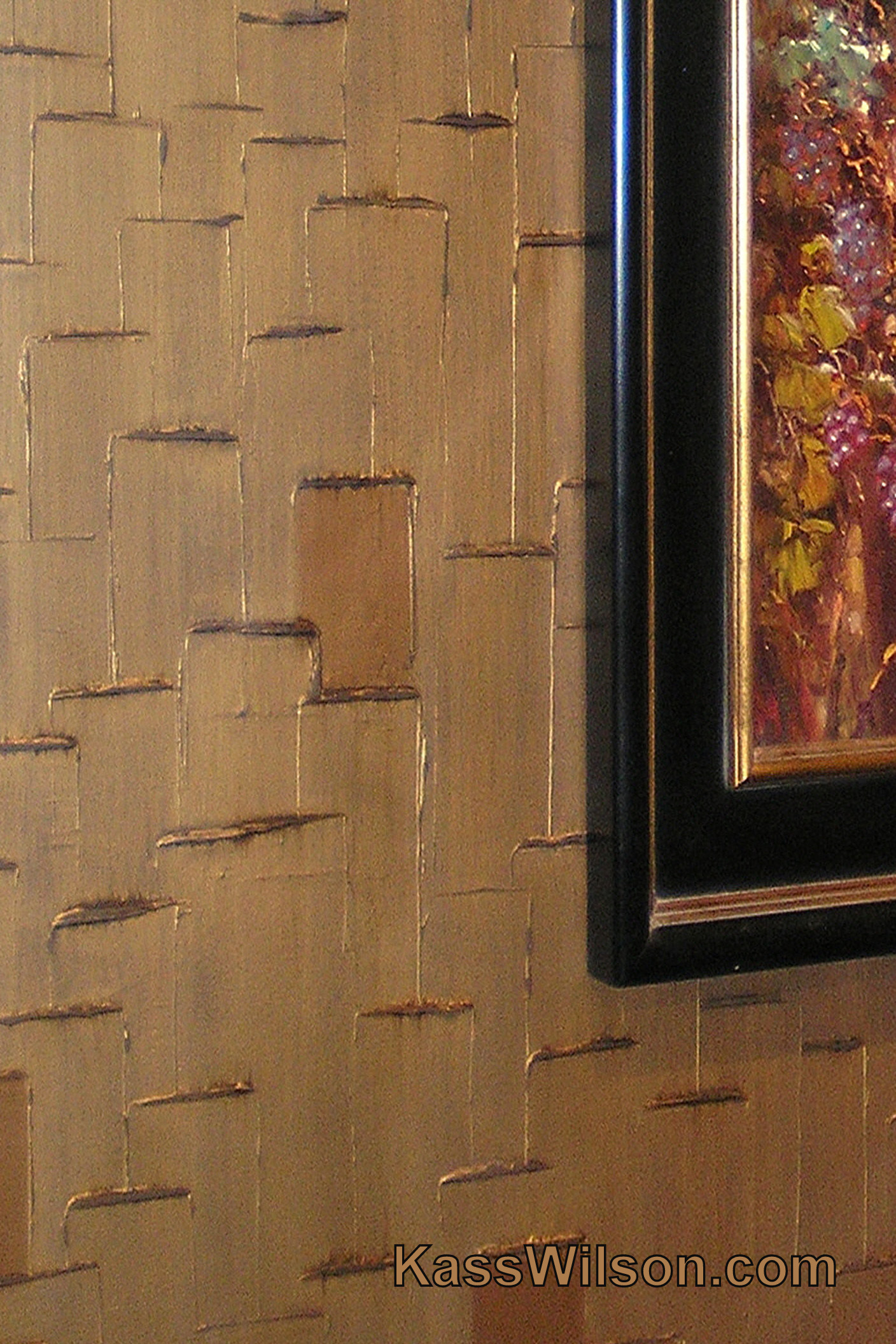
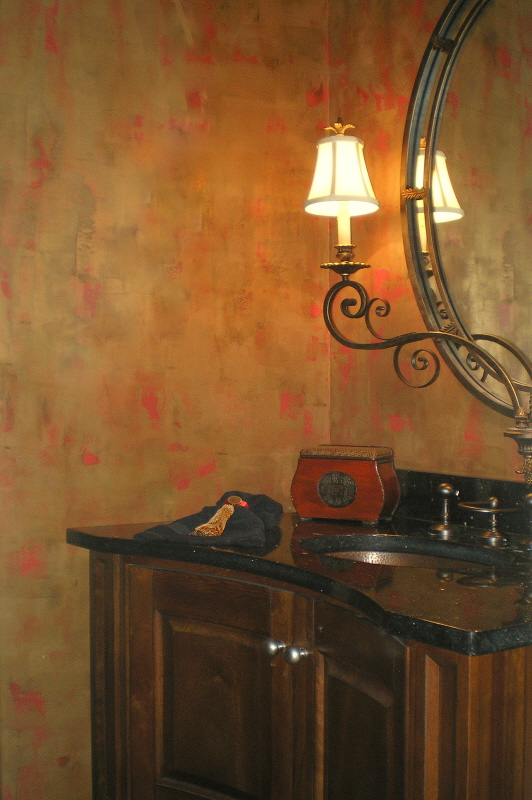
On the Bright Side… metallic plaster accent wall Bold contemporary patterns . . . rich…

No Regrets… Rethinking a textured wall finish Jessica Murphy of Hammer & Harmony Construction was…
Perfect Pairing Here in the South, many clients are looking to “update” the heavy traditional…
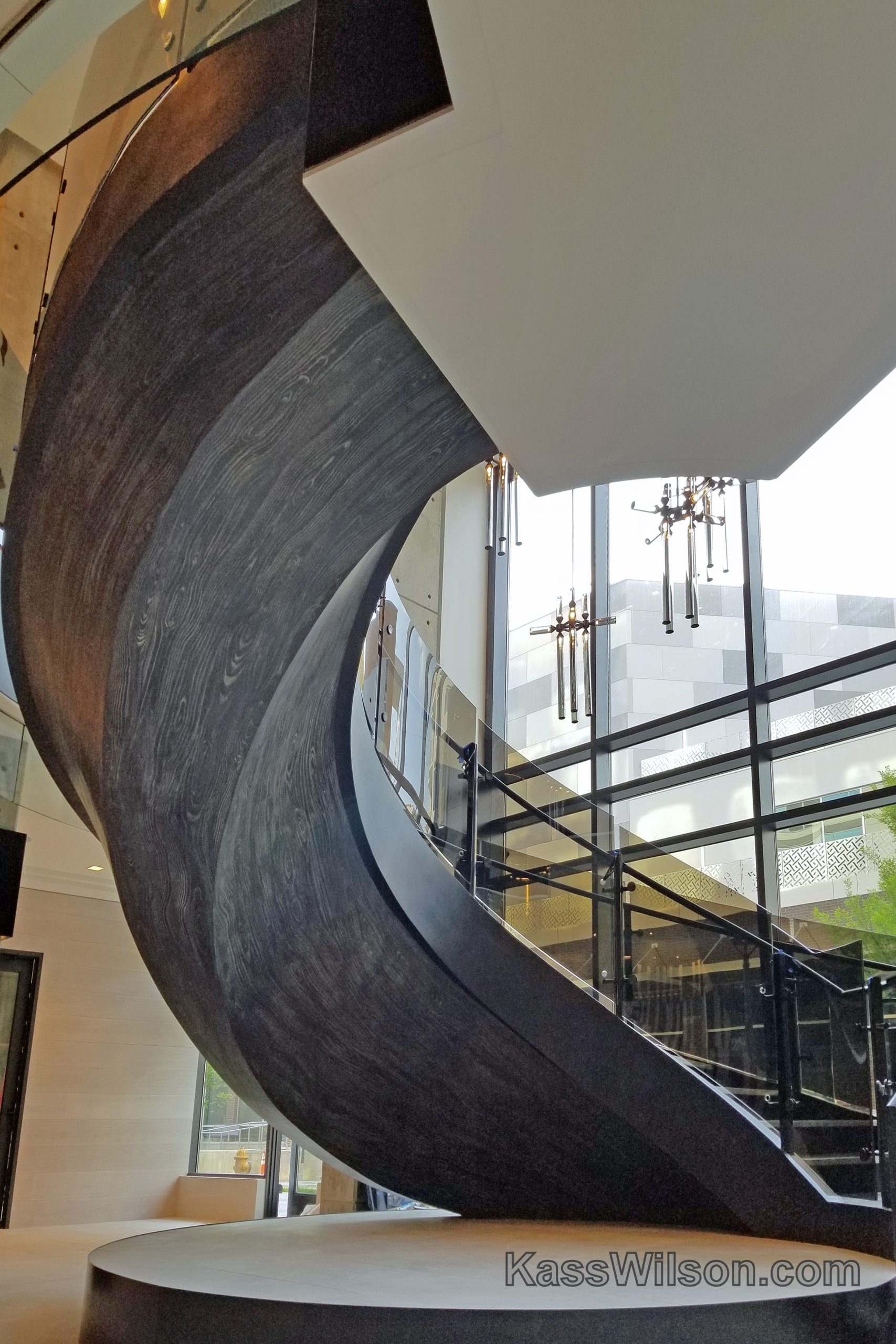
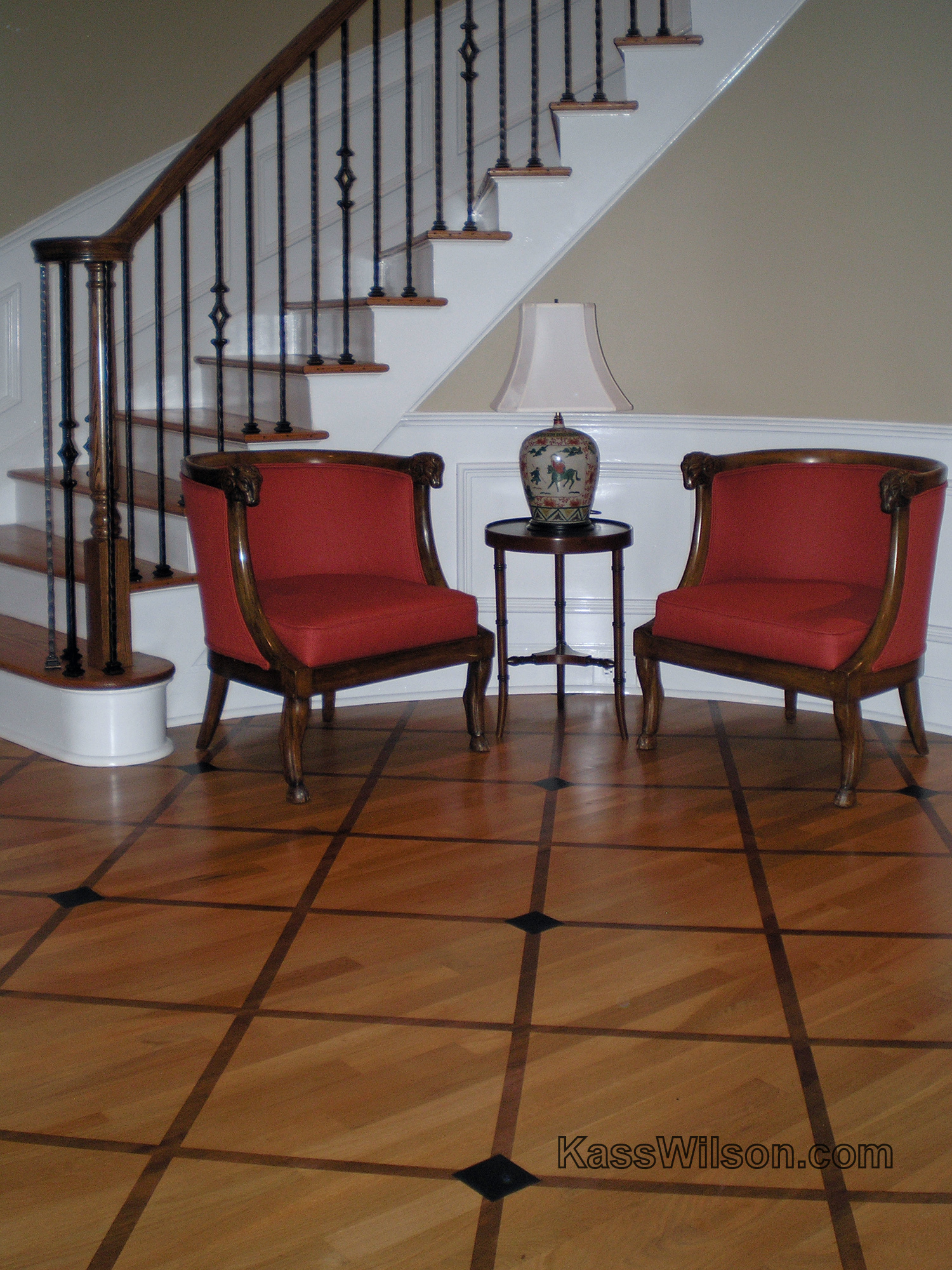
Twists and Turns… A Wood Grained Staircase Nestled in the luscious tree lined streets of…
Defining Moments In this large furniture and design showroom, the challenge was to define the…
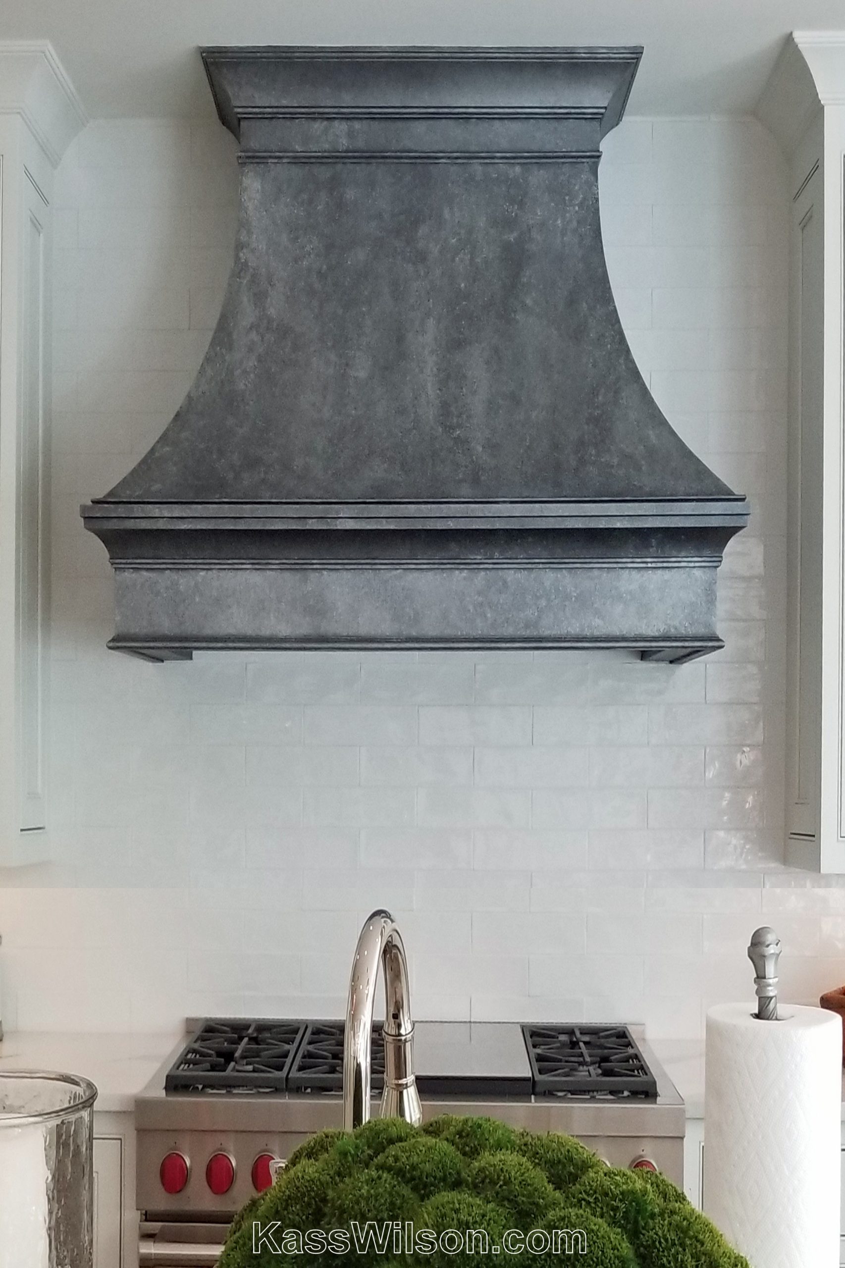
A to Zinc… A Painted Zinc Vent Hood With custom kitchen design taking center stage in home…
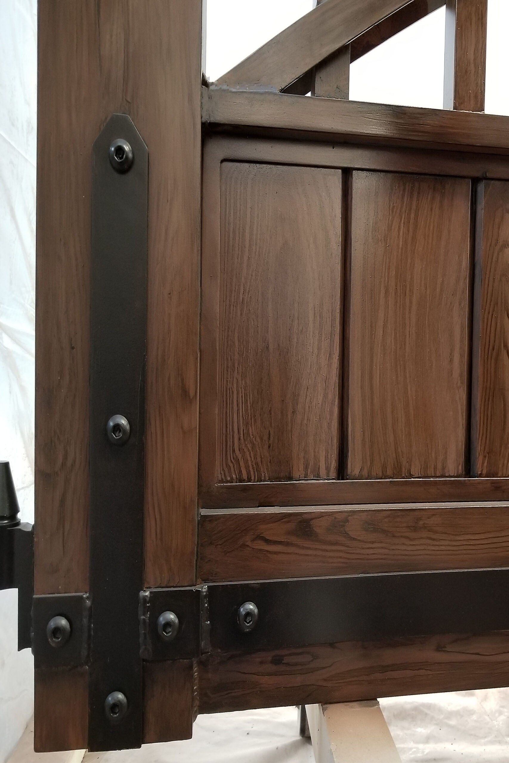
Starting Gate… painted aluminum gates We often think that a home’s first impression starts at…
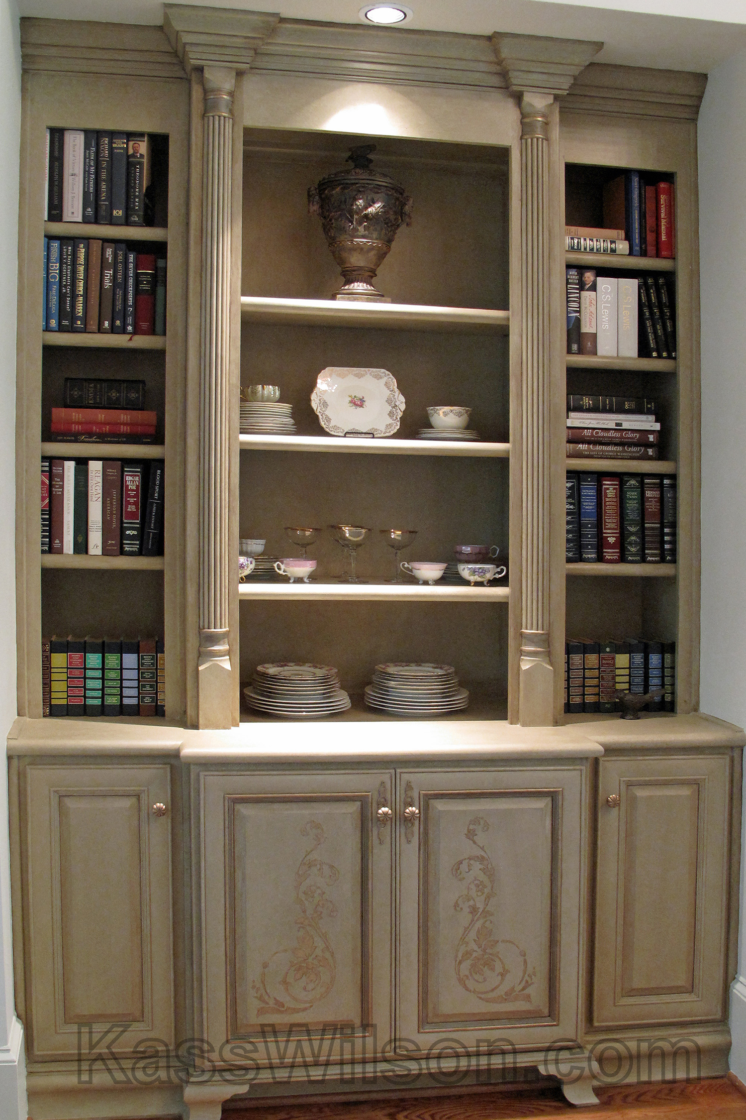
How old is OLD?… aged and distressed bookcases I am often asked to make new…
Fooling Mother Nature… faux driftwood cabinet finish Inspiration for artistic finishes is everywhere. One of…
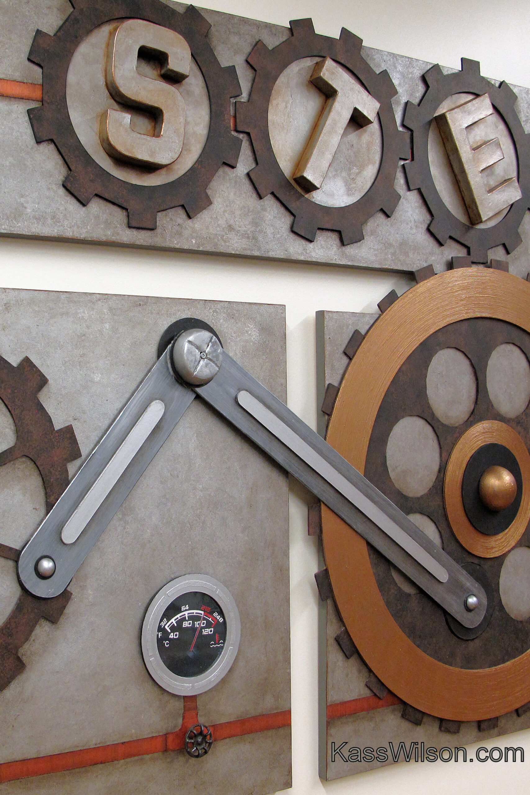
Full STEAM Ahead … a 3-dimensional wall mural STEAM (Science, Technology, Engineering, Arts and Mathematics)…
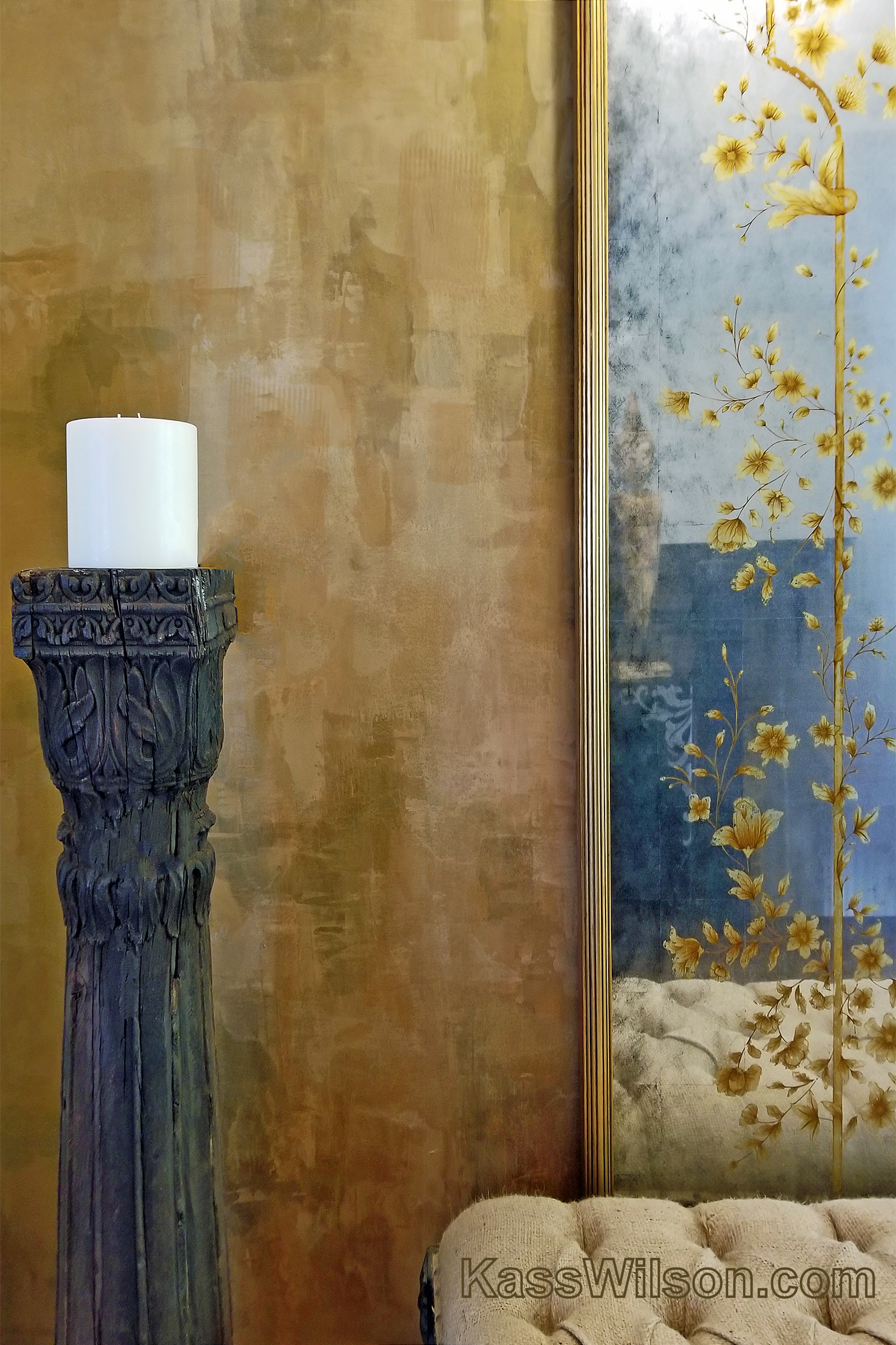
Frame of reference … a reflective wall finish Mirrors are magical. A beautiful mirror can…
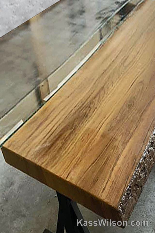
Design Duet…polished concrete and wood grained table There’s something quite beautiful about the intermingling of…
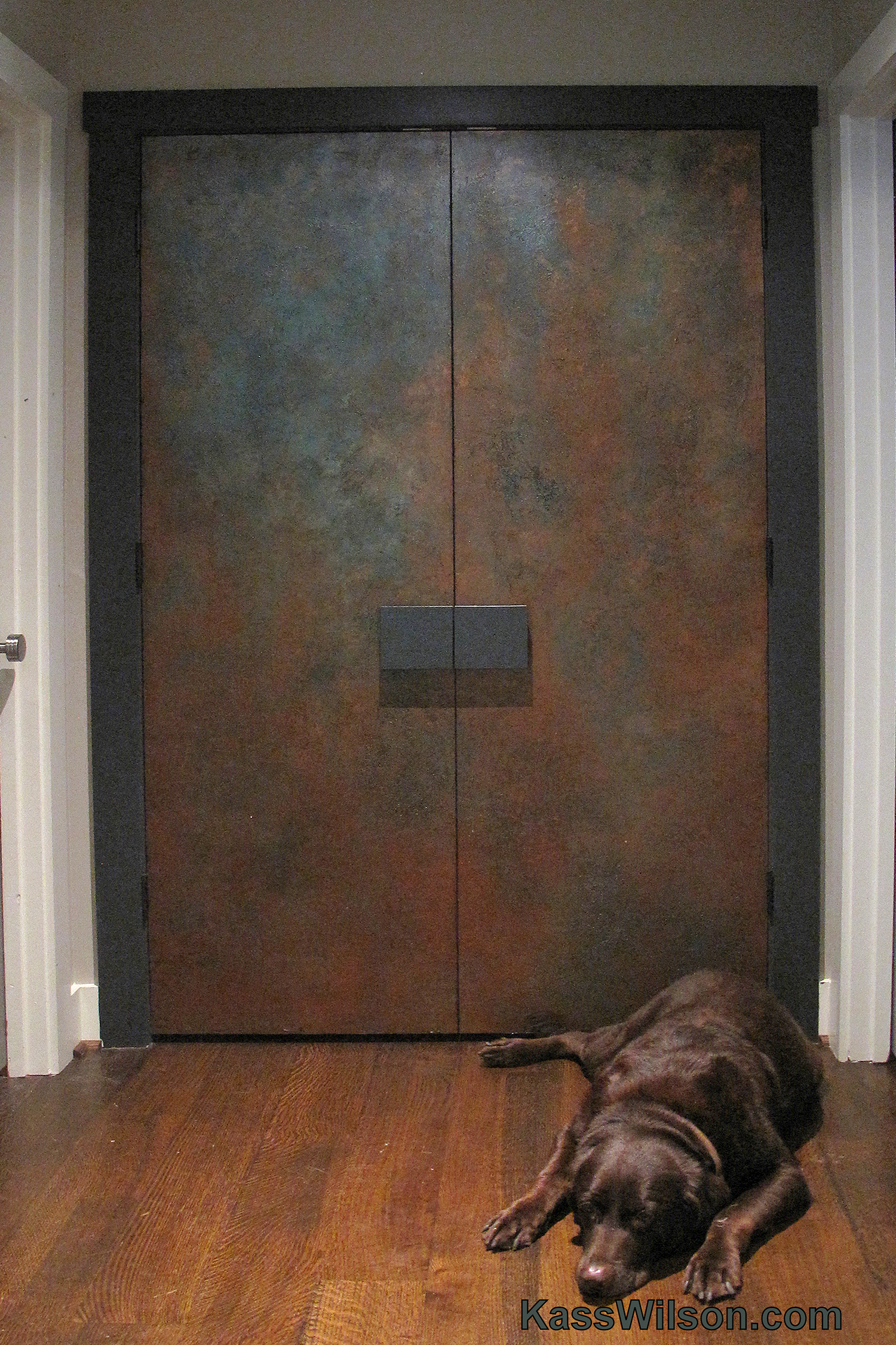
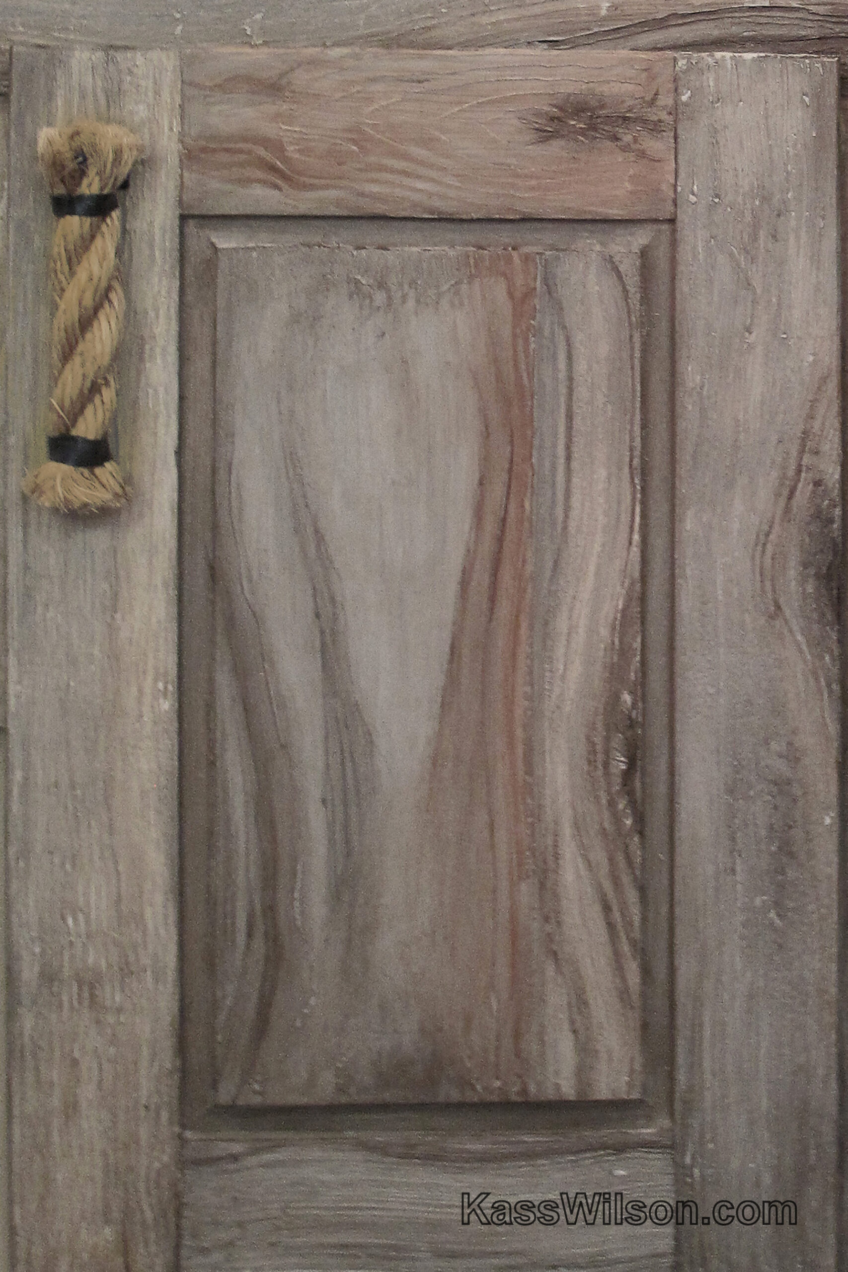
Walk This Way…Faux Antique Copper Doors It is easy to recognize how important it is…
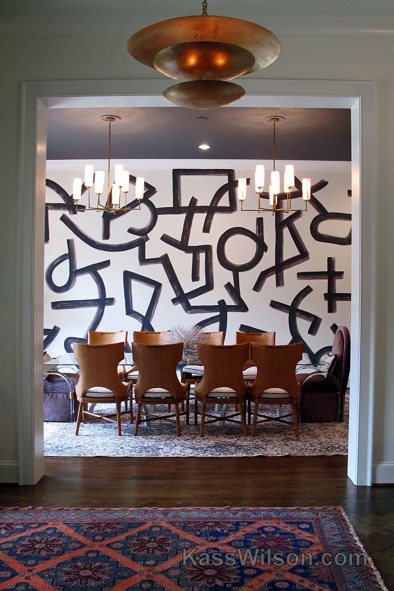
Strokes of Genius…Abstract Wall Finish Large banquet-sized dining rooms pose significant design challenges. Any room…
Introductory Offer…Faux Linen On An Accent Wall This year’s show home, sponsored by Atlanta Home…
Rags To Riches…Metallic Inlay On Painted Wood Cabinets The beauty of this home is the…
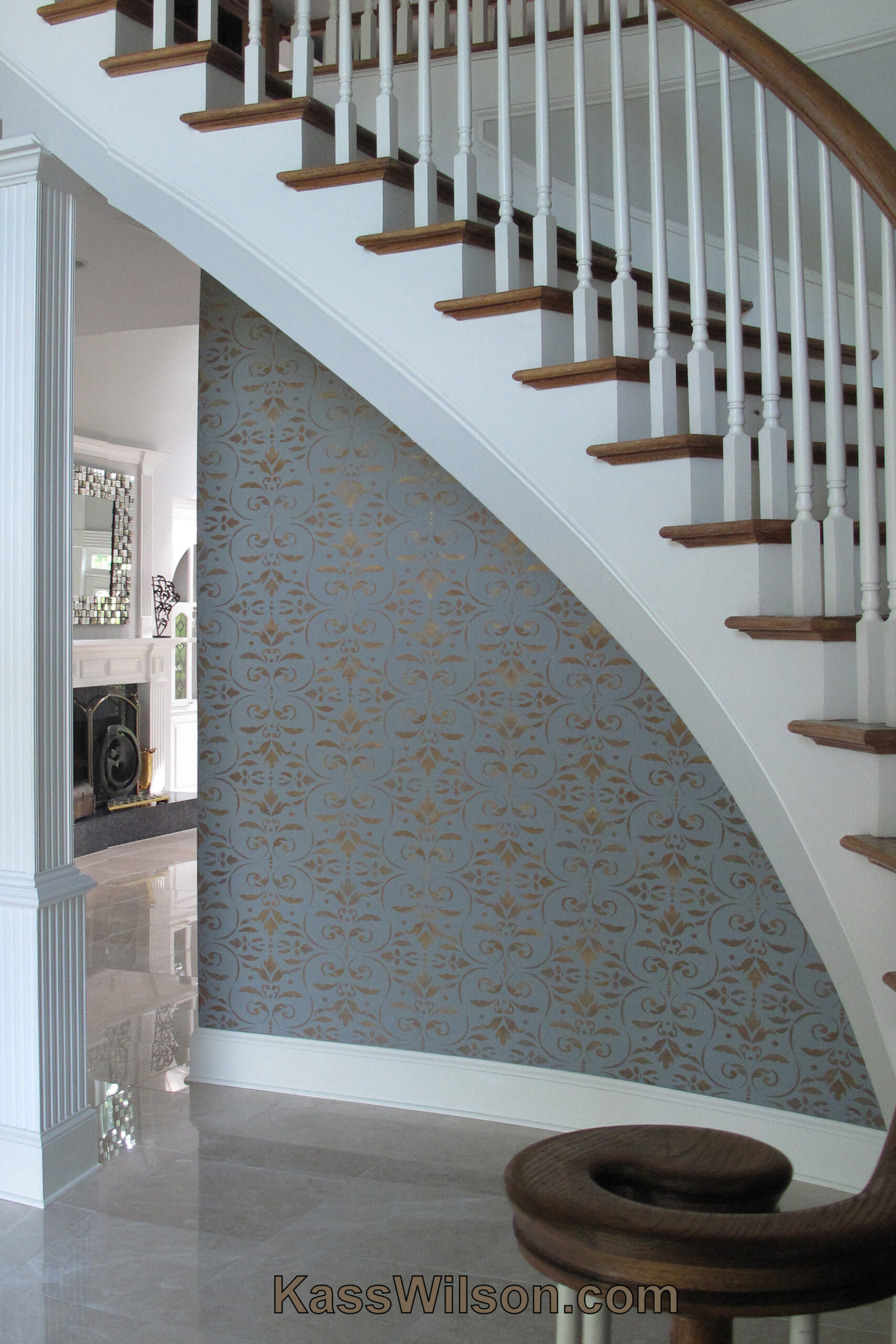
Stairway To Heaven…Metallic Stencil on Accent Wall Good design is all about directing you eye…
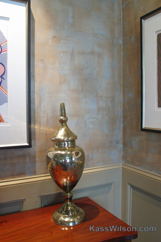
Prime Real Estate…Sophisticated Metallic Plaster “What defines “prime” real estate? It is a reference to…
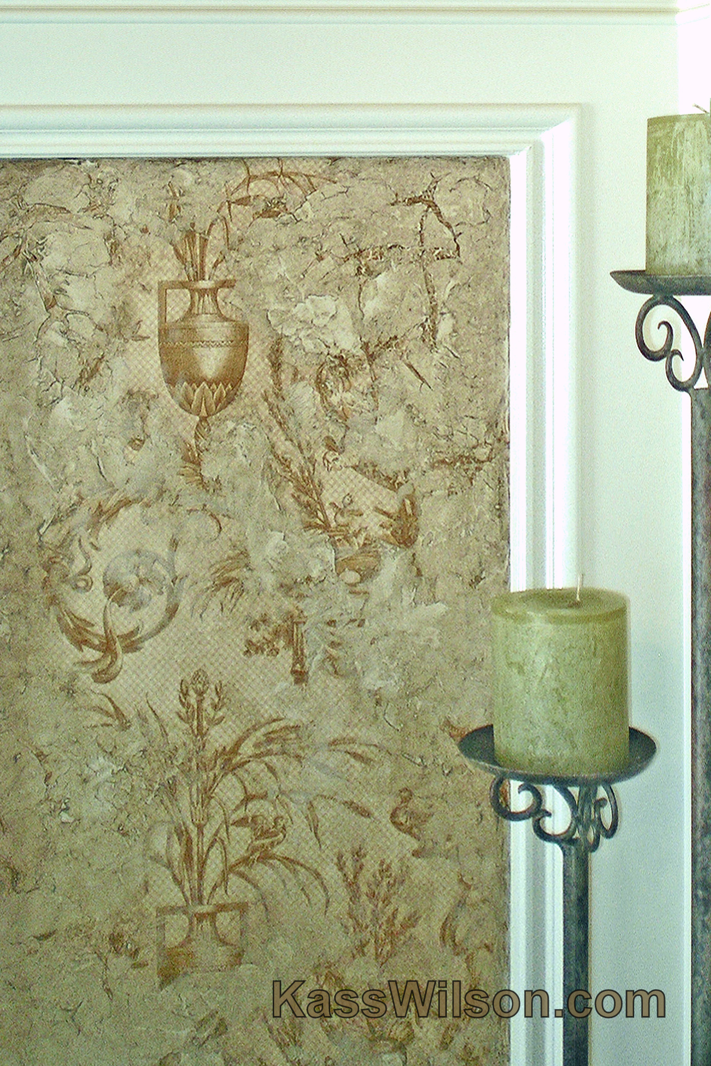
Lost and Found…Aged Plaster Over Images Consistent with a historical theme, designer, Celesa Tuning skillfully…
Champaign Toast…Metallic Damask Stencil Participating in designer events is an opportunity to work with a…
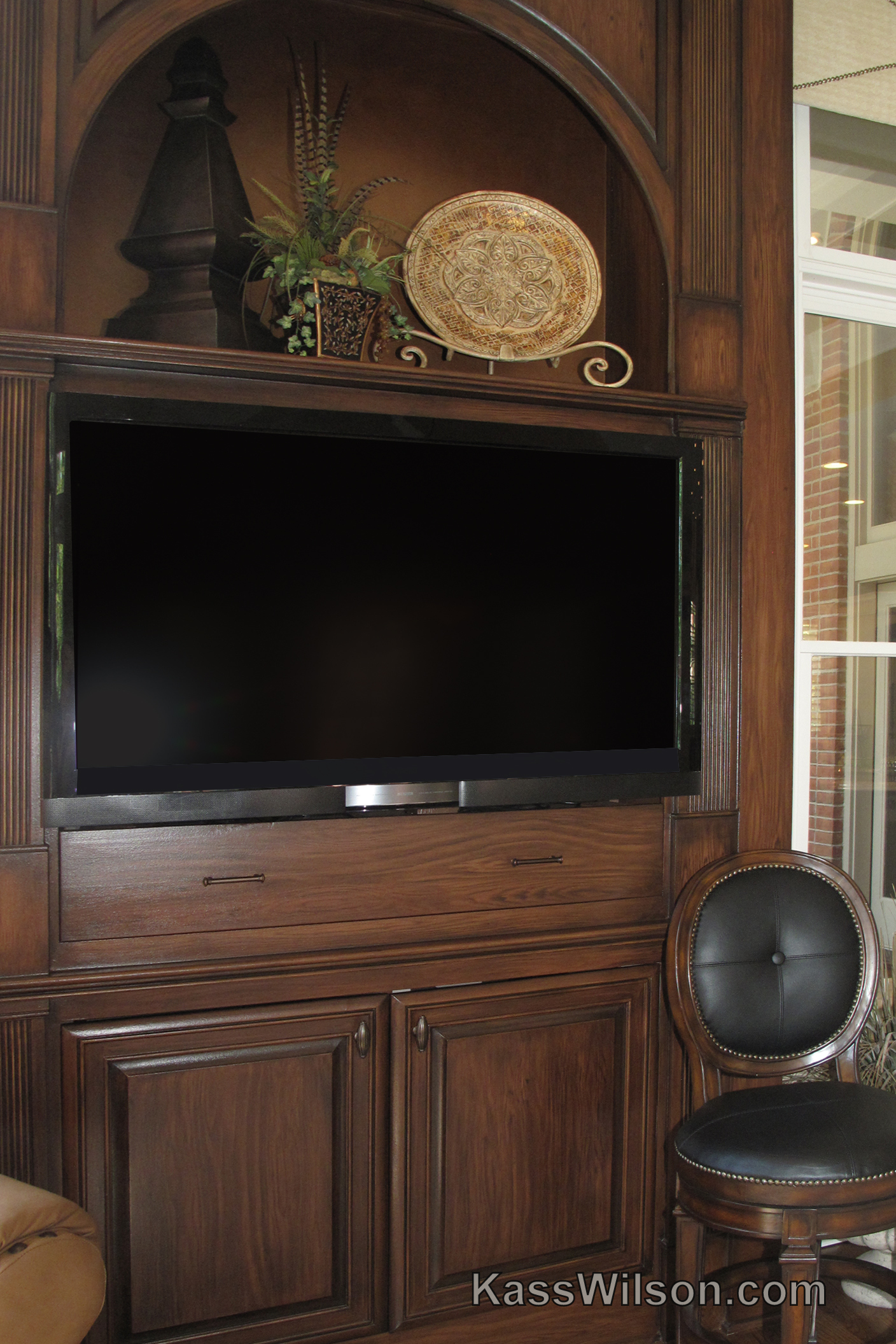
Bigger Is Better…Painted Wood Grain Cabinet The original finish of this cabinet was the same…
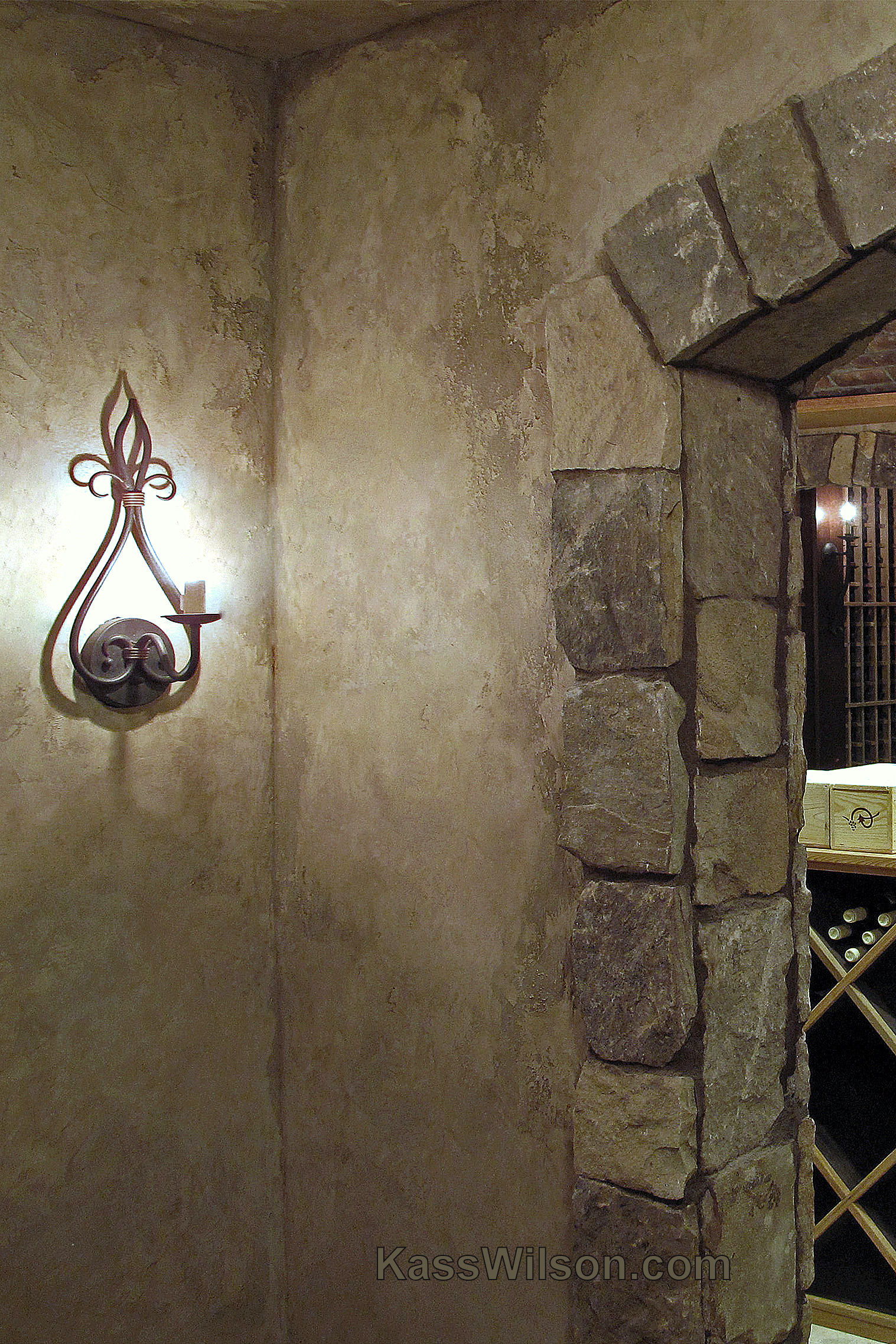
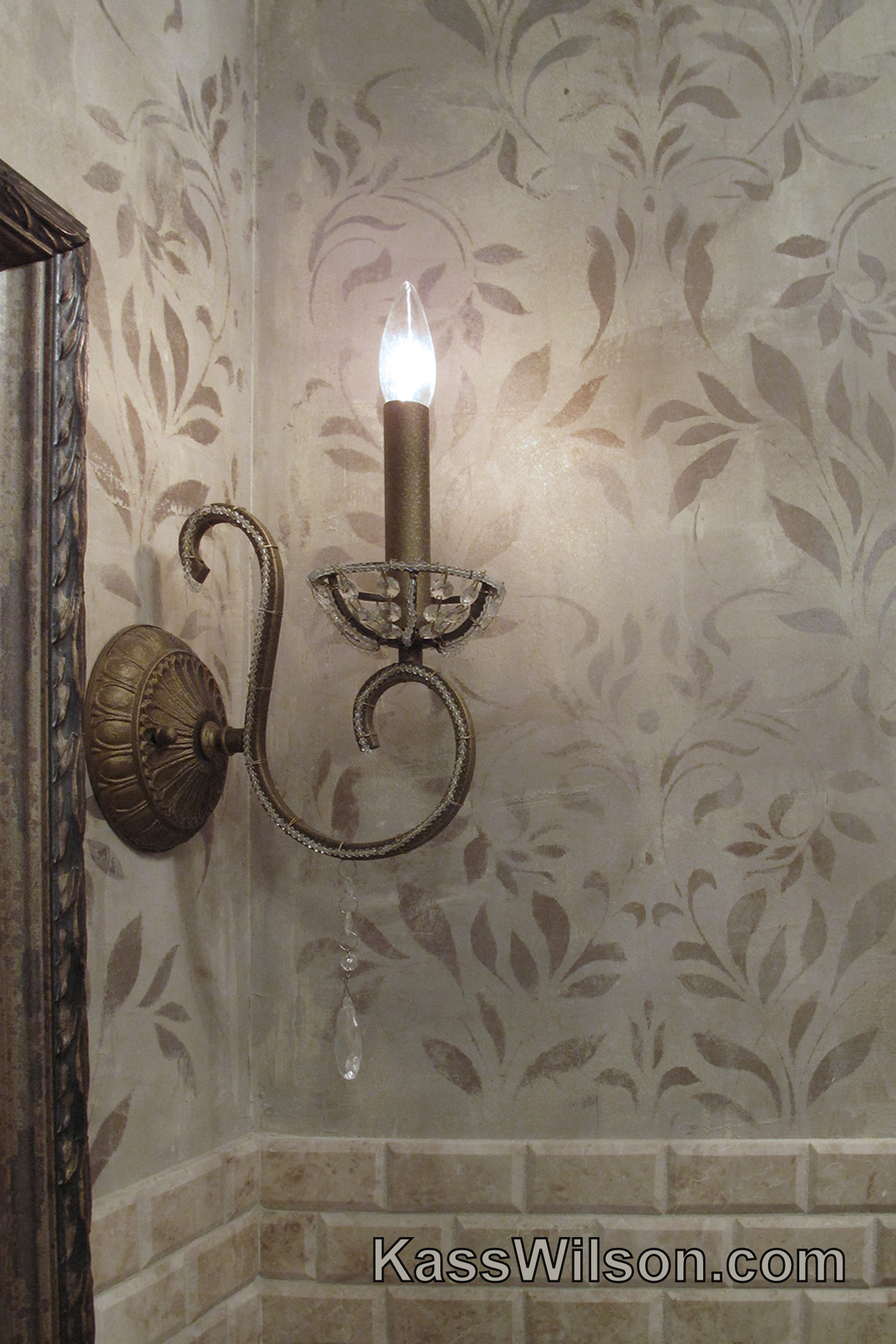
Believable…Old World Wine Cellar Walls This is not your ordinary old world wine cellar. This…
A Little Red…A Dramatic Wall Finish Do you love red? I certainly do. It is…
Good Things In Small Packages…A Faux Stone Mantel This space may be small … but…

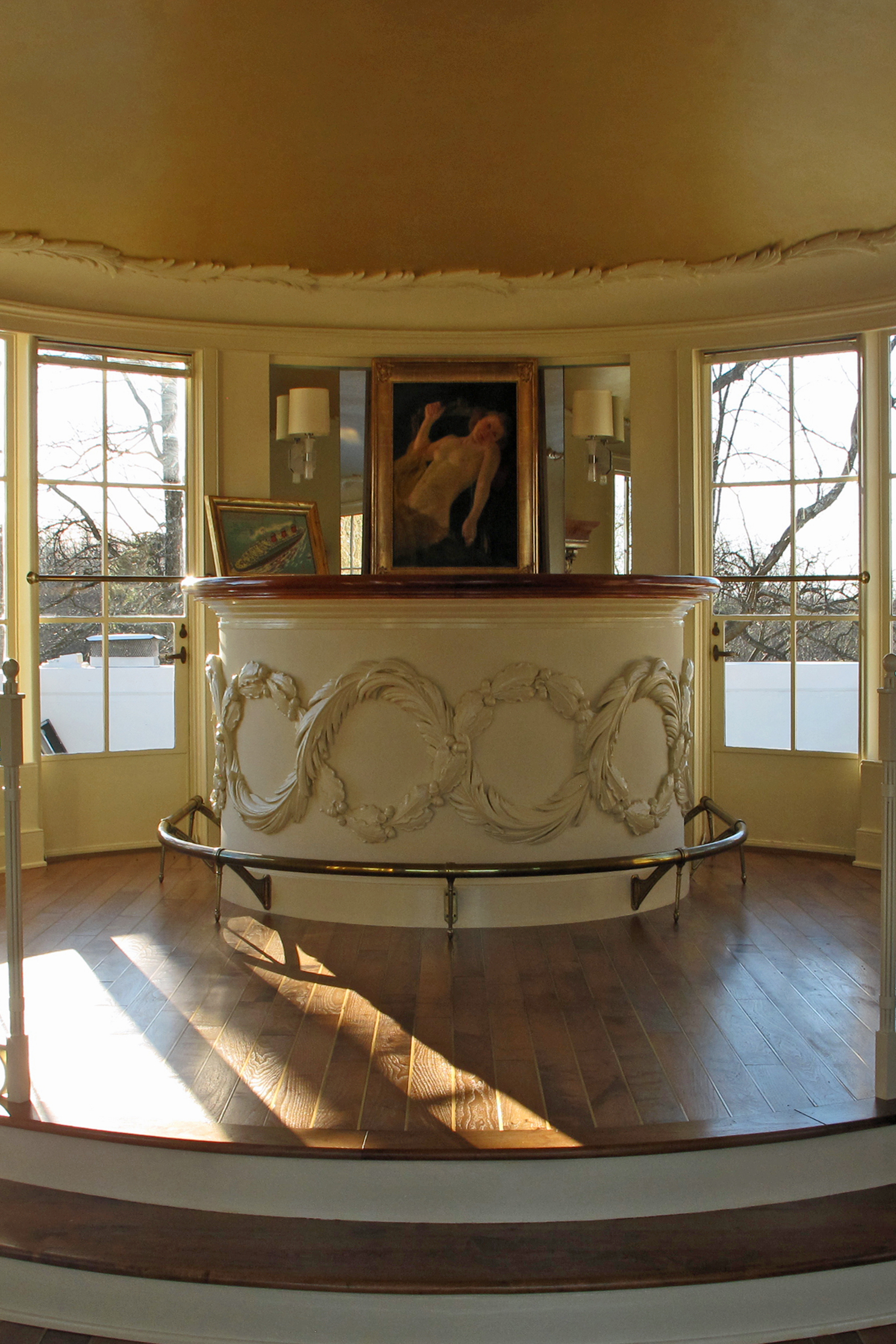
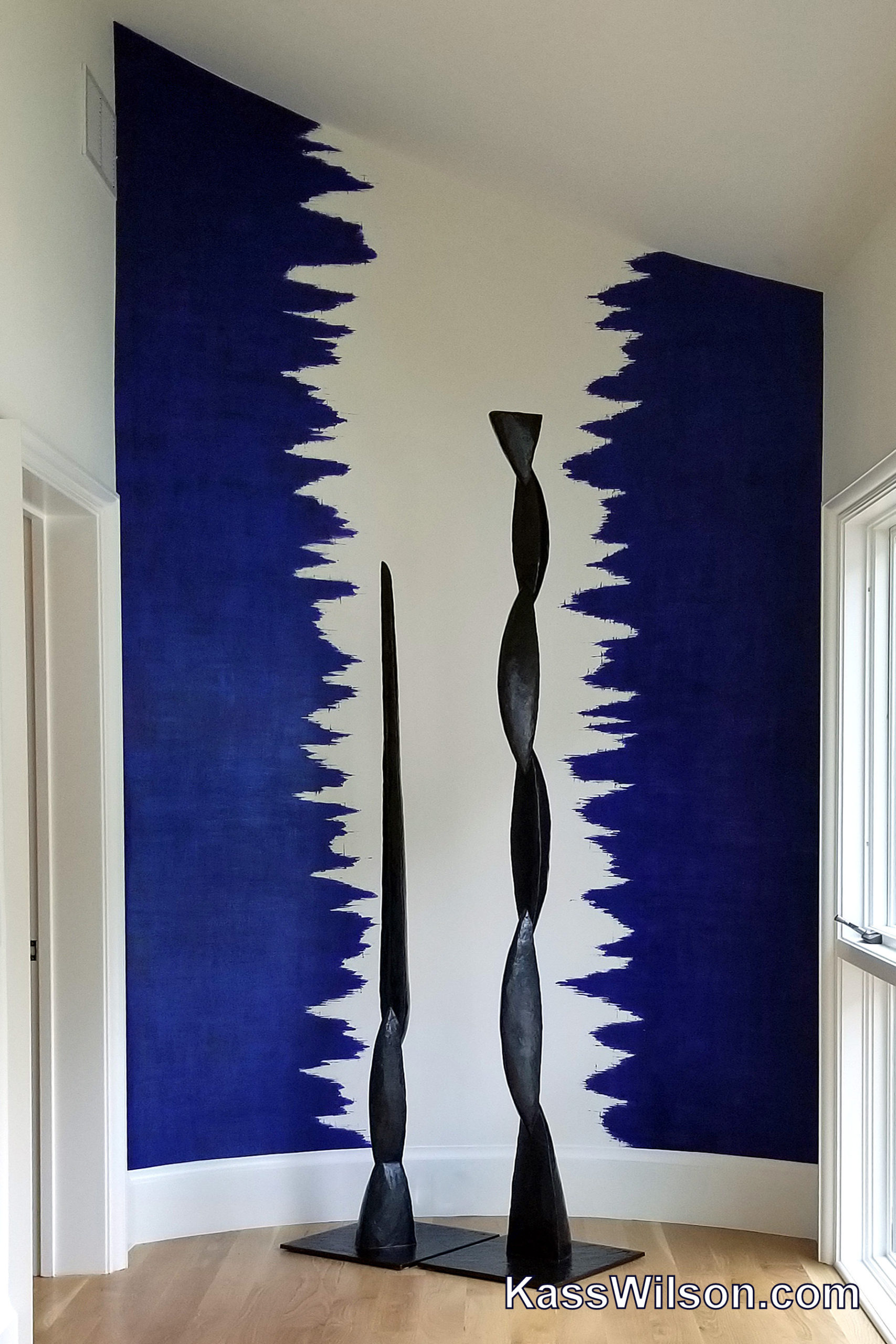
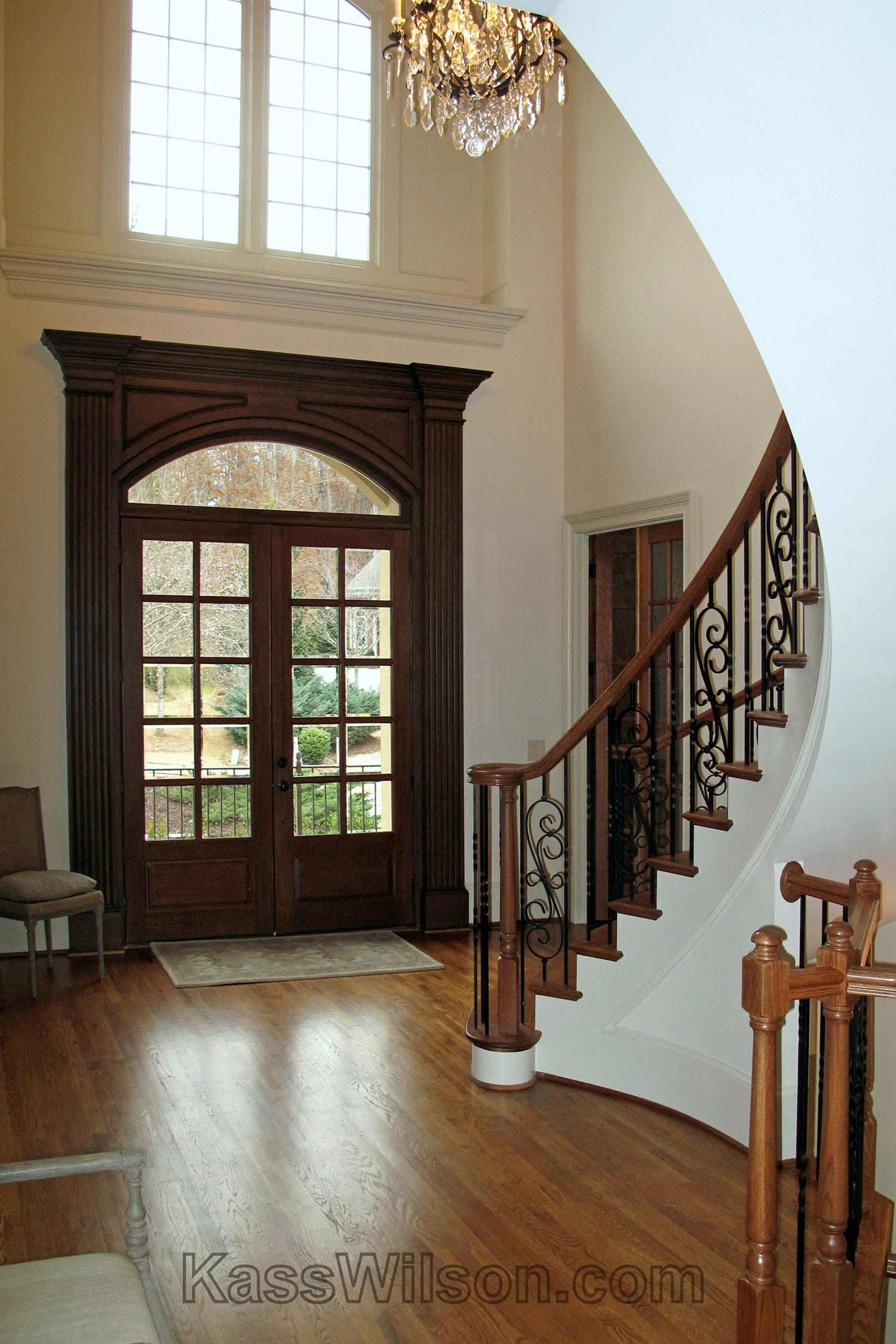
Grand Entrance…Art In A Curved Foyer A circular foyer in this grand home posed a…
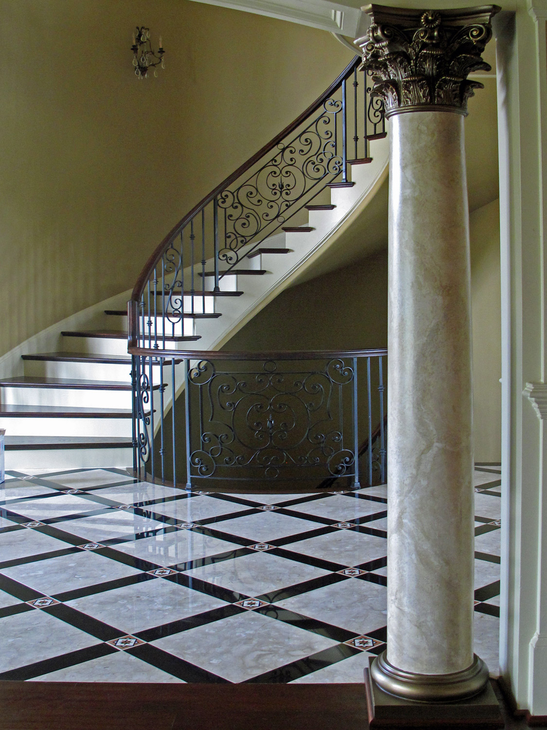
Is it Real…Faux Marbled Columns The term ”faux” is a French word meaning fake, false…
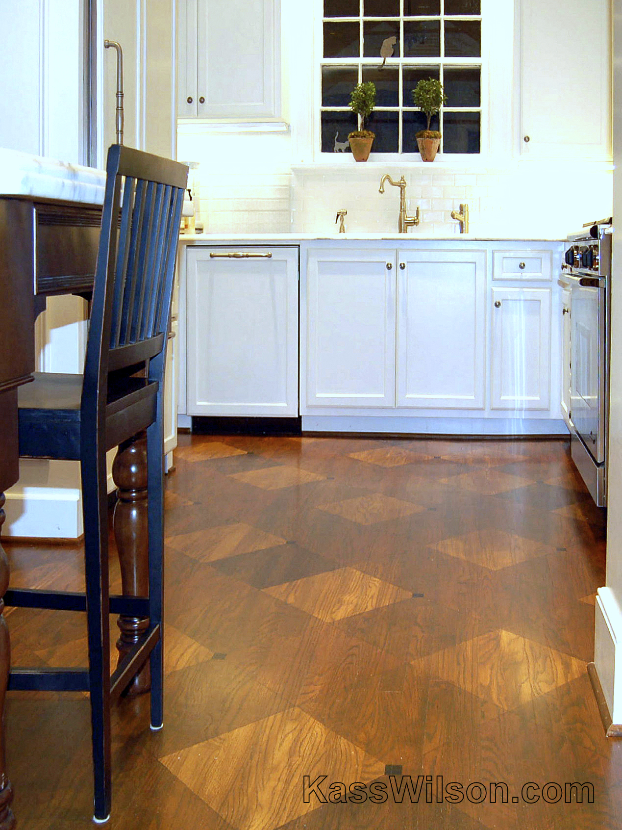
Some Days Are Diamonds…Painted Diamond Pattern On Floor Sometimes, a small space can create large…
Frank Lloyd Delight … Metallic Silver Texture on Ceiling “Strive to simplify: the ensemble of…
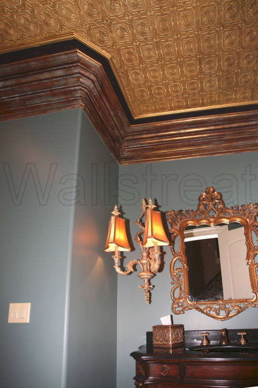
Gift Wrapped … Metallic Ceiling with Aged Trim In most cases, a powder room is…
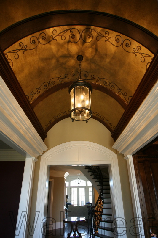
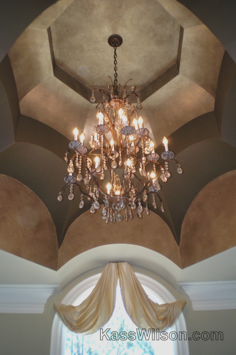
Curve Appeal … Metallic Ceiling With Custom Stencil Design. Curved lines within architectural details are…
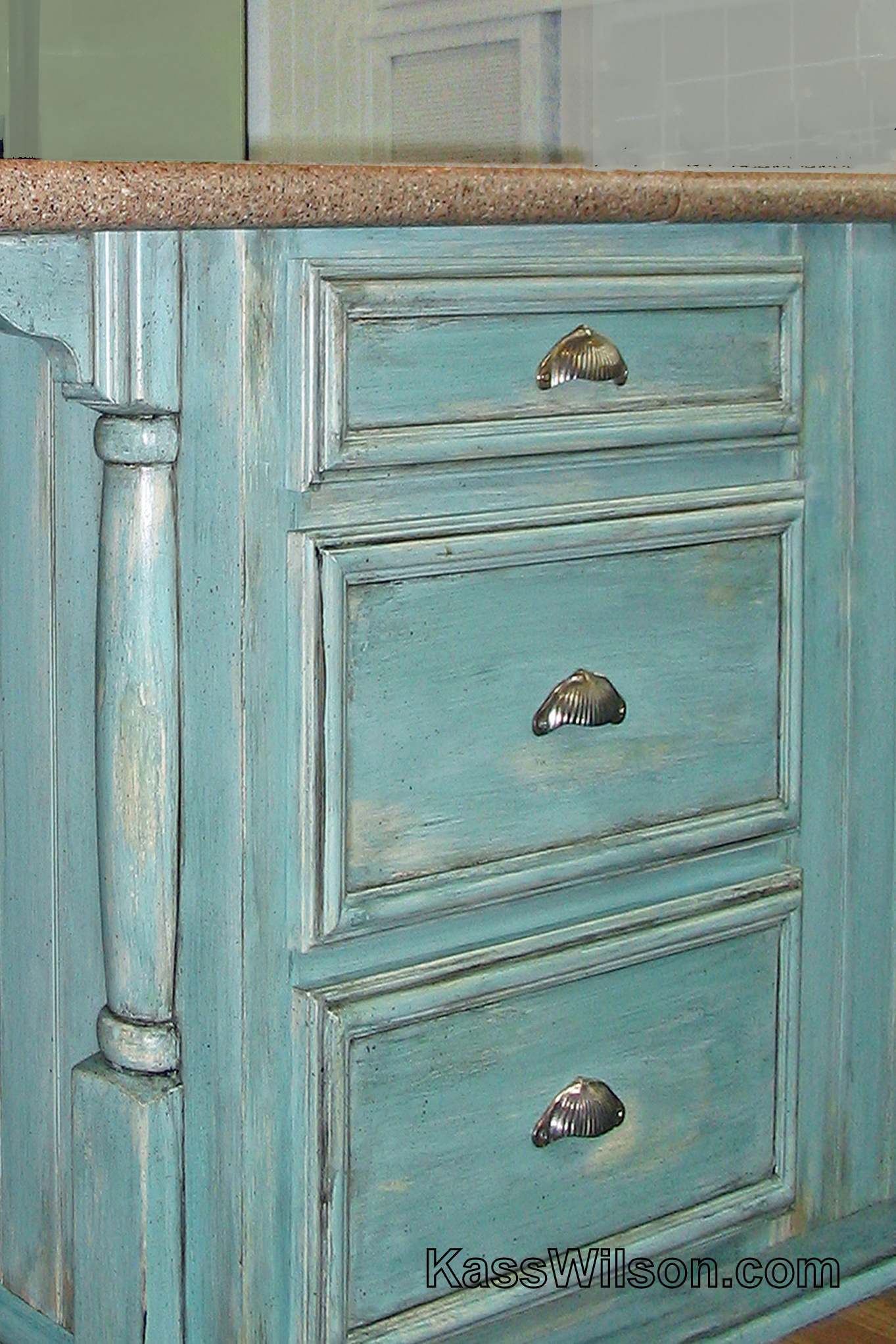
Subtle Suggestions…Aged Cabinet Finish This client recently updated their master bedroom to include more muted…
Every Square Inch…Metallic Squares On Faux Silk The “Craftsman style” originated in Britain and made…
Shift Into Neutral . . . A Dining Room Redesign There is no debating that…
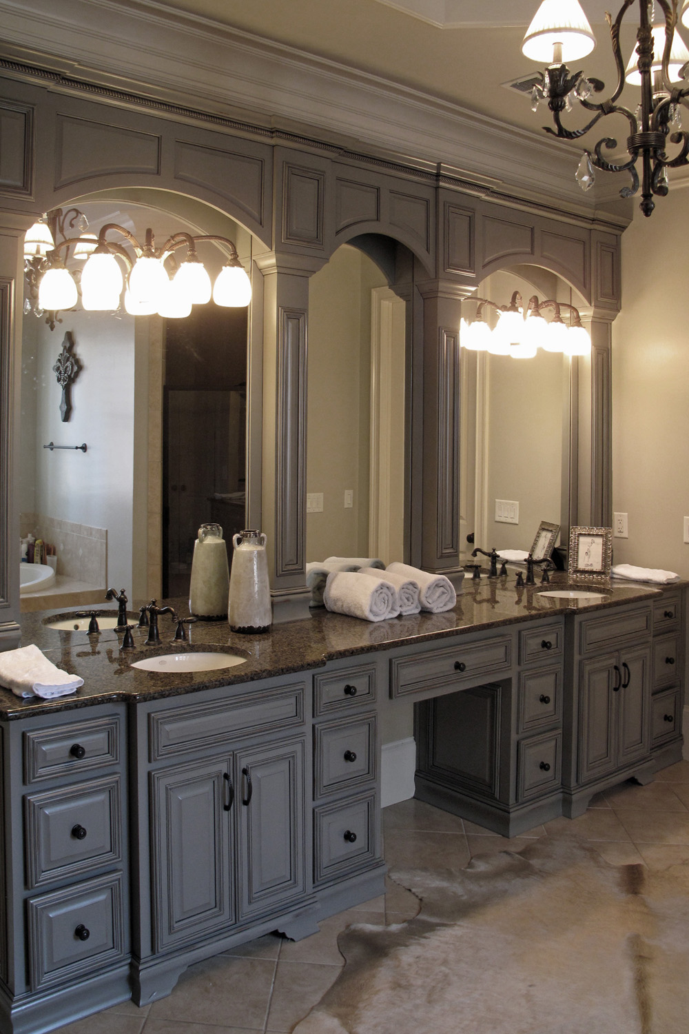
Raising the Bar…Wood Grain On Master Bath Cabinets High ceilings and interesting architecture are just…
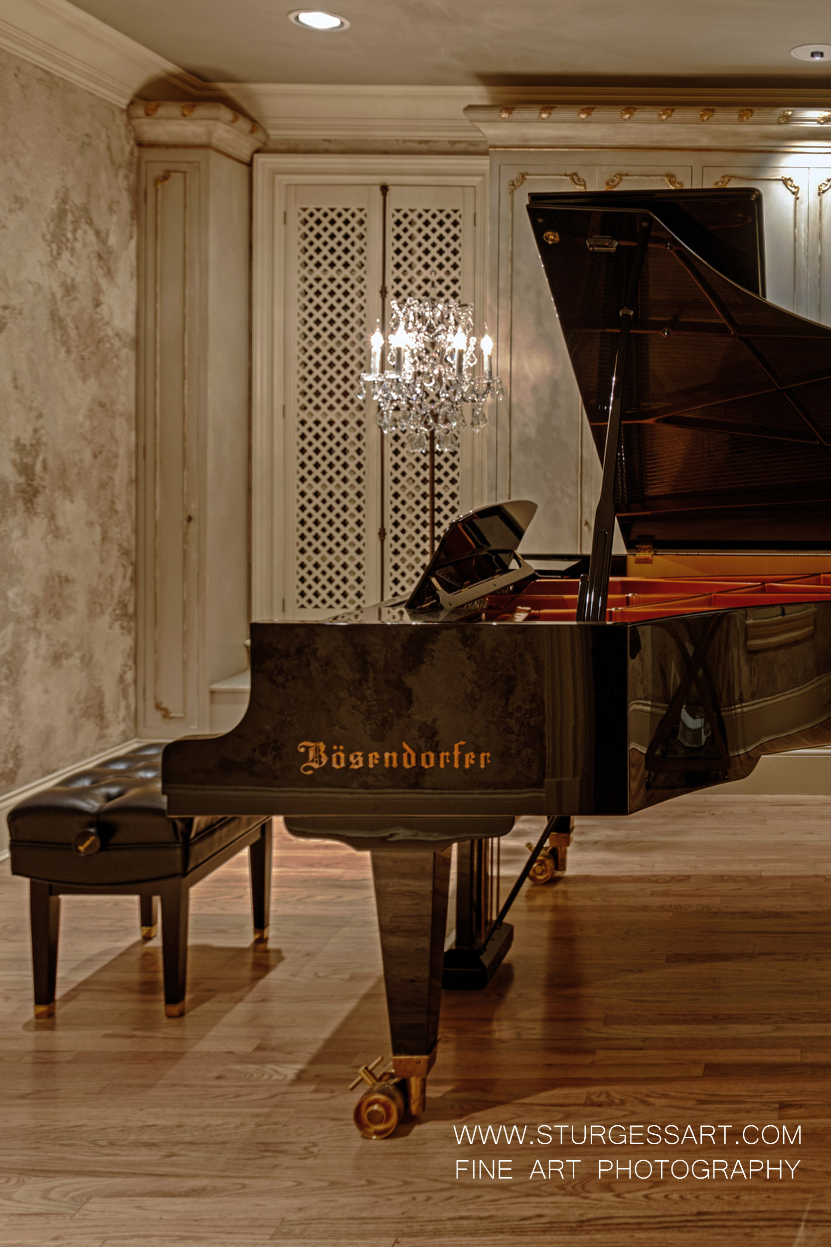
Perfect Harmony…Authentically Aged Plaster Walls Placing a piano in a room can require as much…
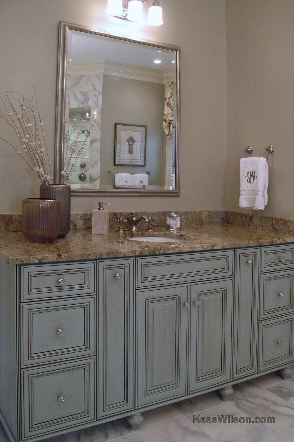
Easy On The Eyes…Bathroom Cabinet Refinishing So often when we think of “updating”, we have…
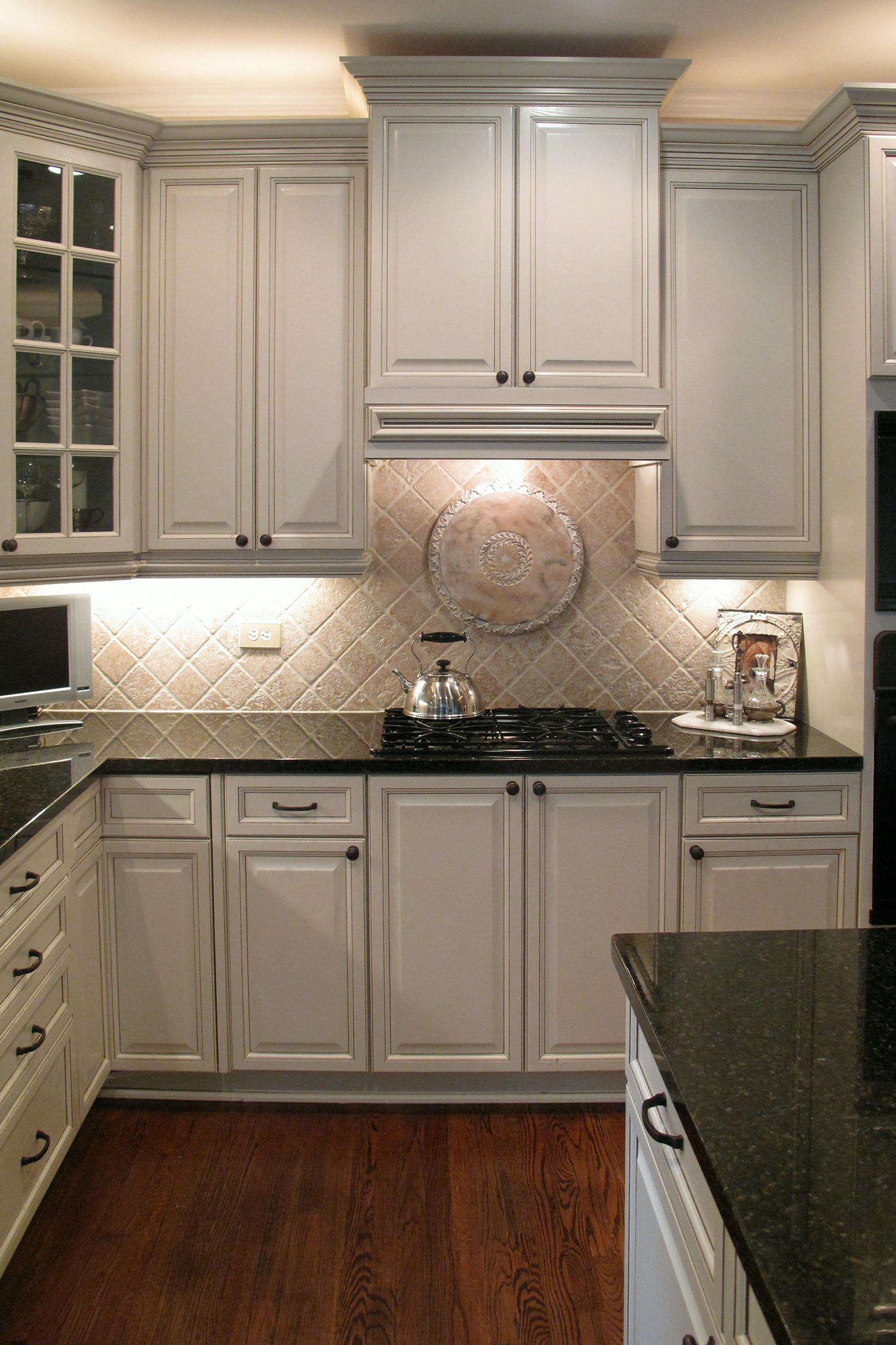
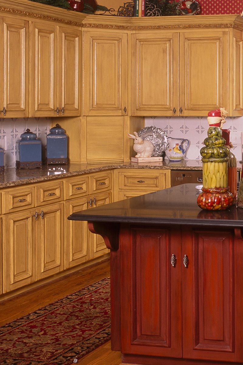
More Than Color…Kitchen Cabinet Redesign It is a well known fact that investing in a…
Midas Touch…Custom Metallic Design On Cabinets The feature wall in the remodel of this great…
Margaritaville…Aged Kitchen Island Inspiration for cabinet finishes can come from unexpected places. After returning from…
Lighten up … Simulated Antique Mirror Color is a wonderful design tool. But too much…
French Bistro…Aged Finishes On Kitchen Cabinets Color. . . lots of color wakes up this…
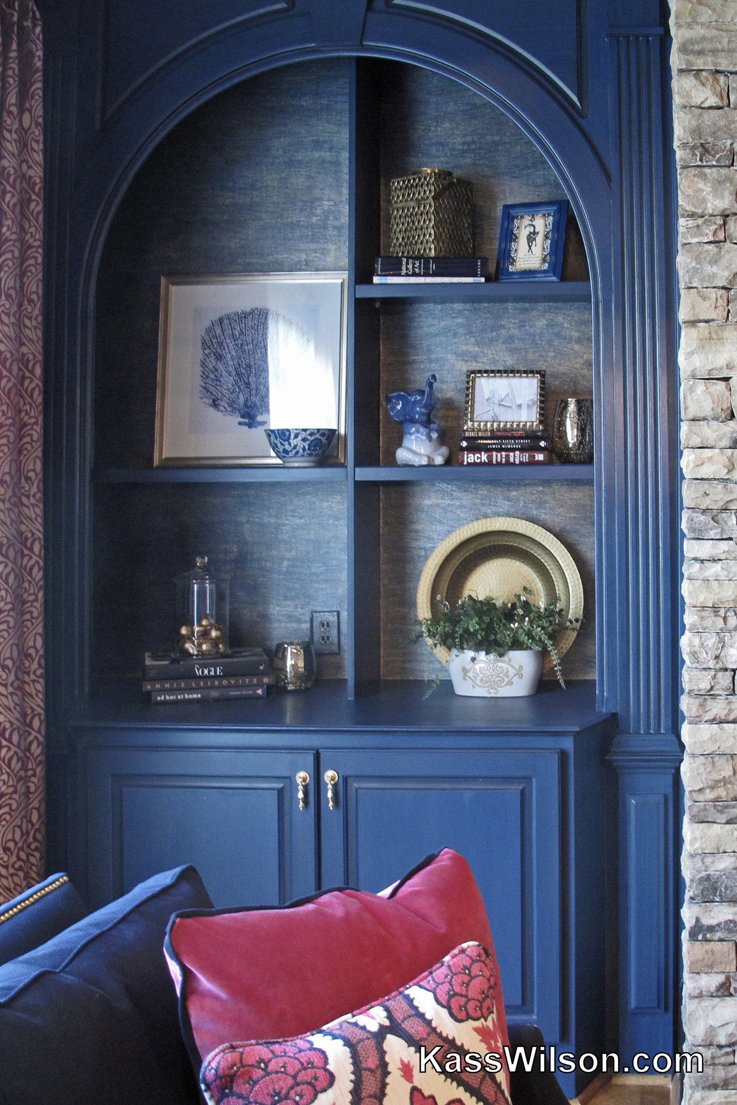
Dress Blues…Refinished Cabinets with Faux Silk Backs Navy blue and “dress blues” … this name…
Purpose Driven Design…Raised Silver Design On Groin Ceiling A dining room, by nature, is a…
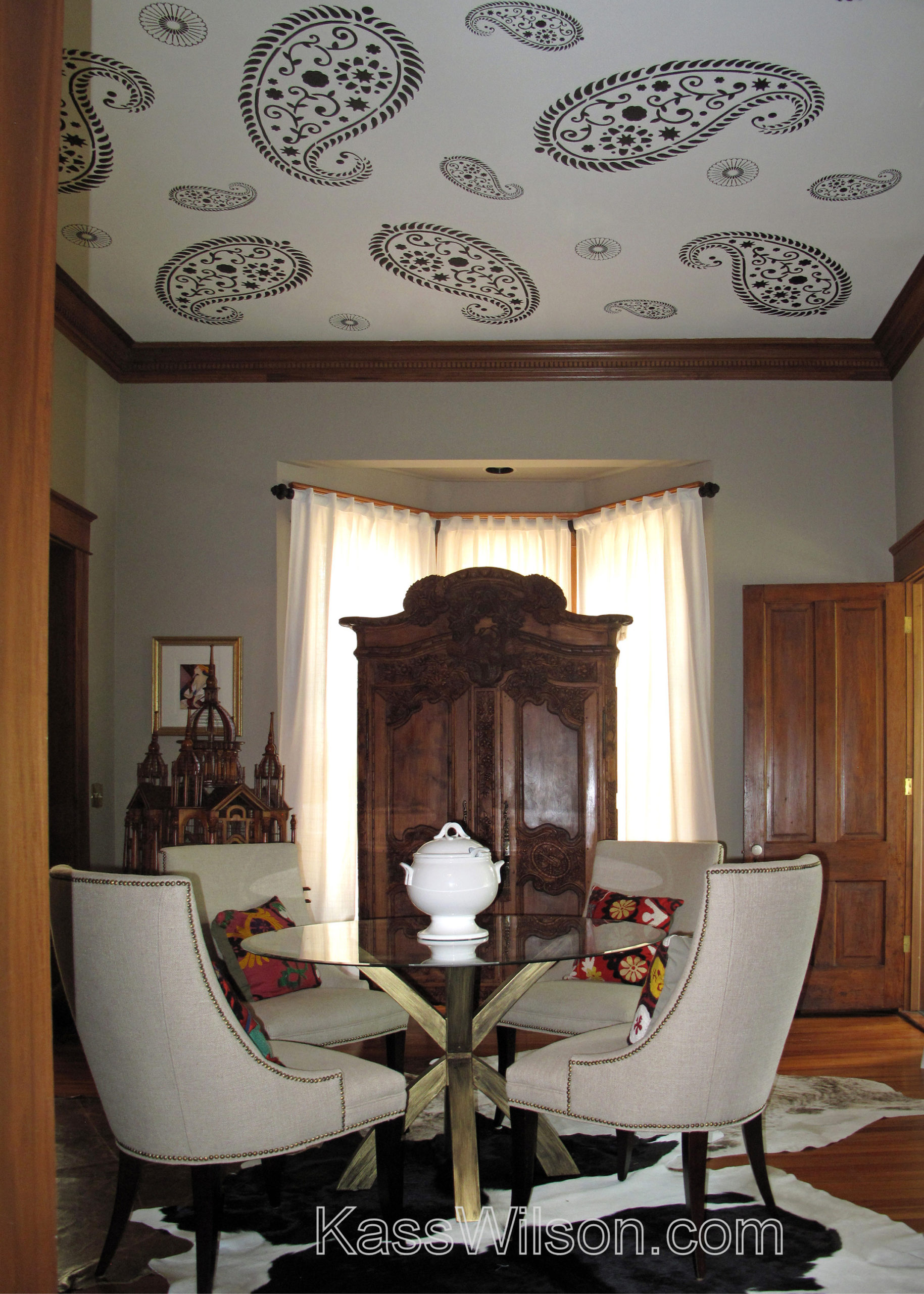
Hidden Agenda…Paisley Stencil On Ceiling When updating a home, there are many decisions to be…
Beam Me Up … Authentically Aged Beams The French Country or Provence style is easily…
Worth Repeating…Trim Mold Painted to Match Door Frame This home’s entrance is fit for royalty….
Icing On The Cake…Metallic Ceiling Finish Beautiful ceilings can be one of the most dramatic…
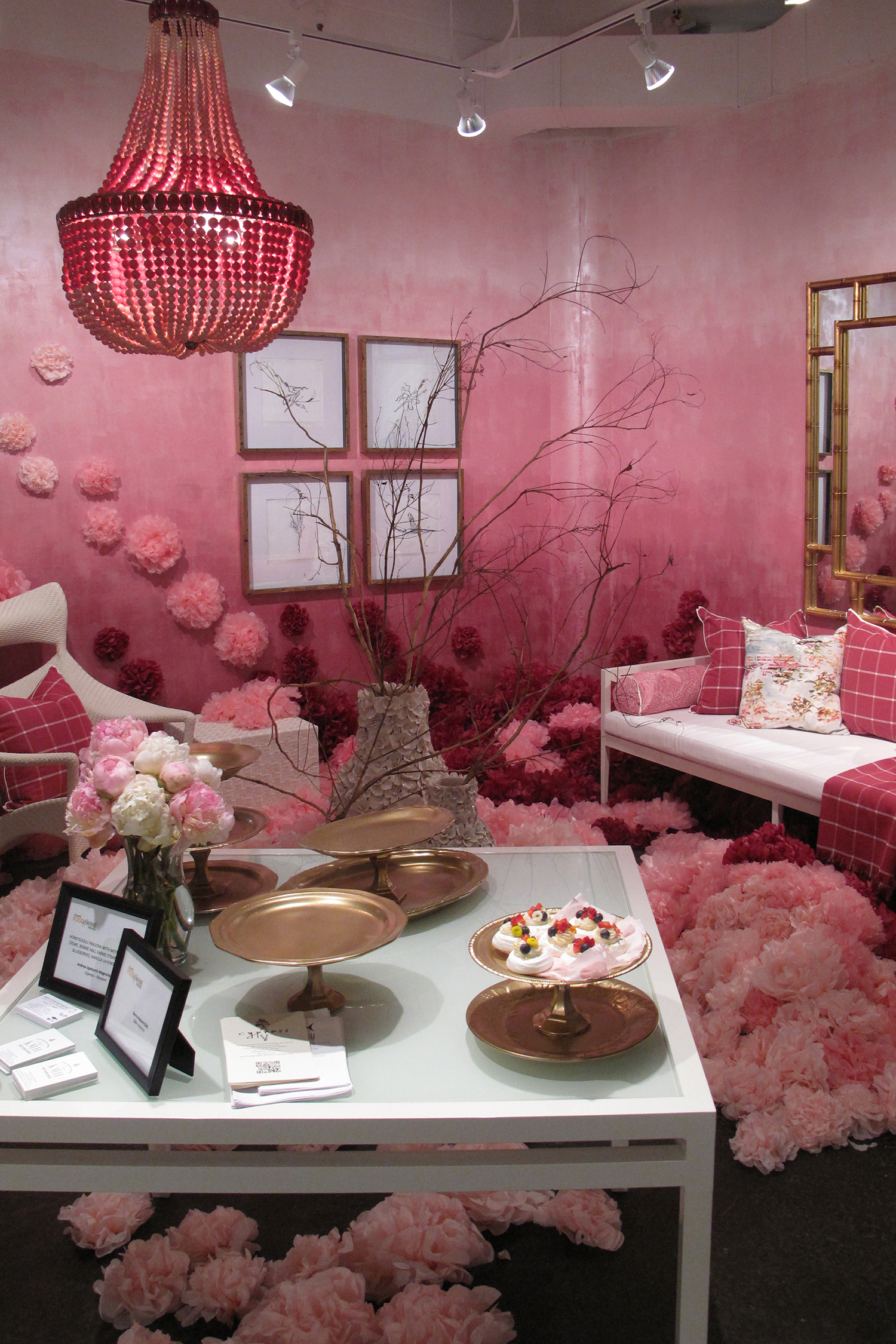
Dancing Walls…Metallic Ombre Every year the Atlanta Food and Wine Festival proves to be one…
Tossed and Found…Antiqued Ceiling Tile Backsplash How do you add warmth and character to a…
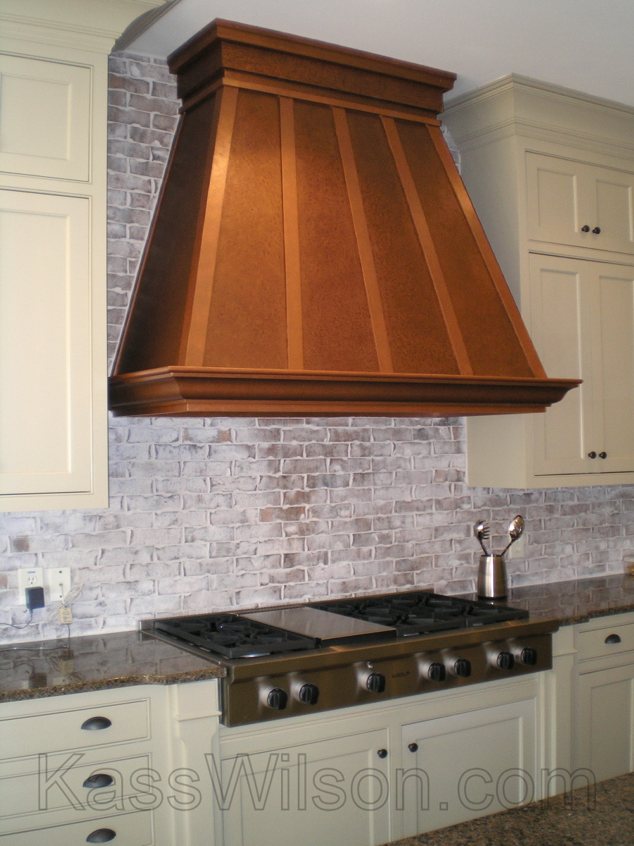
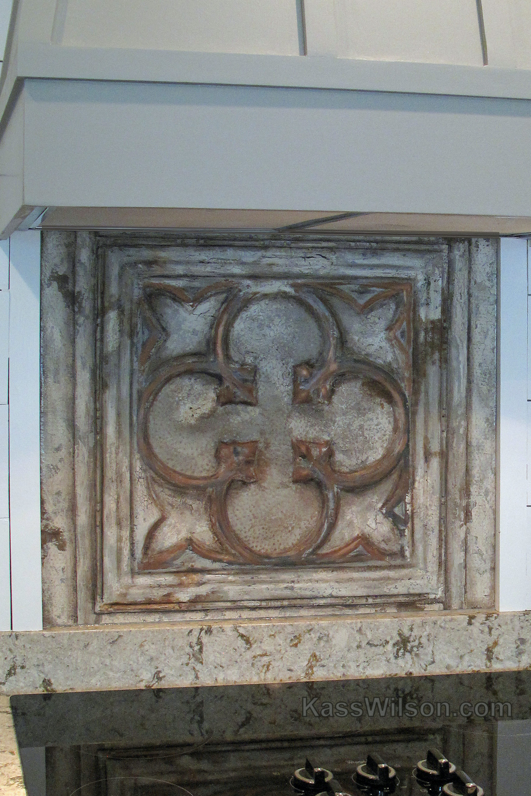
Pennies from heaven…Faux Copper Vent Hood Adding interest to a kitchen involves drawing attention to…
![]()