770.777.7020
The Artist
Projects
Cabinetry
Ceilings
Floors
Walls
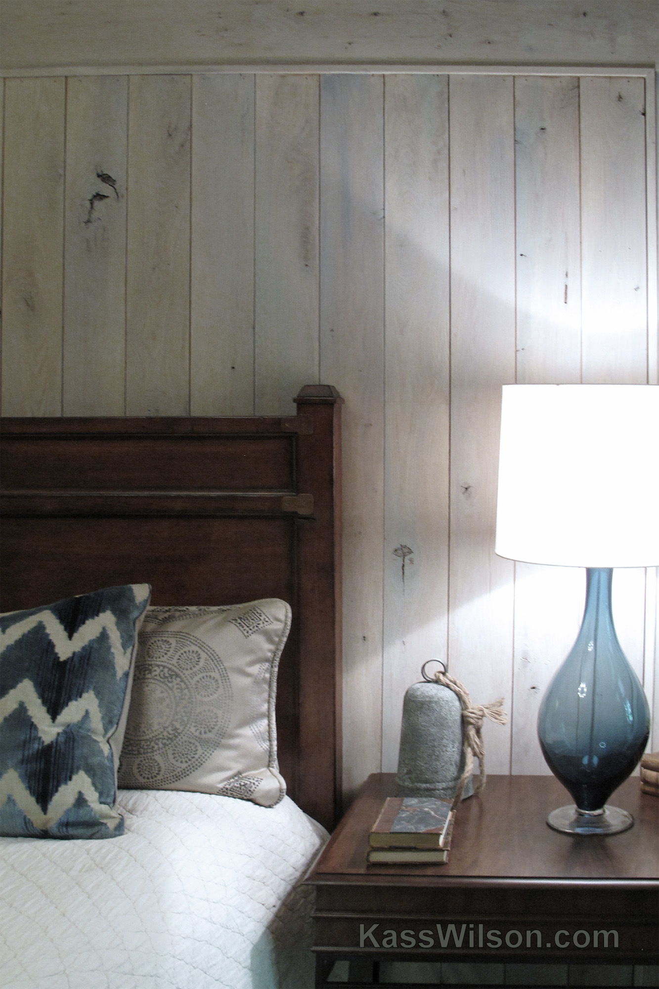
Wood Graining
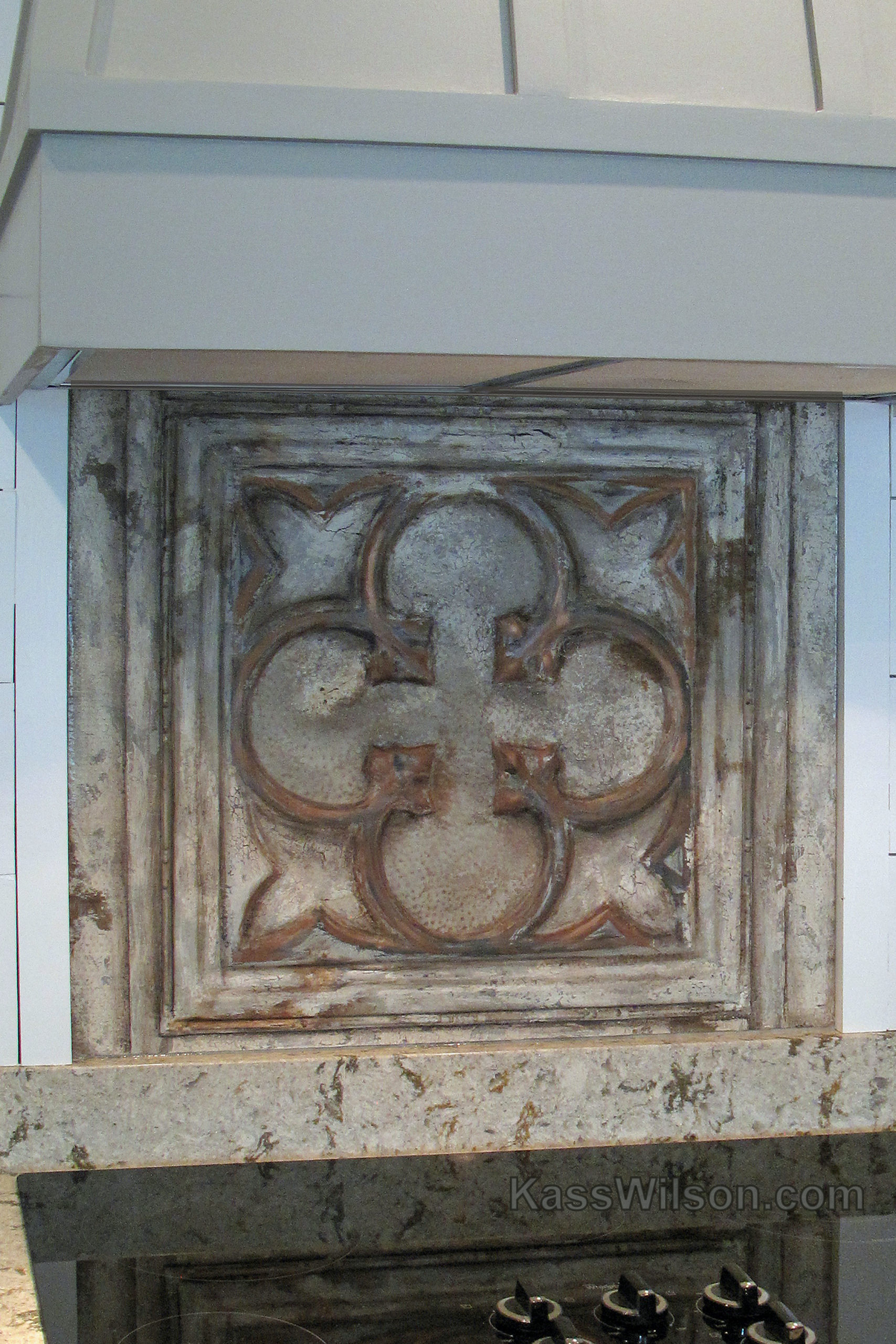
Architectural Details
FAQs
Connect
Blog
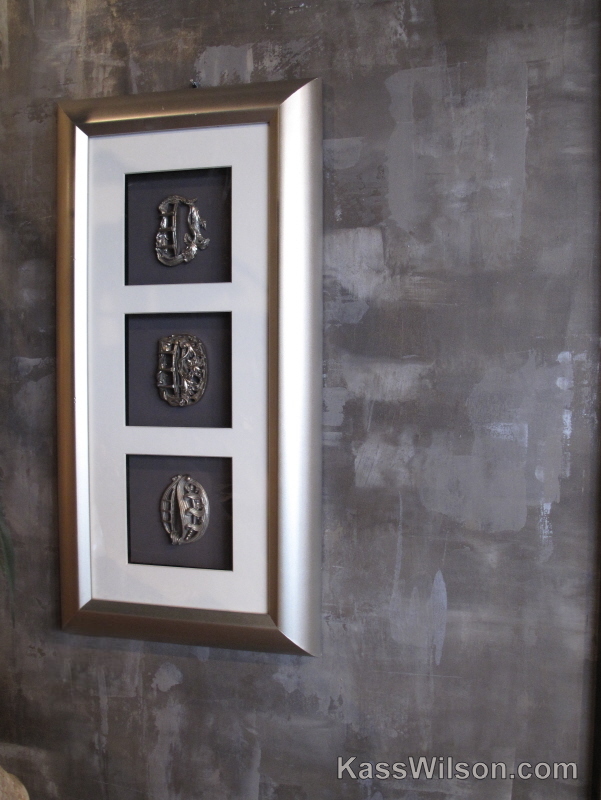
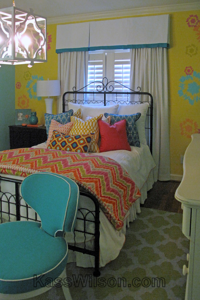
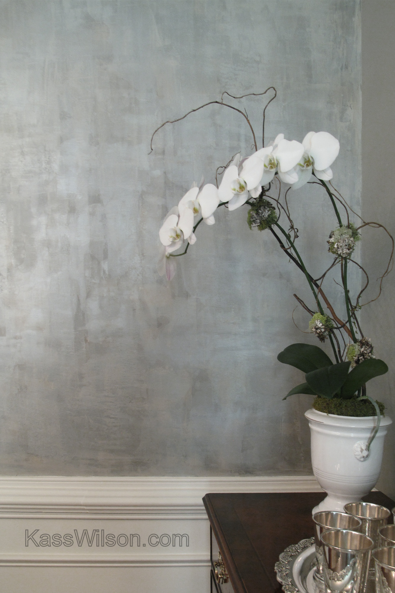
Walls
Window of Opportunity… aged finish in …
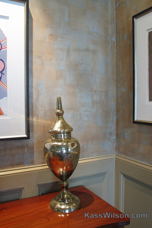
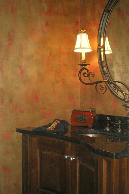
On the Bright Side… metallic plast …
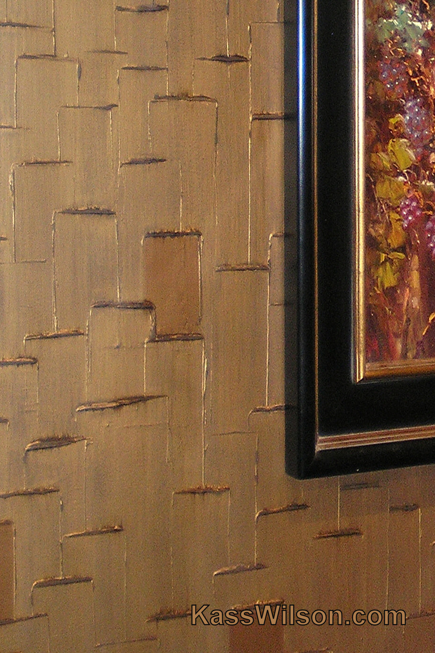
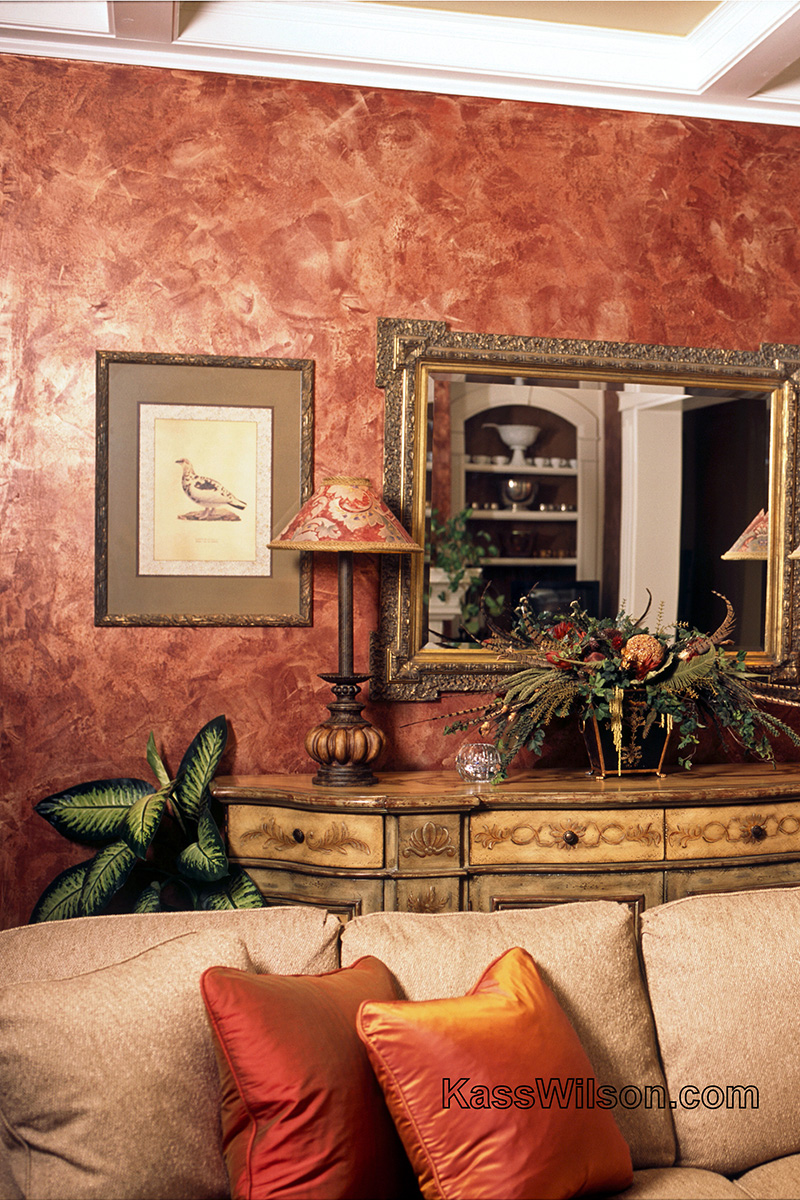
No Regrets… Rethinking a textured wall …
Perfect Pairing
Defining Moments
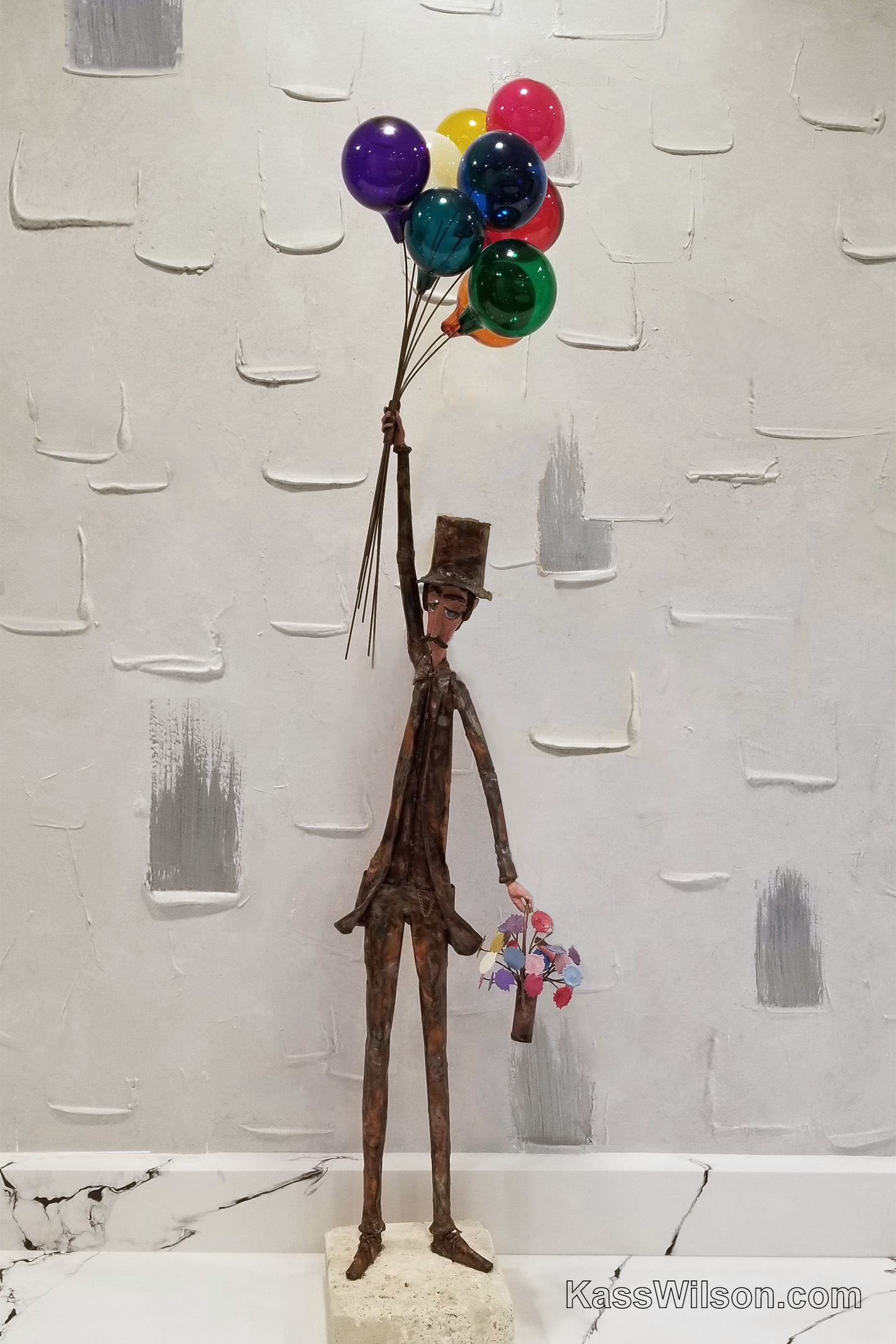
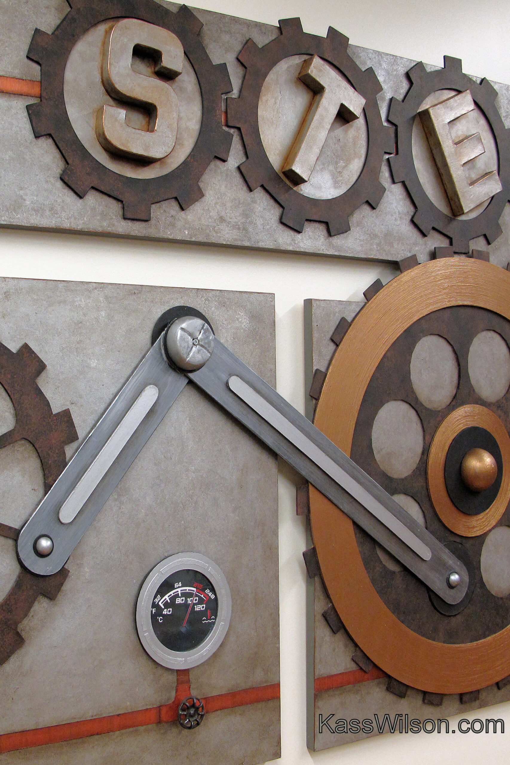
Full STEAM Ahead … a 3-dimensional wal …
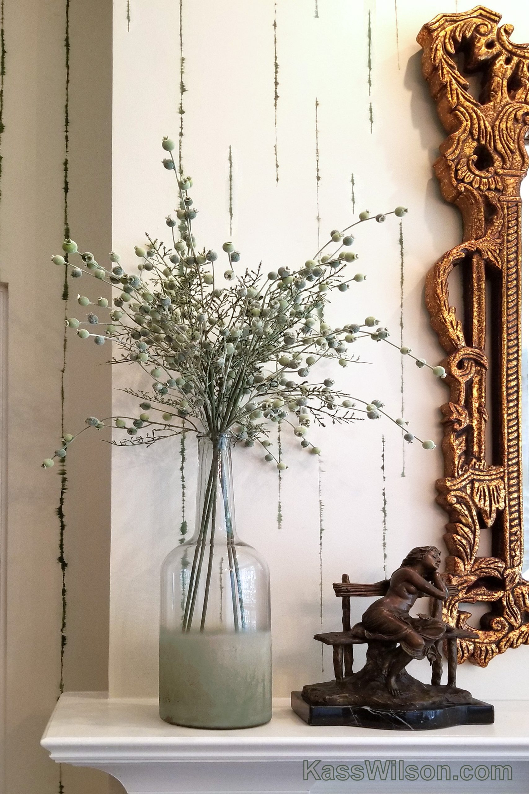
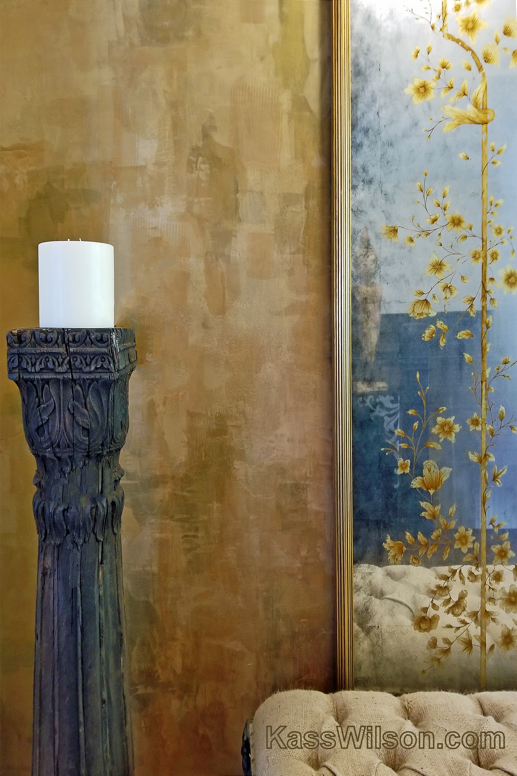
Frame of reference … a reflective wall …
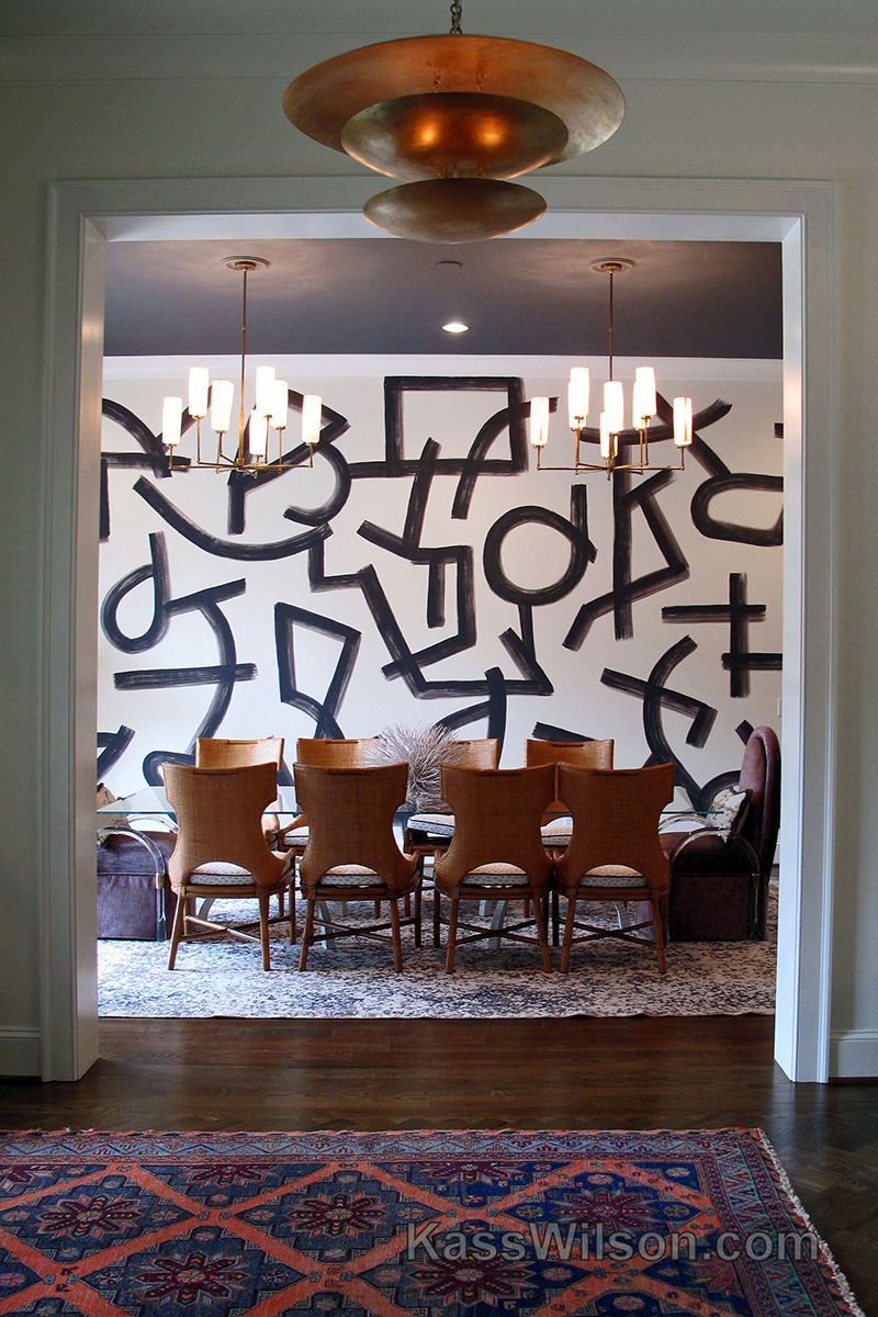
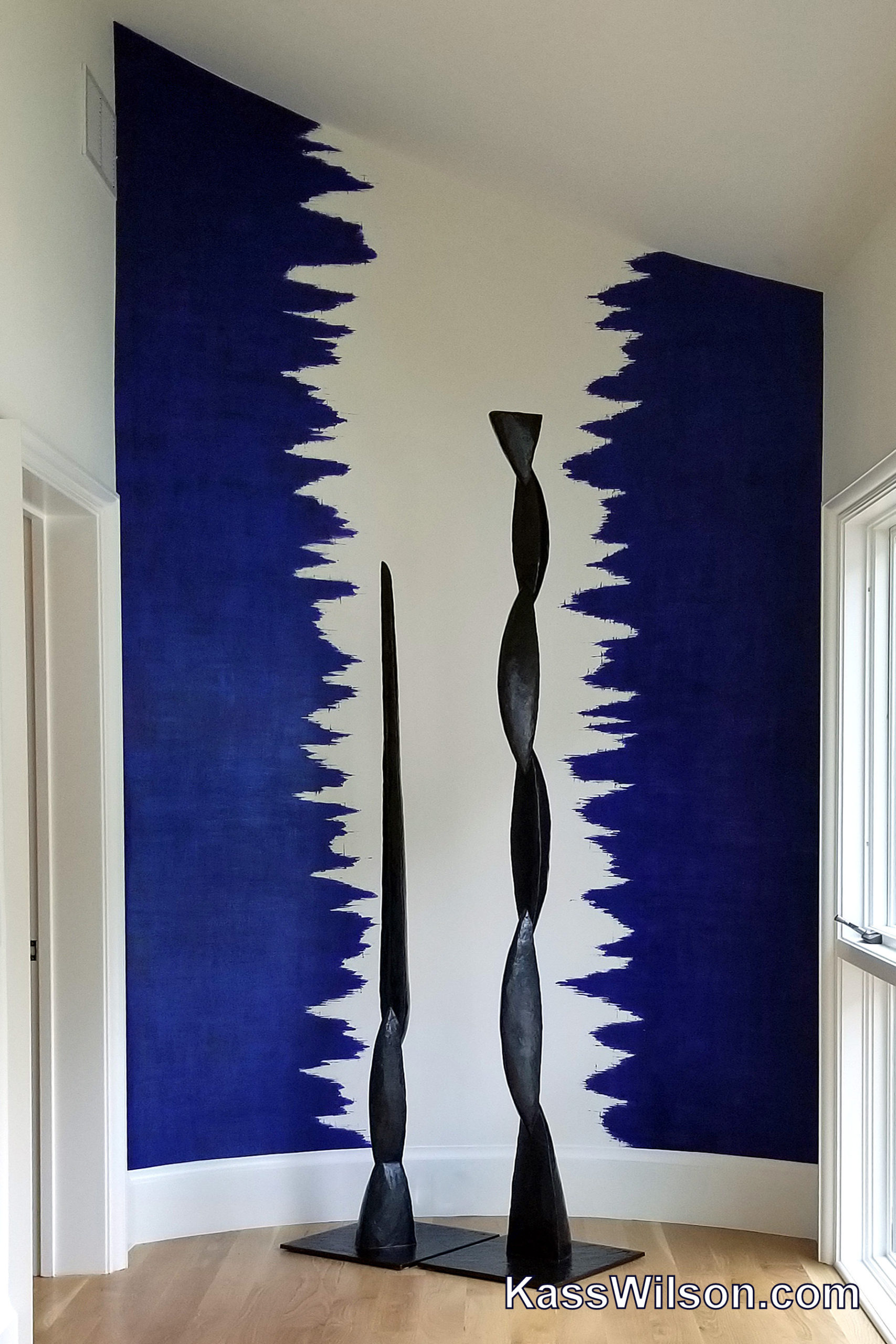
Strokes of Genius…Abstract Wall Finish
Introductory Offer…Faux Linen On A …
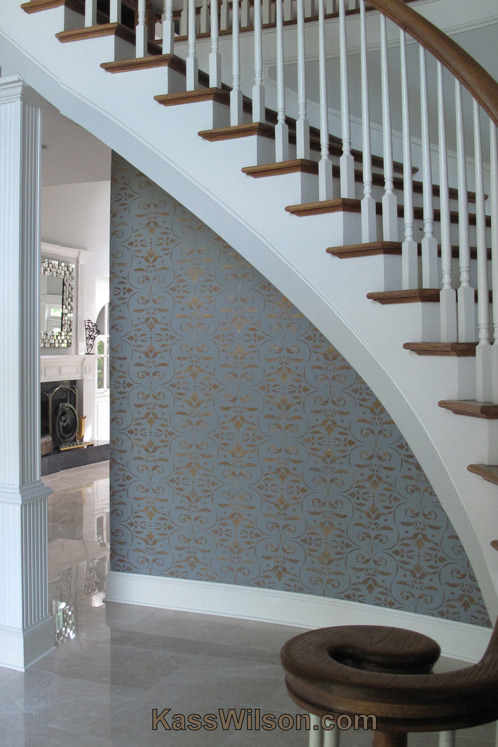
Stairway To Heaven…Metallic Stenci …
Prime Real Estate…Sophisticated Me …
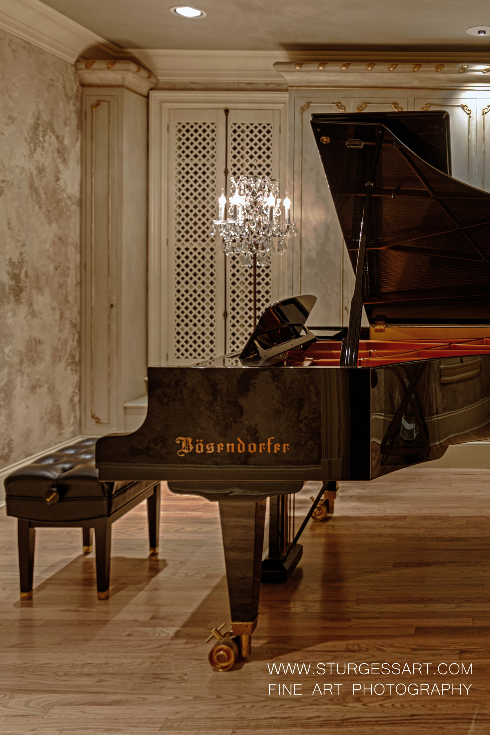
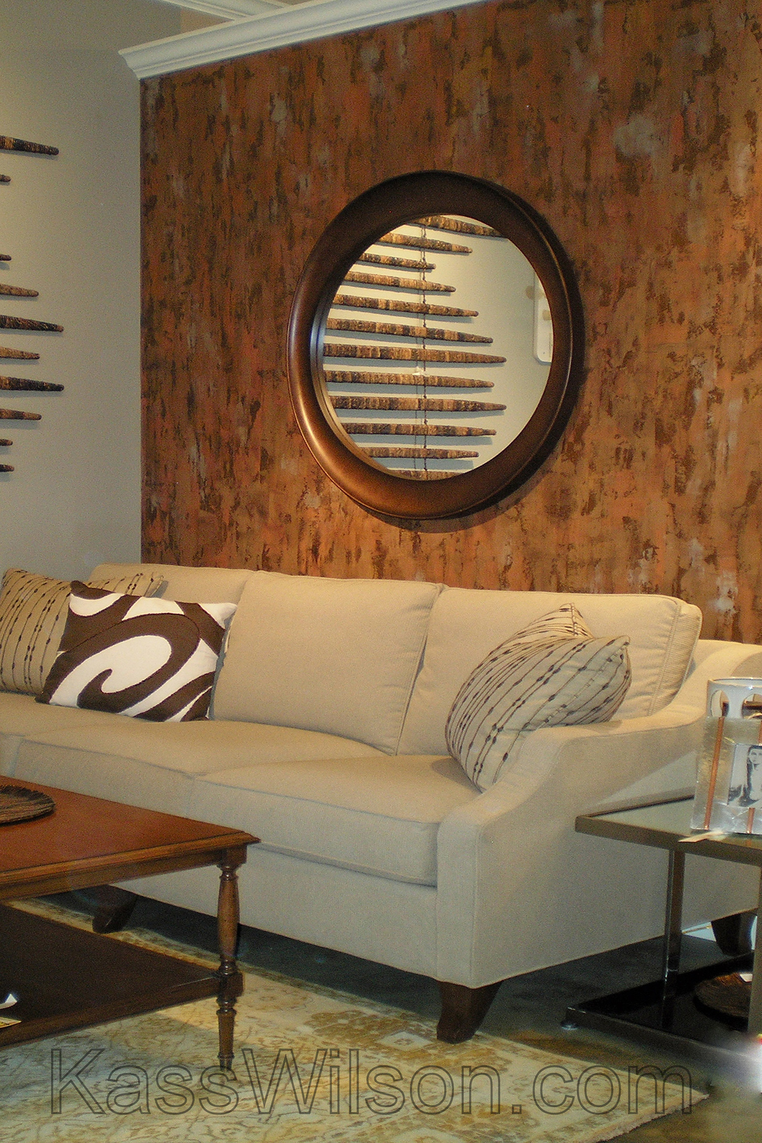
Lost and Found…Aged Plaster Over I …
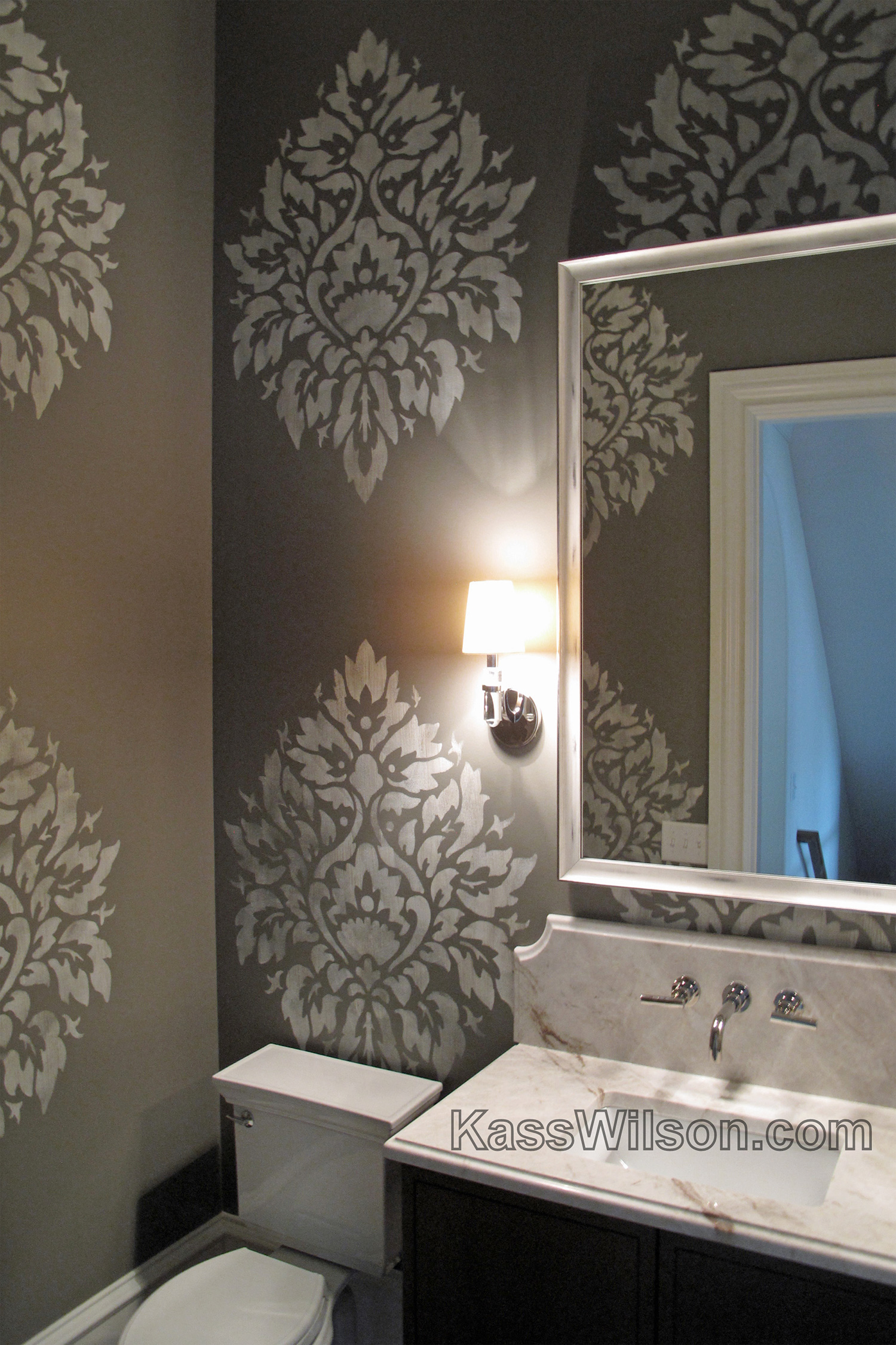
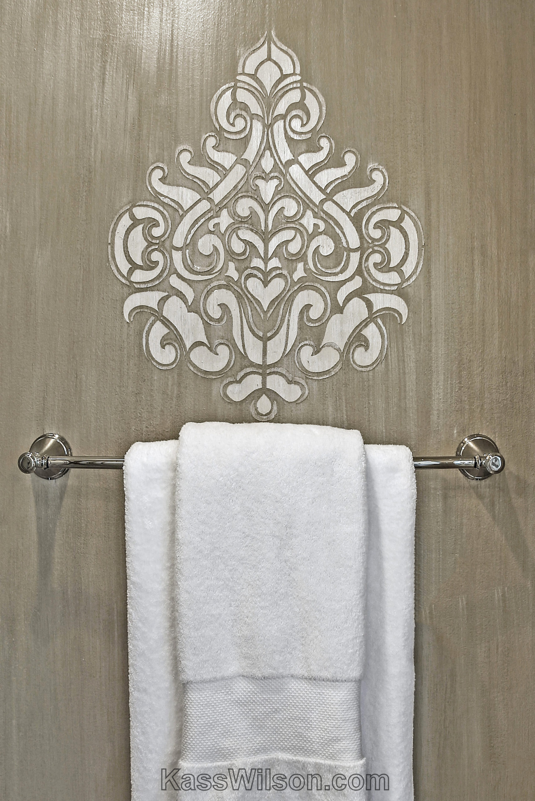
Champaign Toast…Metallic Damask St …
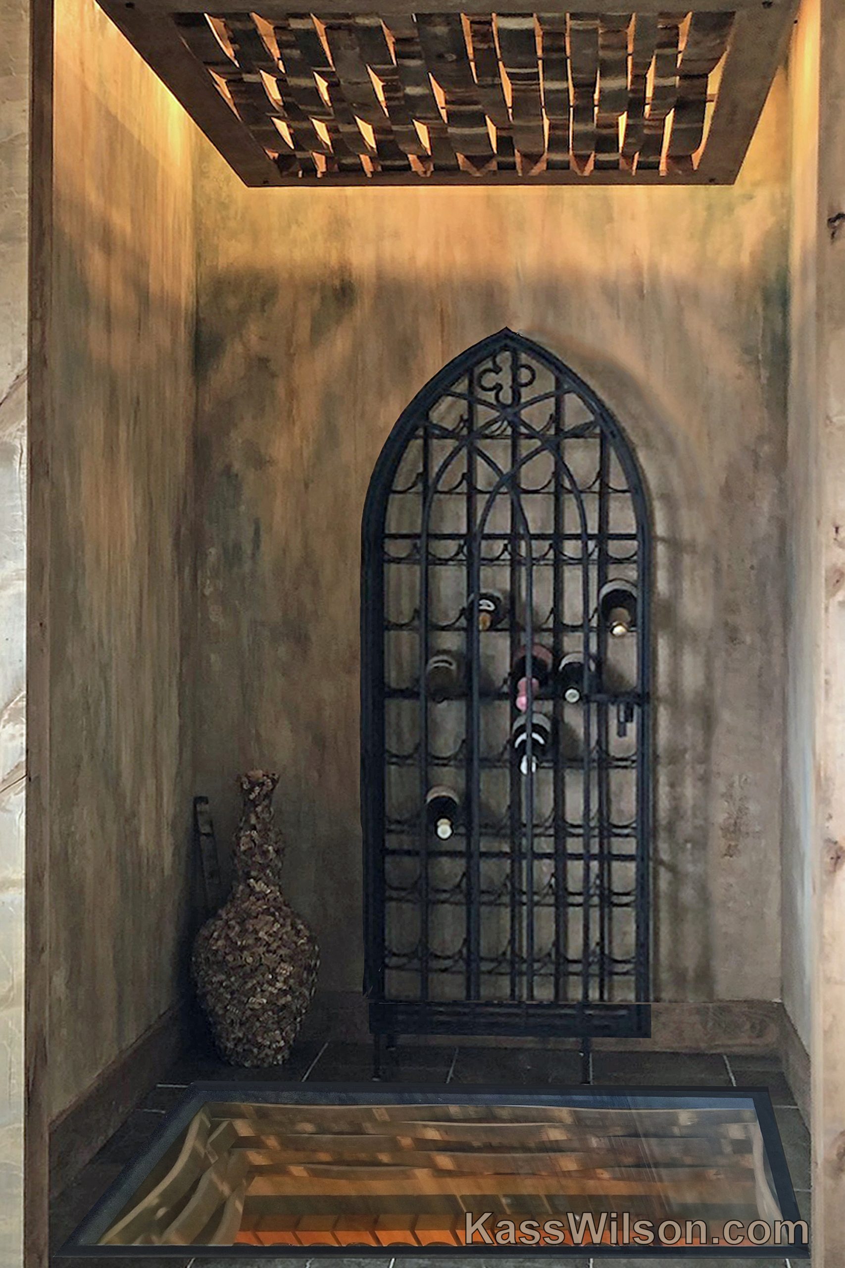
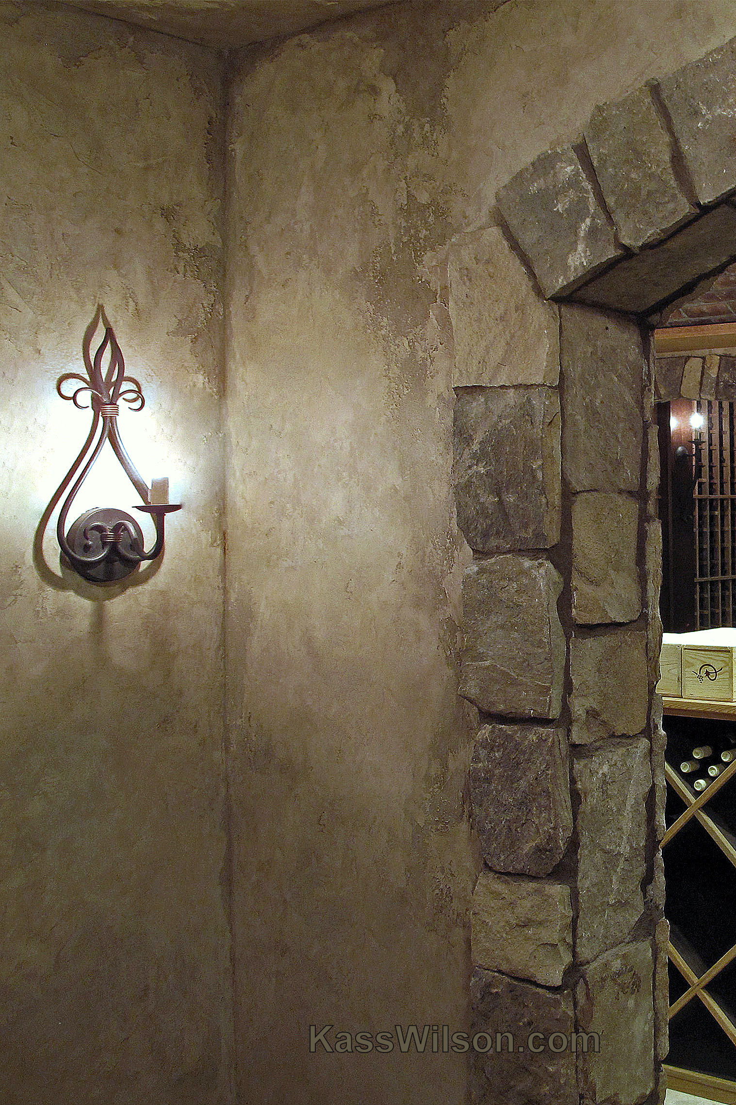
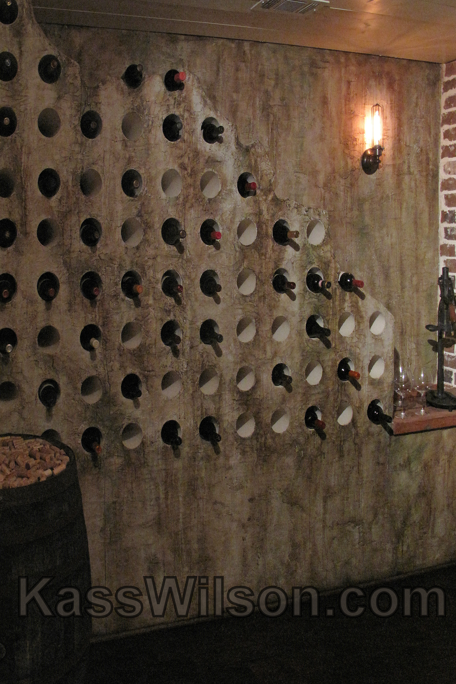
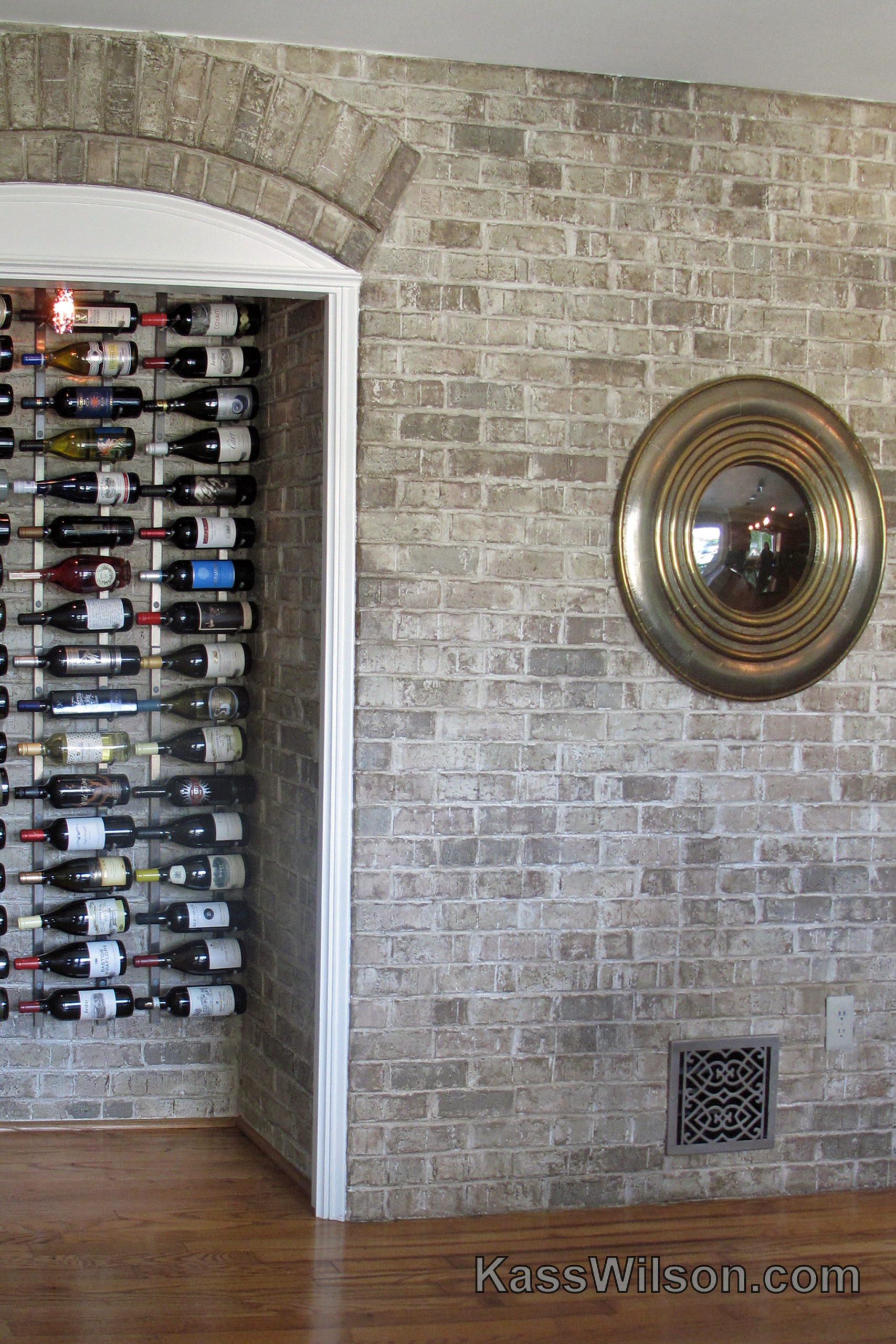
Believable…Old World Wine Cellar W …
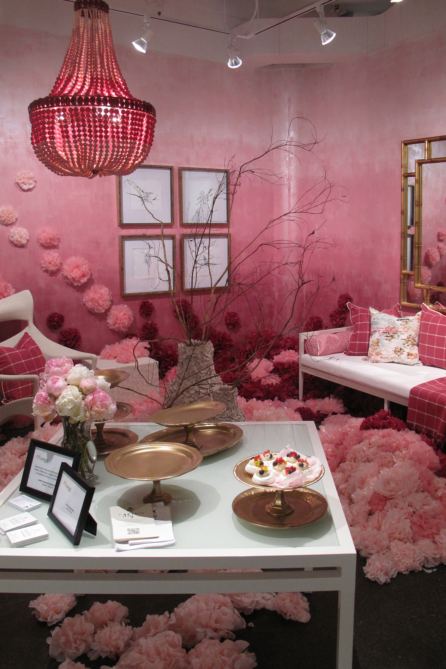
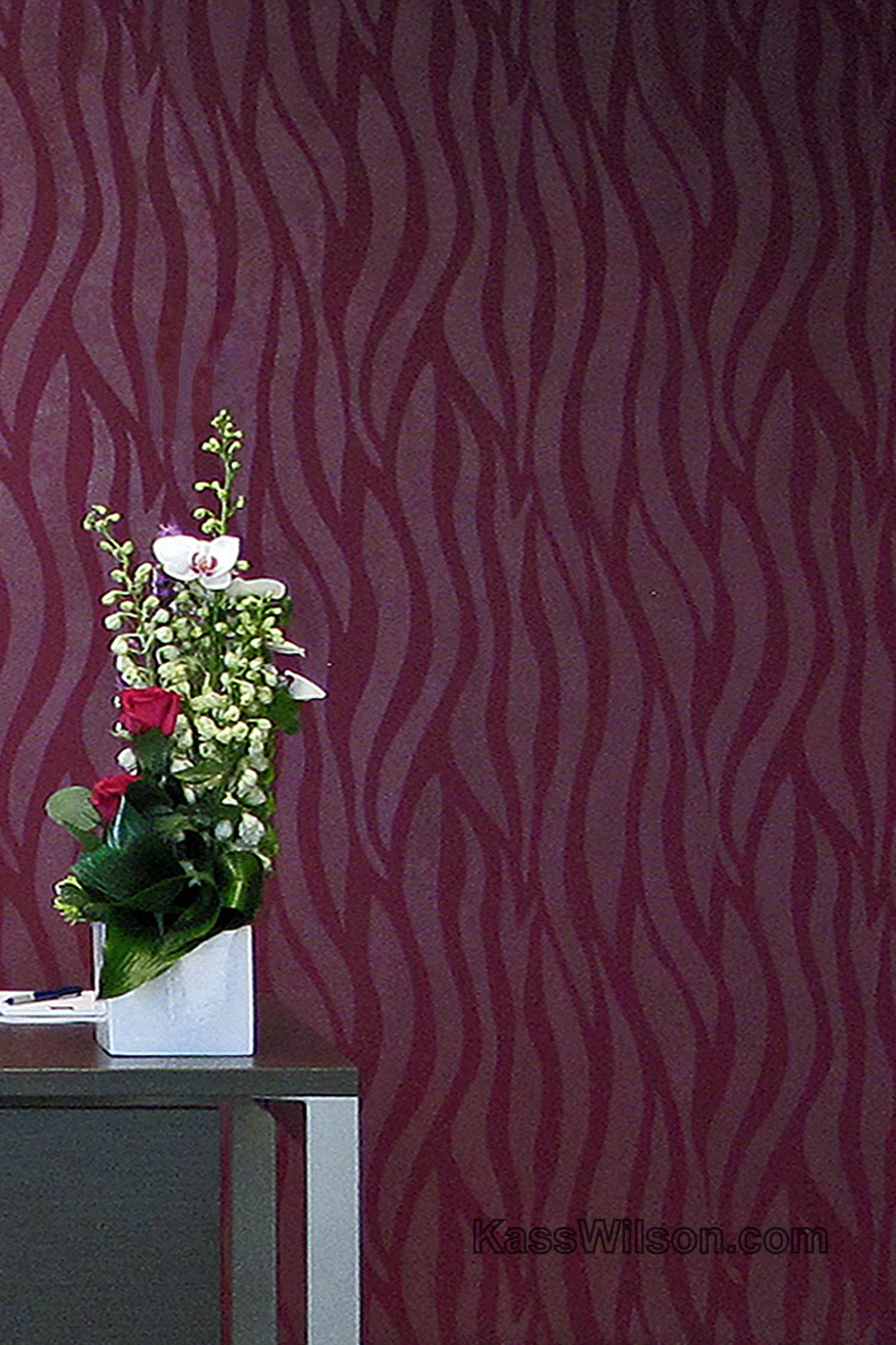
A Little Red…A Dramatic Wall Finis …
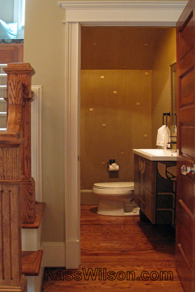
Every Square Inch…Metallic Squares …
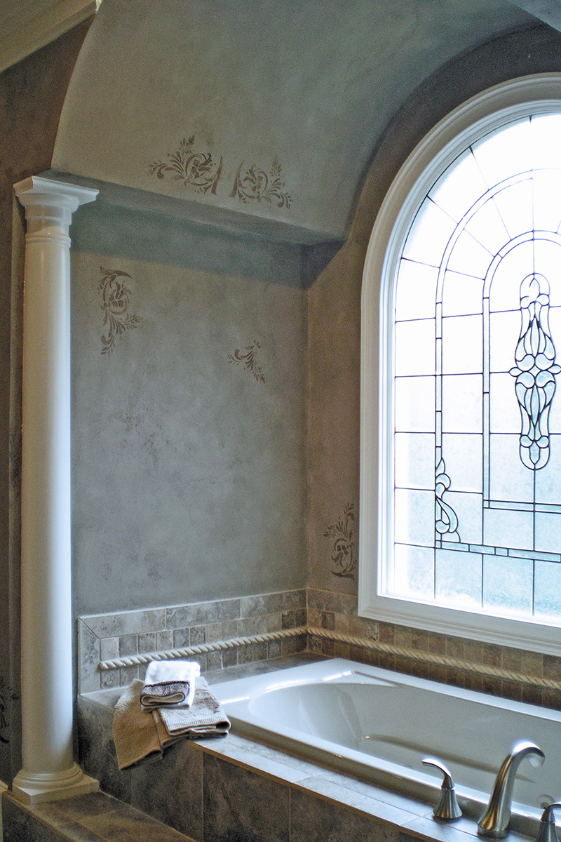
Perfect Harmony…Authentically Aged …
Dancing Walls…Metallic Ombre
Tossed and Found…Antiqued Ceiling …
Faded By Love…Custom Stained Accen …
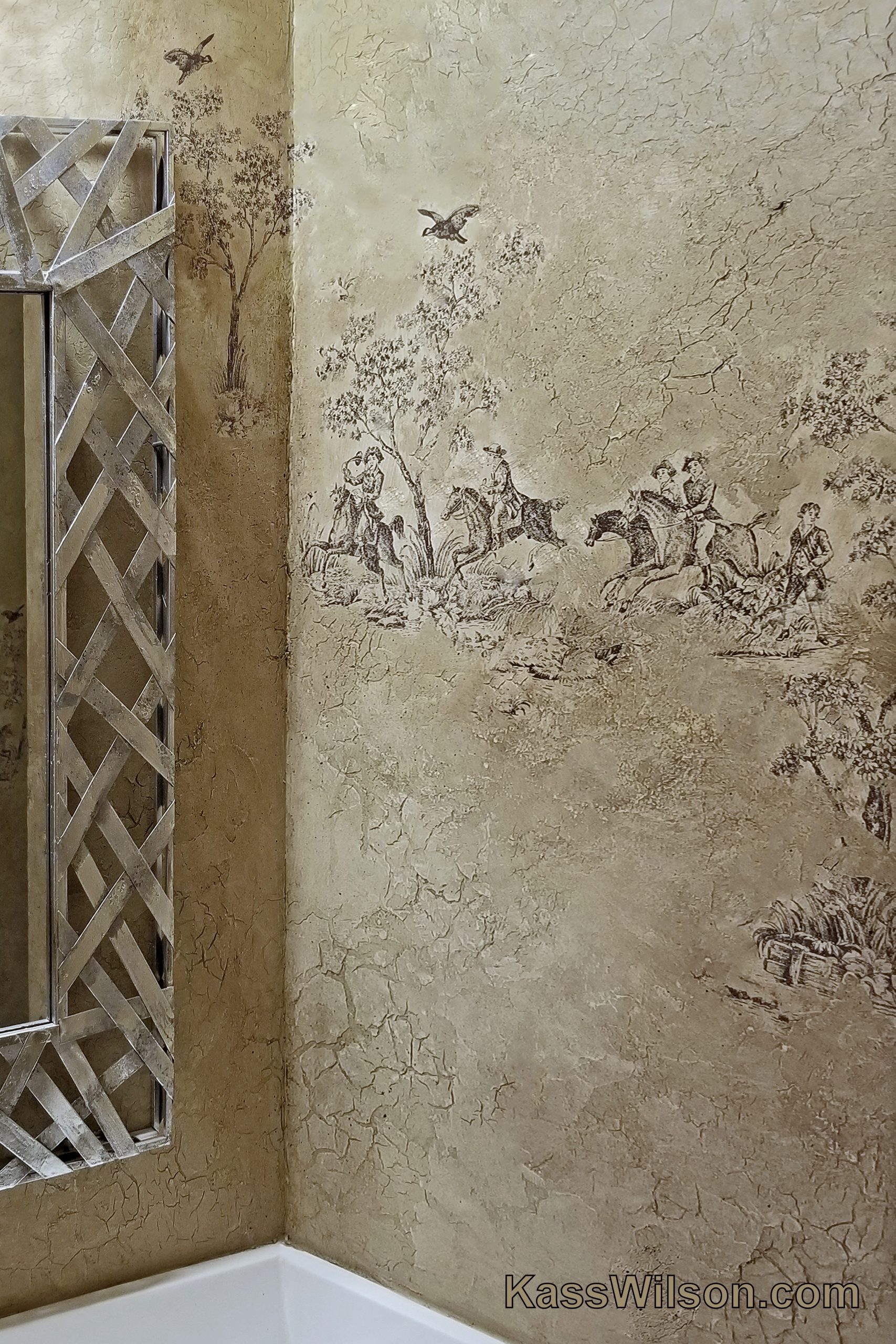
All The King’s Horses… Aged Plas …
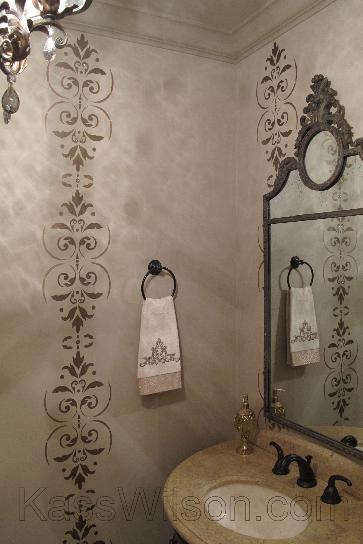
On a Grand Scale…Large Custom Sten …
Sugar On Top…Metallic Stencil On W …
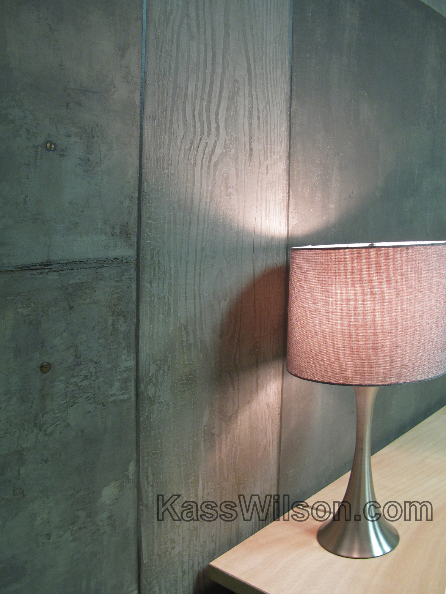
Concrete Solutions…Simulated Concr …
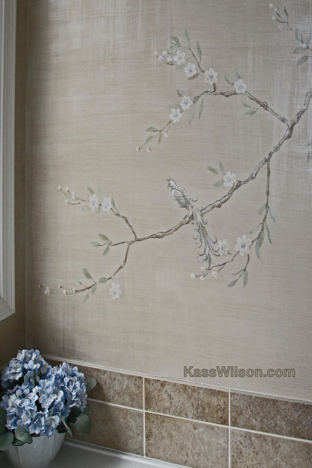
Double Exposure…Faux Silk Chinoise …
To Boldly Go…Colorful Metallic Tex …
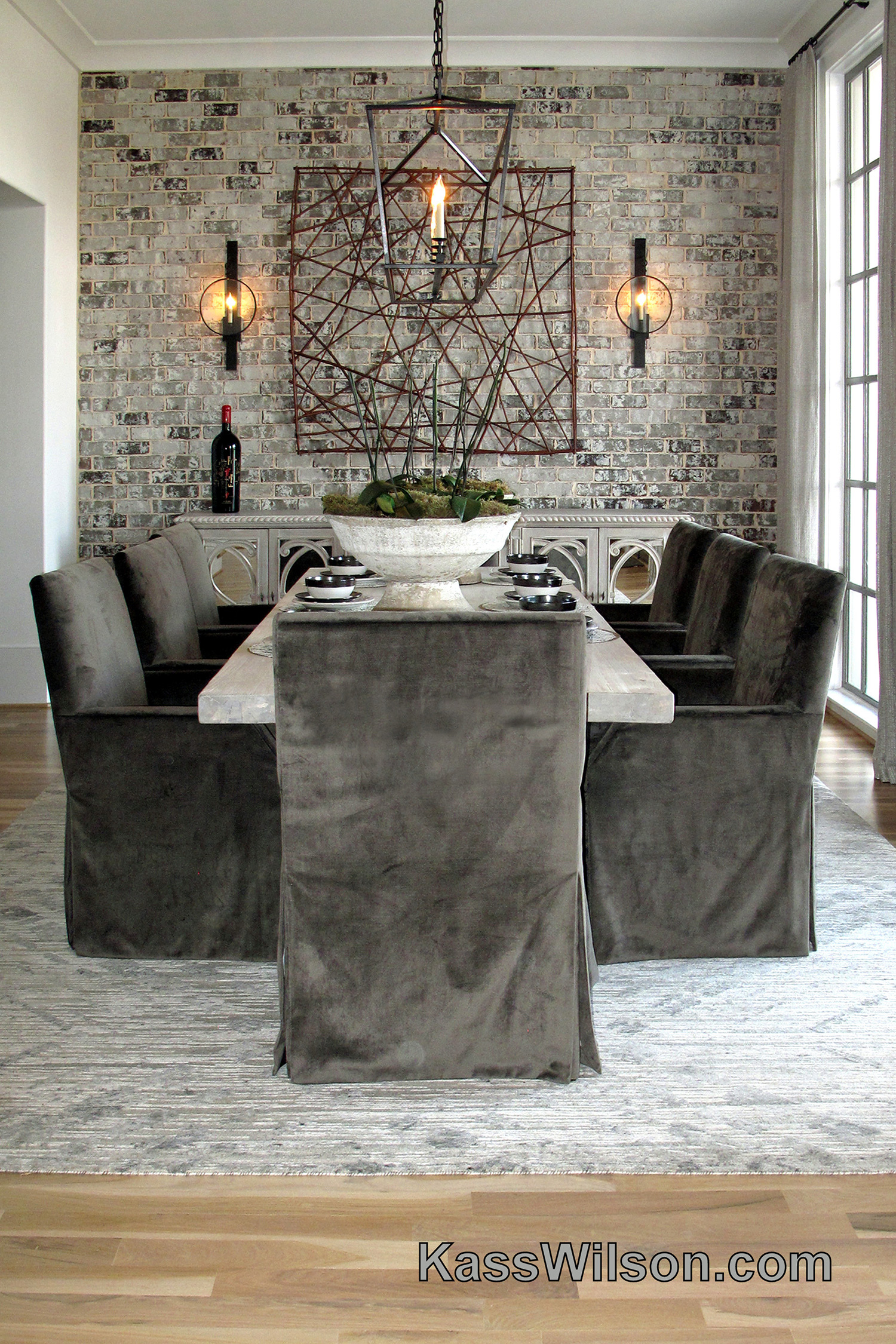
Brick by Brick…Painted Brick Accen …
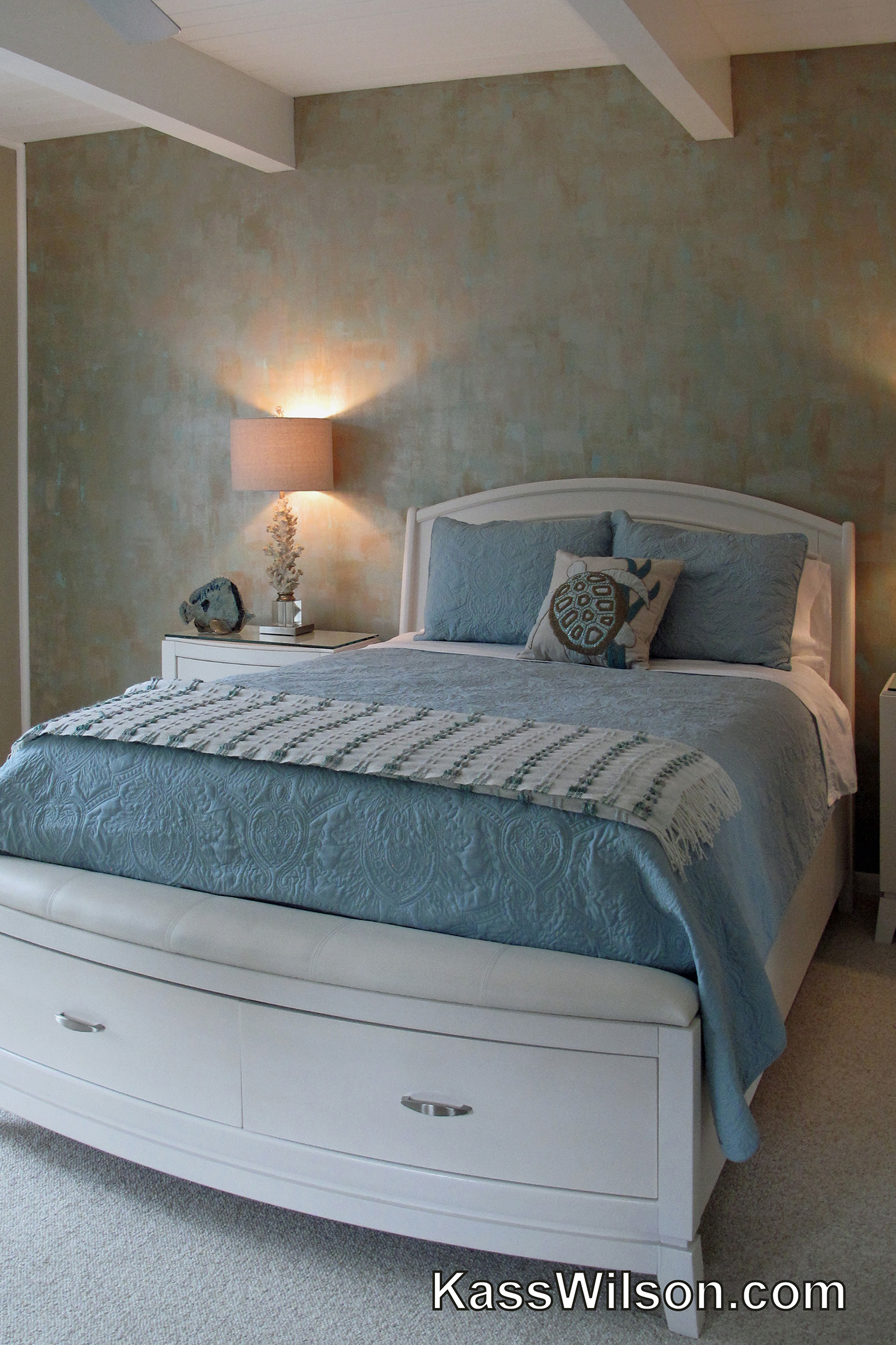
By The Sea…Soft Metallic Plaster A …
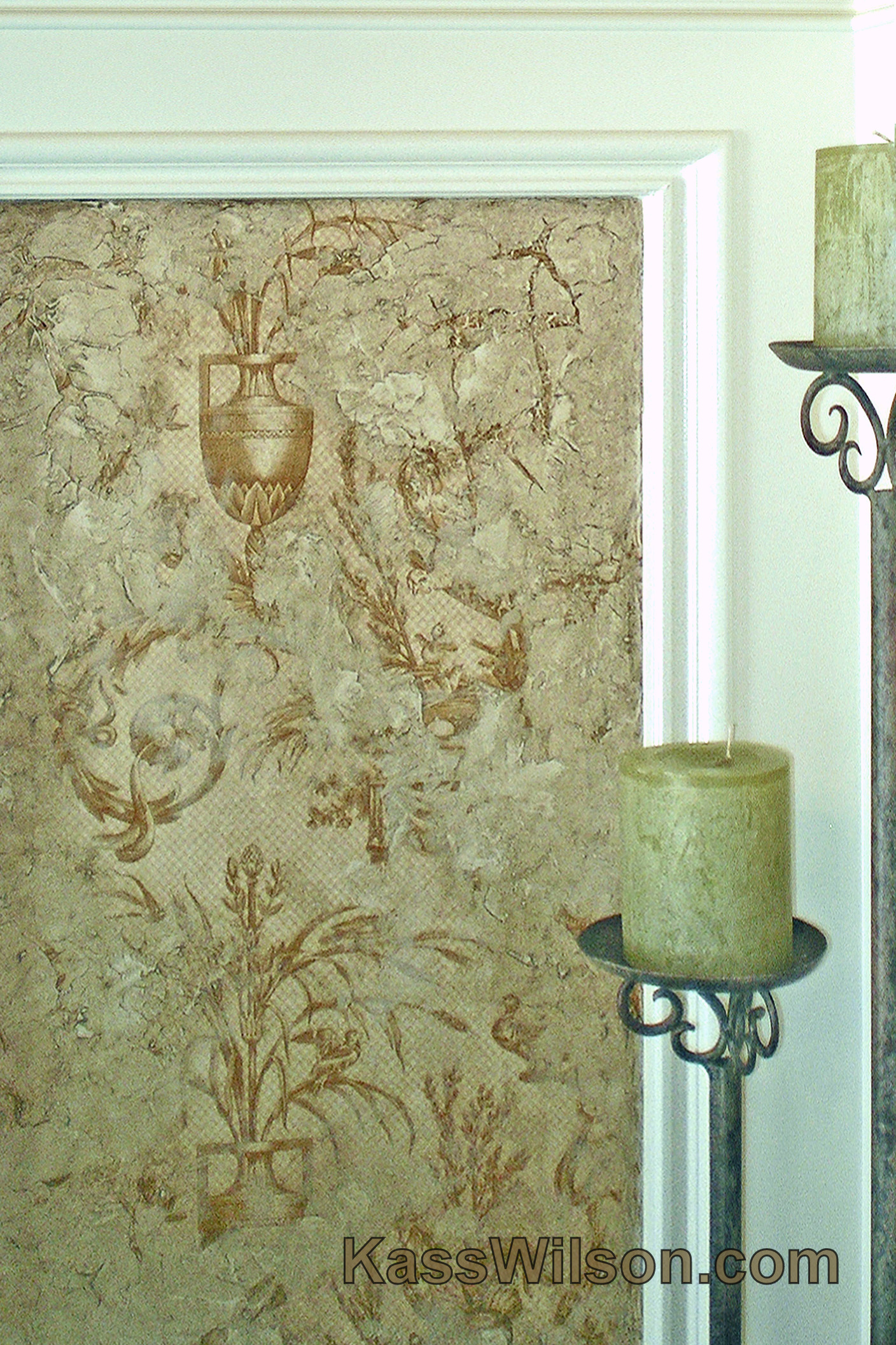
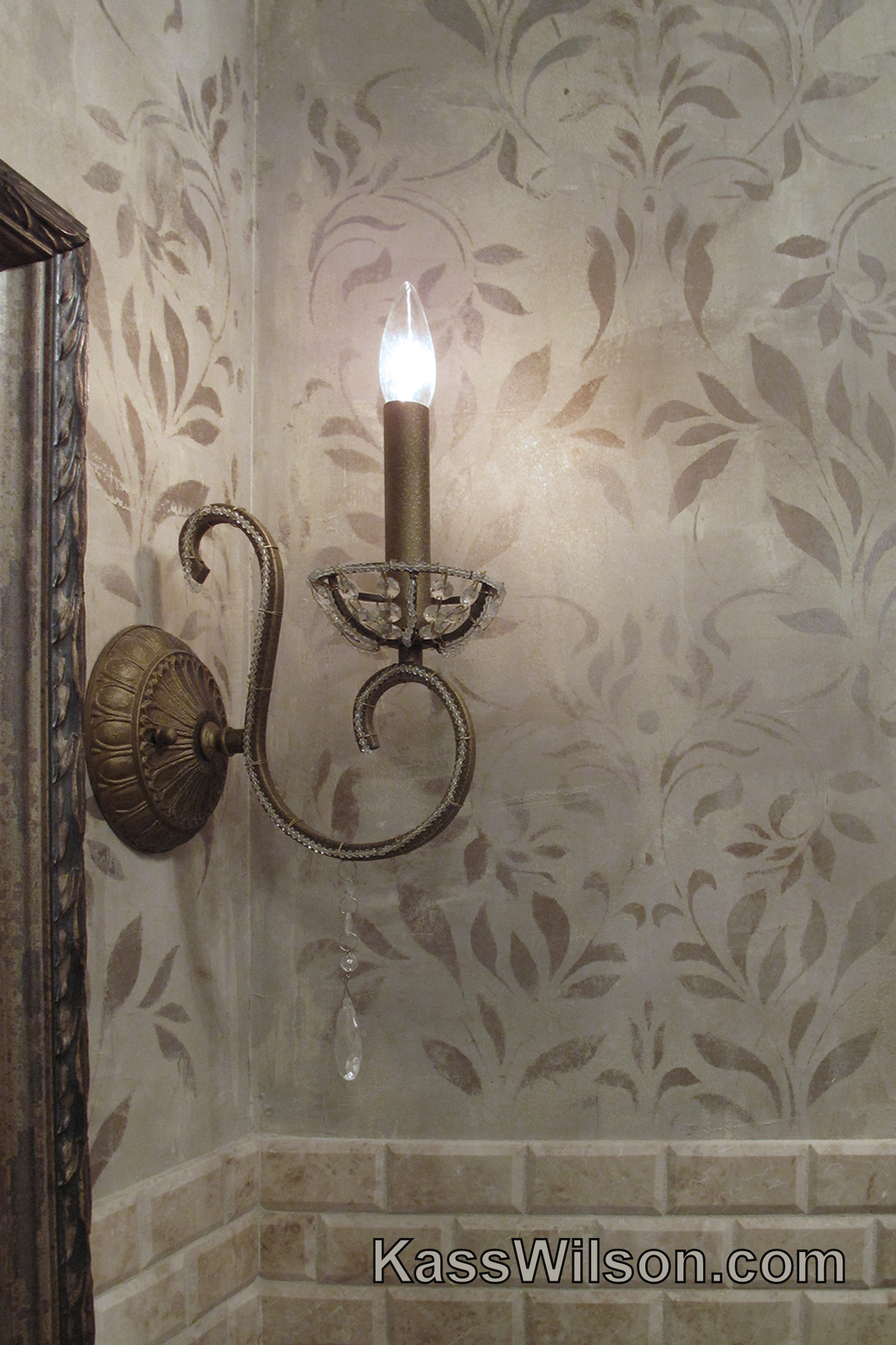
Aging Gracefully…Faux Faded Damask …
Raise Your Glass…Aged Plaster in W …
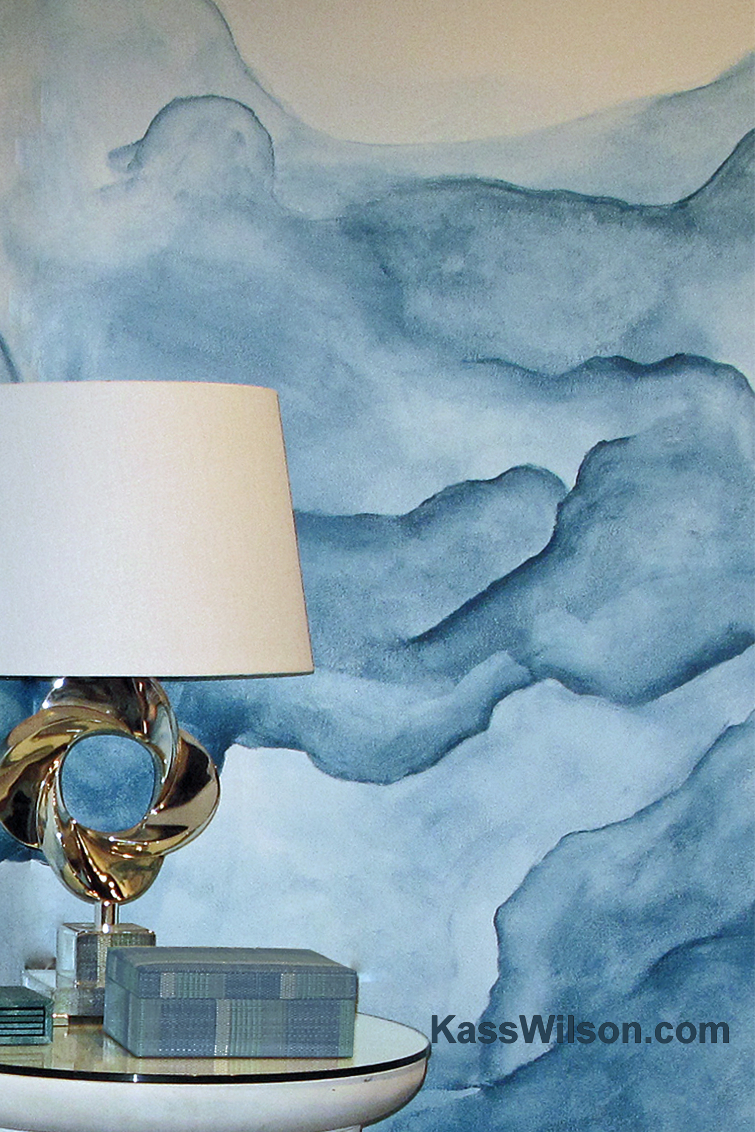
Go With The Flow…Watercolor Walls
Great Escape…Embedded Bronze Desig …
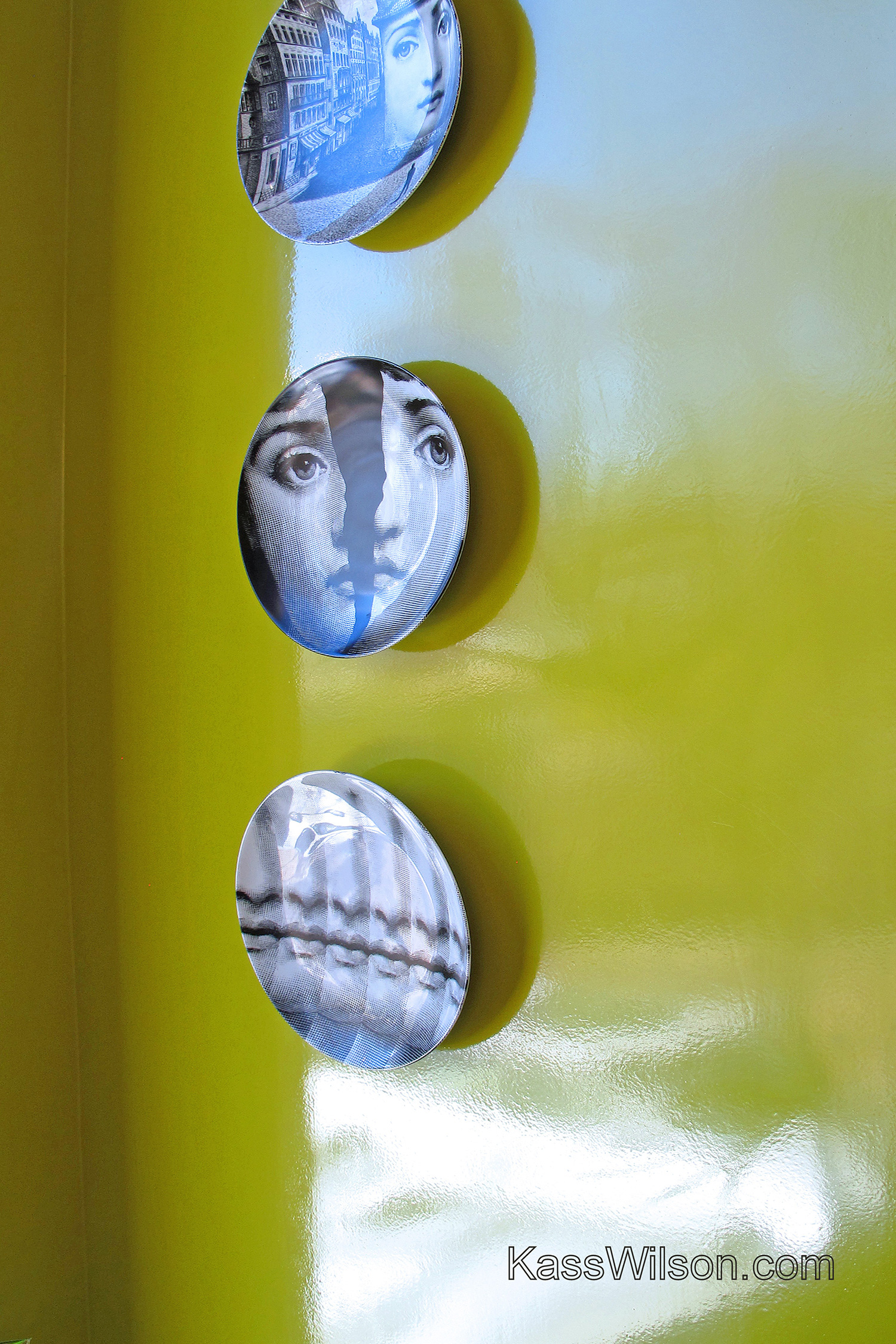
Hi Shine, High Design…High Gloss L …
Supporting Evidence
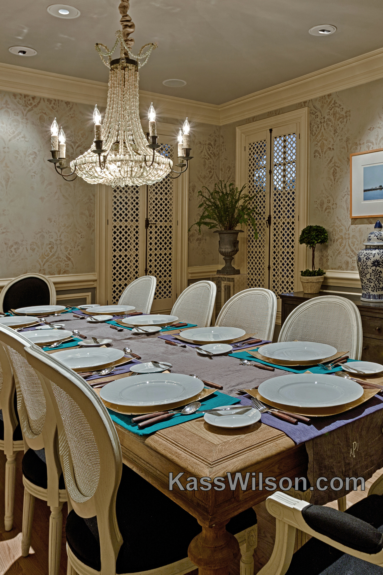
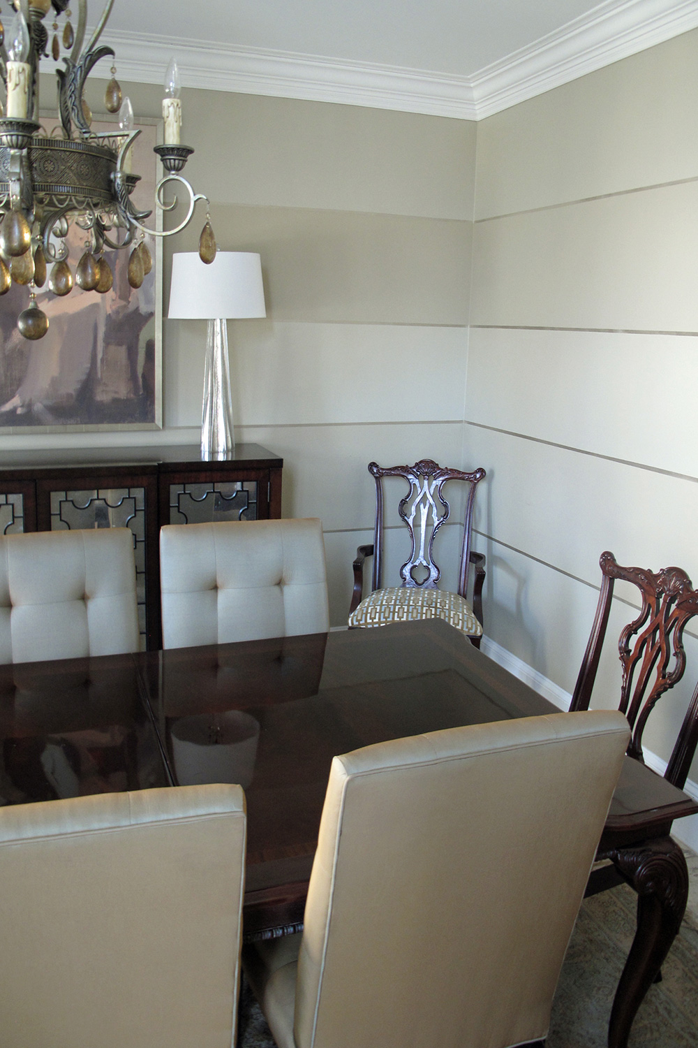
Linear Thinking…Expand A Dining Ro …
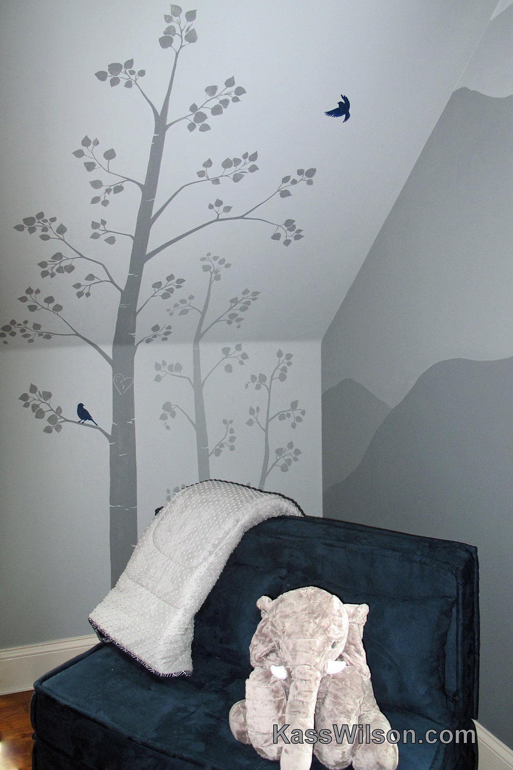
Little Boy Blue…Nursery Mural
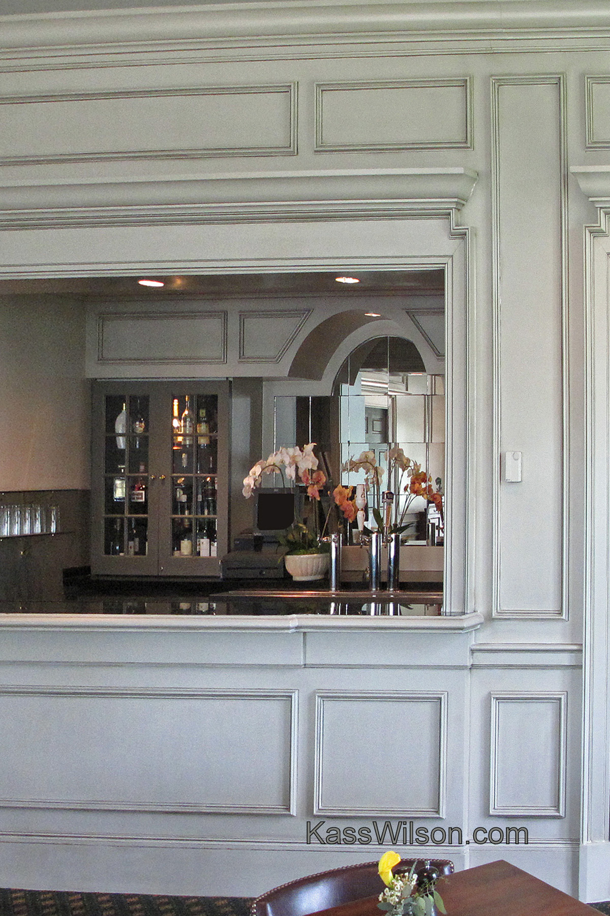
The Nineteenth Hole…Clubhouse Cabi …
Yes You Can…Painted And Aged Brick
Luxury Defined…Raised Faux Silk St …
Ruby Slipper…Bold And Elegant Vene …
Splash…Layered Stencil On Walls
Sterling Reputation…Metallic Plast …
Be inspired! Subscribe to see new projects and updates via email.
Notice: JavaScript is required for this content.
The Artist
Projects
▼
Cabinetry
Ceilings
Floors
Walls
Wood Graining
Architectural Details
FAQs
Connect
Blog